
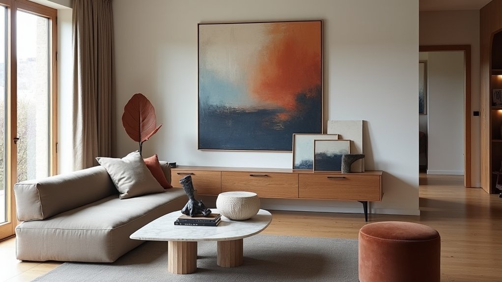
Art shapes your room’s mood, ties your colour palette together, and makes the space feel considered. Start with a simple plan: measure the wall, mark the centre, and mock up layouts with paper or painter’s tape, keeping gaps 5–8cm. Choose a hero piece, then add supporting works that share a thread like colour or frame finish. Hang most art with its centre about 145cm from the floor, and use shelves for flexible layering—next you’ll see how to avoid common mistakes.
Key Takeaways
- Use art to set the room’s mood and focal point, choosing calm, bold, or cozy pieces that match the space’s vibe.
- Plan placement first: measure walls, map sightlines, and mock layouts with paper templates or painter’s tape before hanging.
- Build cohesion by repeating one “thread” across pieces—palette, frame finish, or material—while varying only one element at a time.
- Coordinate room colors from the artwork: pull dominant hues for walls and add one or two accents through textiles and accessories.
- Hang and group with proportion: fill two-thirds of the wall, keep 5–8 cm gaps, and center art around 145 cm from the floor.
Start With a Simple Art Plan for Your Room
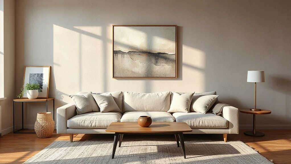
Before you buy anything, map out a simple art plan for the room so each piece supports the look you’re building. Measure every wall, note sightlines from the sofa and doorway, and decide how many focal points you need. Set a budget that includes delivery, hanging, and conservation-grade materials available from UK framers. Build a shortlist by scale: one hero work, a few supporting pieces, and blanks you’ll fill later. Use Art history to guide coherence—shared era, medium, or subject gives structure without forcing a theme. Specify framing techniques early: mount depth, glazing type, and frame profile affect cost and proportions. Finally, plot positions with paper templates or painter’s tape so you avoid impulsive buys.
Match Your Art to the Room’s Vibe (Calm, Bold, Cozy)
Once you’ve mapped your placements and budget, choose art that reinforces the room’s mood rather than fighting it. For a calm bedroom, pick soft-edged landscapes, minimal line drawings, or gentle Abstract patterns; keep the scale tidy and the subject restful. In a bold living room, go for high-impact graphic prints, confident photography, or a single oversized statement piece that can hold its own against strong furniture shapes. To make a snug, cosy snug or reading corner feel inviting, lean into textured works—etchings, textiles, or warm-toned still lifes—and hang them lower for a more intimate sightline. If you’ve got open shelving or a mantelpiece, add Modern sculptures with rounded forms for serenity, or angular pieces for energy. Match the vibe, then commit.
Build a Color Palette From Your Artwork
Start with your artwork and pull out its dominant hues, then make those your room’s main colours for paint, upholstery, or key pieces. Choose one or two accent colours from smaller details in the piece and repeat them in cushions, rugs, or accessories to keep the scheme cohesive. Balance the accents with plenty of neutrals—think warm whites, greys, or natural timber—so the space feels considered rather than busy.
Identify Dominant Hues
How do you pull a room’s colour scheme straight from the art you love? Start by identifying the dominant hues in the piece, not the tiny details. Stand back two metres, squint, and note the three colours you still see. You can also snap a photo and use a simple colour-picker app to confirm what your eye’s telling you.
Next, translate those hues into paint and soft furnishings available in the UK: match one hue to a wall colour, one to a larger textile (sofa, rug, curtains), and one to cabinetry or flooring undertones. Aim for Color harmony by keeping the hues in the same temperature (warm or cool). Check hue contrast between them so the palette reads intentional, not muddy. Keep it consistent room to room.
Balance Accent Colors
Where do accent colours fit when your artwork already supplies the main hues? You use them to support, not compete. Pull two to three Accent hues from smaller details in the piece—think a thin line, shadow tone, or background wash—then repeat them sparingly across the room. Limit accents to 10–15% of what you see: cushions, a lampshade lining, a vase, or a single painted niche. Keep your base neutral (warm white, putty, soft grey) so the art stays dominant. To lock in color harmony, match undertones: blue-greens with cool greys; ochres with warm creams and brass. In typical UK light, test samples morning and evening before you commit.
Choose the Right Art Size for Each Wall
Although you might be tempted to buy art based on the image alone, the size needs to suit the wall or it’ll look lost or overbearing. Start by judging wall proportion: measure the clear width between corners, windows, radiators, and furniture, then aim for artwork that fills roughly two-thirds to three-quarters of that span. On a narrow alcove, choose a single vertical piece; on a wide chimney breast, go larger or use a tight grouping so it reads as one visual block.
Match art size to viewing distance, too: in a hallway you can go smaller and sharper; in an open-plan living room you’ll need bolder scale. If you’re unsure, tape paper templates on the wall before you buy.
Hang Wall Art at the Right Height and Spacing
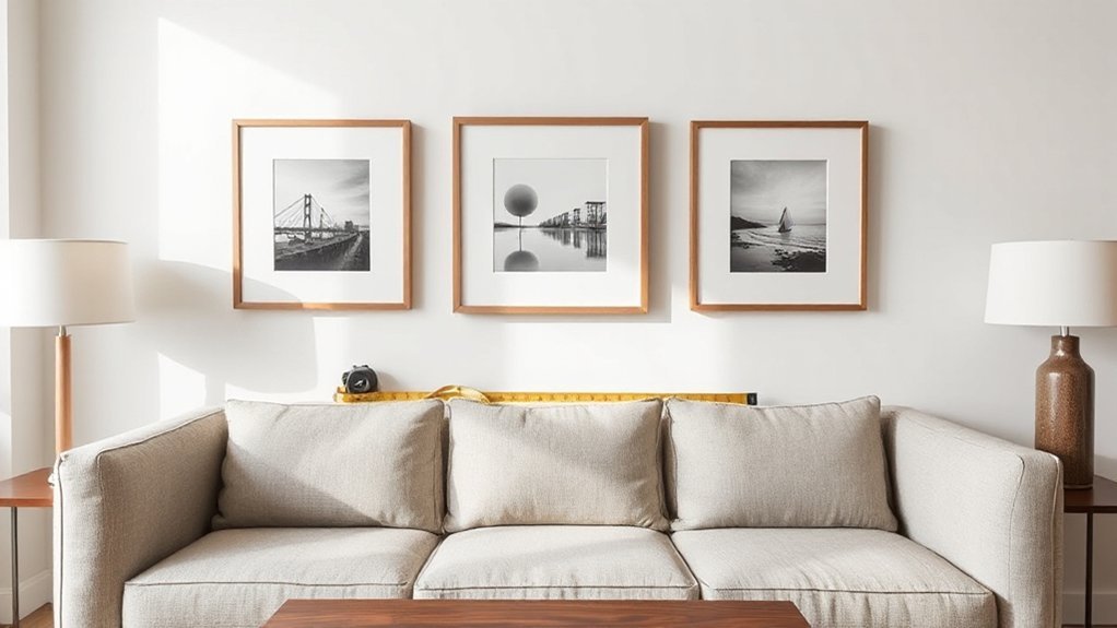
Hang your wall art so the centre sits at about 57 inches (145 cm) from the floor, which matches typical UK eye level. Keep spacing consistent—around 2–3 inches (5–8 cm) between frames—and treat groupings as one unit so the layout feels balanced. Align pieces with your furniture, centring over a sofa or sideboard and leaving a clear gap above it so everything reads as intentional.
Follow The 57-Inch Rule
To make wall art look intentional rather than “floating,” you can rely on the 57-inch rule: position the centre of the artwork at roughly 57 inches (about 145cm) from the floor, which matches average eye level in UK homes and galleries. Measure from the finished floor, mark the centre point lightly in pencil, then calculate the drop to your hanging hardware (D-rings, wire, or sawtooth) so the piece lands exactly where you planned. If you’re adding to an art collection, keep this centreline consistent across rooms for a calm, curated feel. Use framing techniques that suit British light levels: anti-reflective glass for bright bays, or simple mounts to give work breathing room. Always level, then step back and check alignment.`
Balance Spacing And Groupings
Once you’ve set a consistent centreline with the 57-inch rule, spacing and grouping decide whether your wall reads as a polished gallery or a jumble. Aim for spacing consistency: keep gaps equal between frames, typically 5–8 cm for most UK homes, and don’t let one odd gap break the rhythm. Use paper templates or painter’s tape to mark edges, then step back to check alignment from your usual viewing spot.
Apply grouping principles before you drill. Treat a cluster as one unit, with an overall outline that feels intentional—grid for tidy, salon for relaxed. Repeat finishes or mount colours to unify mixed styles, and vary sizes to create a clear focal point without crowding.
Consider Furniture Alignment
Although the 57-inch centreline keeps eye level consistent, your furniture sets the real visual anchor, so align wall art to what sits beneath it rather than the ceiling line. Treat sofas, consoles, and headboards as your baseline: the artwork should feel connected, not floating.
- Over a sofa: hang the bottom edge 15–25cm above the back; centre to the sofa, not the wall.
- Above a console: keep a 10–20cm gap and match the piece to the console’s width by two-thirds.
- With a seating arrangement: align the art’s centre with seated eye level if you lounge more than stand.
- For furniture positioning: use painter’s tape to test height and spacing before you drill.
Place Art Above Sofas, Beds, and Consoles
When you hang art above a sofa, bed, or console, you anchor the furniture and give the room a clear focal point. Keep the centre of the artwork roughly at eye level when you’re standing, and leave about 15–25cm between the top of the furniture and the bottom of the frame. For Sofa focal points, choose one substantial piece that spans around two-thirds the sofa’s width, so it looks intentional rather than undersized. Above a bed, balance matters: pick a horizontal work or two matching frames, centred to the headboard, and avoid heavy glazing if you’ve got low ceilings. For Bedside accents, echo the artwork’s colours in cushions or lamps to tie the scheme together. Use secure fixings suited to plasterboard or masonry.
Plan a Gallery Wall Layout That Looks Intentional
If you want a gallery wall to look curated rather than chaotic, start with a clear layout plan before you pick up a hammer. Measure your wall, mark the centre line, and decide whether you’re framing a sofa, stairwell, or landing. You’ll get better visual flow when you commit to consistent spacing and align key edges, not random corners. Mock it up first using paper templates and low-tack tape, then adjust until the gallery arrangement feels balanced from the doorway.
- Set a boundary (tape a rectangle or follow existing panelling).
- Choose an anchor piece and build outwards.
- Keep gaps consistent (around 5–7 cm is a reliable UK rule).
- Use proper fixings for plasterboard, masonry, or lath and plaster.
Mix Art Styles Without Making the Room Feel Busy
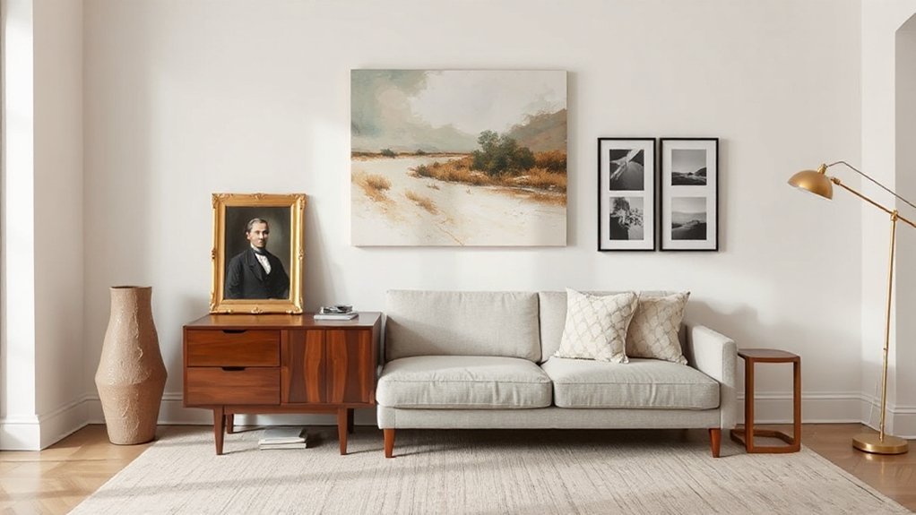
Because a room can only handle so many competing signals, you’ll get the best results by mixing art styles around one consistent thread—typically a shared colour palette, a repeating material (oak, black metal, brass), or a uniform frame finish. Then vary one factor at a time: pair a graphic print with an oil landscape, but keep saturation similar, or mix line drawings with photography while sticking to the same tonal range. Limit bold pieces to one or two per wall; let quieter works create breathing space so you don’t end up with Overwhelmed senses. Watch for Clashing patterns between artwork and soft furnishings; if your sofa fabric is busy, choose calmer compositions. Finally, anchor the mix with a single “hero” artwork and build outward.
Mix Frames and Mats So They Still Coordinate
When you mix frames and mounts, you’ve got to balance colours and tones so the collection reads as one, not a jumble. Vary sizes to create rhythm, but keep harmony by repeating a consistent finish or profile across key pieces. Match overall style cues and mix textures—such as oak, black metal, and linen mounts—so everything coordinates while still feeling considered.
Balance Colors And Tones
Although your artwork may be the star, you’ll keep the overall scheme looking intentional by balancing the colours and tones in your frames and mats. Use tone coordination to link pieces without making everything matchy-matchy, and lean on Color psychology to steer the mood: warm woods feel welcoming, black reads crisp and modern, and soft off-whites calm busy prints. In UK homes with variable daylight, check samples in morning and evening light before you commit.
- Pick one dominant neutral (black, oak, white, brass) for most frames.
- Repeat one accent tone from the art in the mount for subtle cohesion.
- Mix matte and satin finishes, but keep undertones consistent (warm with warm).
- Limit to two metal colours across a wall for control.
Vary Sizes, Keep Harmony
Once you’ve balanced colours and tones, you can start varying sizes to build a display that feels collected rather than cookie-cutter. Use scale contrast: pair one statement piece with two to four smaller works so the eye has a clear anchor. Keep spacing consistent—around 5–8cm between frames works well in most UK homes.
Maintain harmony through repeat cues. Choose a tight palette of frame finishes (for example, black, oak, and brass) to create Frame variety without chaos. If you mix mounts, keep their colour consistent (off-white or soft white) and vary only the width to suit each artwork. Align either top edges or centre lines across the grouping, and measure before you drill to avoid patching plaster later.
Match Styles, Mix Textures
To make mixed frames and mounts look intentional, you need one clear style thread that runs through the whole arrangement. Pick a dominant cue—black metal, pale oak, or warm brass—and let everything else vary around it. You’ll get depth through Texture layering, but you’ll avoid the jumble that can cheapen a wall in a typical UK terrace or new-build.
- Set a rule: keep one frame colour or finish consistent across 60–70% of pieces.
- Use Color contrast: pair light mounts with dark frames (or vice versa) to sharpen edges.
- Mix materials: combine timber, metal, and acrylic, but repeat each at least twice.
- Standardise mounts: match mount tone (warm white, off-white) so different art still reads as a set.
Style Art on Shelves, Mantels, and Picture Ledges
When you treat shelves, mantels, and picture ledges as working display zones rather than afterthoughts, art starts to feel intentionally integrated into the room. Use Shelf styling rules: anchor the arrangement with one larger framed piece, then layer smaller works in front so you keep sightlines clean. Lean frames rather than fixing everything; it lets you swap prints seasonally without filling walls with holes.
For mantel decor, keep the centre clear and build asymmetry: stack two frames on one side, balance with a vase or sculptural object on the other. Stick to a tight palette—black, oak, brass—so mixed media still looks calm. Leave breathing space between items, and keep heights stepping up and down to avoid a flat row.
Use Art to Define Zones in Open-Plan Rooms
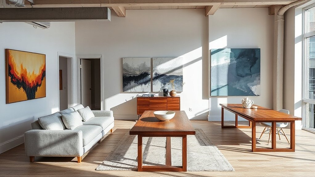
Although open-plan layouts promise flexibility, they can look undefined without clear visual cues—so use art to draw boundaries that furniture alone can’t. Treat each zone like a mini room and choose pieces that signal function at a glance. Use scale, placement, and colour to direct movement through your kitchen–diner–living space without adding walls. Colour blocking with bold prints can separate the dining area from the lounge, while calmer palettes keep a work nook focused. Build furniture anchoring by aligning art edges with the back of a sofa, a console, or the end of a breakfast bar.
- Hang one large piece to crown the seating zone.
- Group three frames to mark the dining table footprint.
- Use a vertical artwork to define a hallway run.
- Echo frame finishes with lighting or hardware.
Art Mistakes That Make a Room Feel Unfinished
Even the best furniture and lighting can fall flat if your art looks like an afterthought, so tackle the common missteps that leave a room feeling half-done. Don’t hang pieces too high; keep centres roughly at eye level (about 145cm), adjusting for sofas and dining chairs. Avoid undersized prints that float on big walls—scale up or group works with consistent spacing. Stop scattering frames across rooms without a plan; repeat colours and subject matter to create continuity. Don’t ignore art placement near radiators, direct sun, or steamy bathrooms; it can warp paper and fade pigments, undermining art preservation. Finally, skip flimsy fixings—use proper wall plugs for plasterboard and masonry so everything sits straight and secure.
Frequently Asked Questions
How Do I Protect Artwork From Sunlight, Humidity, and Temperature Changes?
You’ll protect artwork by using UV protection glazing, keeping it out of direct sun, and adding humidity control with a dehumidifier. Maintain steady 18–21°C, 40–55% RH, and avoid radiators, bathrooms, and kitchens.
Should I Buy Original Art, Prints, or Digital Downloads for My Home?
Buy originals if you want Art investment; choose prints for affordable Artistic styles; use digital downloads for flexible updates. In the UK, UV can fade colours by 40% in 3 months—so frame, glaze, and position smartly.
What Lighting Works Best to Highlight Art Without Causing Glare?
Use gallery lighting: adjustable LED picture lights or track spots at a 30° angle. Choose matte glazing, add anti-reflective glass, and fit dimmers for glare reduction. In UK homes, 2700–3000K LEDs protect colours.
How Can I Insure and Appraise Valuable Artwork in My Collection?
Treat your collection like a lighthouse in fog: document, then insure. You’ll hire a UK-accredited valuer for appraisal, use clear valuation methods, keep updated reports, and choose specialist Insurance policies covering transit, theft, damage.
Where Can I Find Affordable Art From Emerging Local Artists?
You’ll find affordable art at local art scenes: open studios, degree shows, artist-run pop-ups, and council galleries. Use Emerging artist tips: follow Instagram, join mailing lists, visit print fairs, and negotiate UK shipping or framing.
Conclusion
Treat art like the final coat of paint: it seals the room’s mood. When you start with a plan, scale pieces correctly, and hang them at eye level, everything else clicks. One London client swapped a too-small print for a single 90cm canvas; the space felt “finished” in minutes, like tightening the last screw on flat-pack furniture. Keep your palette tight, vary frames with intent, and let art anchor each zone.