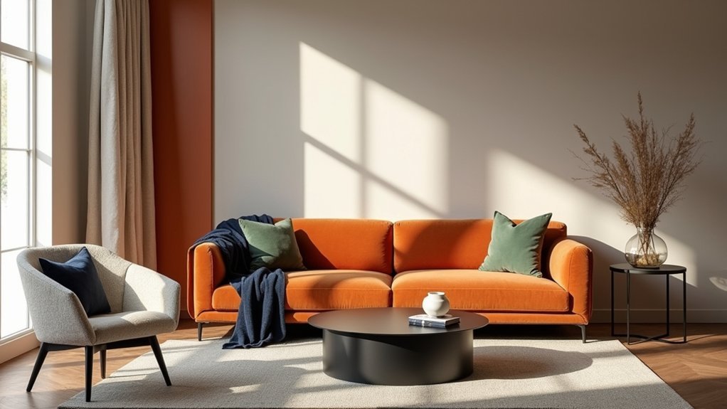
You’ll get a balanced orange scheme when you match its undertone to your light and anchor it with steady neutrals. Use clay or terracotta on big surfaces, then add brighter orange as accents. Pair orange with cream, beige, or warm wood to ground it, cool it with blue-leaning grey or navy, or sharpen edges with matte black hardware. Sage or olive keeps it natural, and blush tones soften it. Next, you’ll see room-by-room pairings and ratio tips.
Key Takeaways
- Choose the right orange undertone and saturation; muted terracotta suits large areas, while high-chroma orange works best as an accent.
- Test orange in your room’s light; north light cools it, south light warms it, and warm LEDs can push it pumpkin.
- Anchor orange with dark neutrals like charcoal, matte black, or navy to sharpen edges and prevent the palette feeling overly sweet.
- Balance orange with earthy counterparts—sage or olive greens, warm woods, and tan or camel neutrals—for a grounded, natural interior.
- Use cool greys and off-whites to modernize orange; repeat orange in small doses through textiles, art, and hardware for cohesion.
Pick an Orange: Undertone, Saturation, and Light
Before you pair orange with anything else, you need to choose the right orange for your room, because undertone, saturation, and light exposure will decide whether it reads warm and grounded or loud and restless. Check undertone first: red-leaning oranges feel cozier and heavier, while yellow-leaning oranges read brighter and sharper. Then control saturation: in large areas, pick a softened, clay or terracotta level; reserve high-chroma tangerine for small hits. Evaluate light by direction and bulbs—north light cools orange, south light amplifies it, and warm LEDs can push it too pumpkin. Sample on two walls and observe morning/night. Use Color psychology: orange raises energy and appetite, so modulate intensity. Plan Complementary accents only after the base orange behaves consistently.
Best Orange Colour Pairings (Quick Shortlist)
Once your chosen orange stays consistent across undertone, saturation, and light, you can pair it with colours that either steady it, cool it, or make it feel more intentional. For a quick shortlist, start with charcoal or soft black: they anchor orange and sharpen edges, especially in matte paint finishes. Choose navy or inky blue to cool the palette; Color psychology reads this as confident, grounded energy. Use slate or steel grey for a modern, low-risk balance that won’t compete with orange’s warmth. Add sage, olive, or deep forest green when you want a natural counterweight; eggshell finishes keep greens calm. Try blush, dusty rose, or mauve to soften orange without turning sugary; reserve satin finishes for trim for definition.
Orange Colour Pairing: White, Cream, and Beige
Although orange brings instant warmth and energy, white, cream, and beige give it breathing room and keep the scheme feeling deliberate rather than loud. Use these neutrals to control Color psychology: orange reads sociable and optimistic, while pale backdrops signal calm and cleanliness, so the room feels welcoming, not hectic. Pay attention to lighting effects; warm bulbs intensify orange, while cooler daylight can sharpen contrast and make whites look crisper.
- Choose a warm white to avoid a clinical edge beside terracotta or rust
- Layer cream textiles to soften saturated tangerine accents
- Use beige on larger surfaces to reduce visual noise
- Add matte finishes to prevent glare and color shift
- Repeat orange in small doses (art, cushions) for balance
Orange Colour Pairing: Grey for a Modern Look
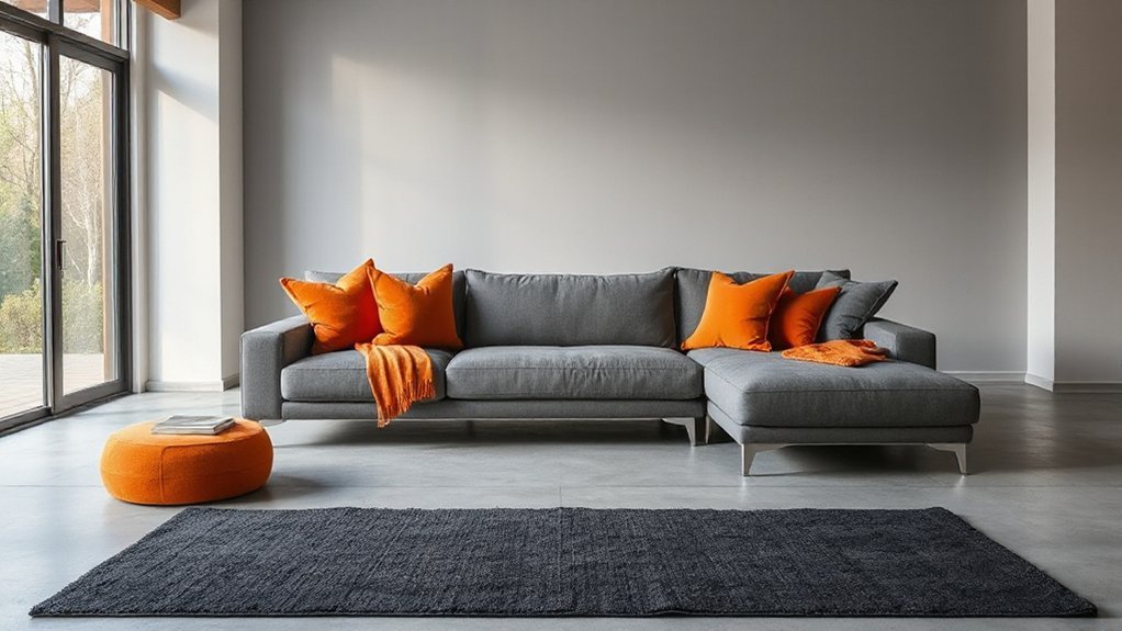
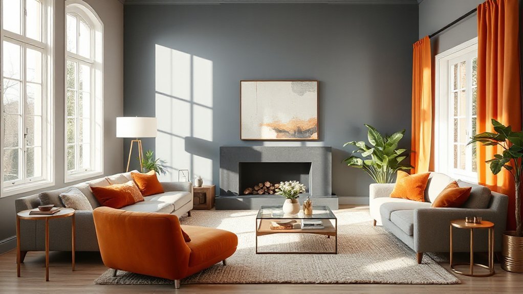
Pair warm orange with cool grey to get a crisp, modern contrast that still feels inviting. You’ll reinforce the look with modern materials—think matte concrete, brushed steel, charcoal textiles, and light oak—to control temperature and texture. Keep orange as a disciplined accent (pillows, art, a single chair) and let grey carry the larger surfaces so the space stays balanced.
Warm Orange, Cool Grey
When you combine warm orange with cool grey, you get a modern contrast that feels sharp but still inviting. You’ll balance energy and calm by treating orange as the accent and grey as the stabiliser. This pairing suits Complementary palettes because it heightens contrast without visual noise, and it adapts easily to Seasonal variations by shifting tone and saturation.
- Pick a muted, blue-leaning grey to keep orange looking crisp.
- Use burnt orange for depth; use tangerine for a cleaner, fresher edge.
- Keep large surfaces grey, then repeat orange in two to three tight hits.
- Add off-white to prevent the scheme from feeling heavy or cold.
- Match warmth levels: warmer orange needs a slightly softer, mid-value grey.
Modern Material Pairings
Warm orange and cool grey set the colour direction; the materials you choose decide whether the room reads sleek or flat. Use matte grey microcement or large-format porcelain to keep planes quiet, then introduce orange through tactile finishes like wool upholstery, powder-coated steel, or stained oak. Color psychology matters: grey stabilises and sharpens, while orange adds perceived warmth and energy, so choose materials that control sheen. Pair satin nickel, blackened steel, or brushed aluminium with orange textiles for a modern edge; avoid high-gloss grey lacquers that can feel cold. For sustainability considerations, specify low-VOC paints, recycled-content carpet tiles in grey, and FSC-certified timber in warm tones. Keep grout, hardware, and trim consistently grey to maintain a clean, architectural read.
Accent Balance Strategies
Although grey sets a calm, modern baseline, you’ll only get a balanced look if you control how much orange you introduce and exactly where it lands in the sightline. Use Color psychology: grey reads stable and quiet, while orange signals energy; cultural symbolism can skew orange toward hospitality, ritual, or warning, so calibrate intensity.
- Limit orange to 10–15% of the room’s visual weight.
- Place the strongest orange at focal points: entry, fireplace, or art.
- Repeat a softer orange twice elsewhere to prevent a “single pop” effect.
- Choose warm greys to harmonize; cool greys to sharpen contrast.
- Anchor with matte black, oak, or concrete so orange stays intentional.
Test samples under day and night lighting, then lock placement and scale.
Orange Colour Pairing: Tan, Brown, and Warm Woods
Why does orange feel instantly more grounded when you pair it with tan, brown, and warm wood tones? You’re anchoring a high-energy hue with earth-based neutrals that share similar undertones. Start with a tan wall or rug, then add orange in controlled doses: cushions, art, or a single upholstered chair. Choose warm woods—oak, walnut, or teak—to bridge the gap and keep contrast soft.
Build complementary palettes by matching orange’s intensity to your browns: burnt orange suits chocolate leather, while apricot works better with camel and honey oak. Manage seasonal variations by shifting textiles: linen and light tan in summer, boucle, suede, and deeper browns in winter. Finish with brass or matte black hardware for definition.
Orange Colour Pairing: Navy and Deep Blue
Pair orange with navy or deep blue to get crisp contrast while keeping colour balance—anchor the scheme with blue on large surfaces and use orange as controlled highlights. You’ll get the cleanest results in living rooms, bedrooms, and studies, where deep blue can ground the space and orange can add energy without overwhelming it. Choose matte navy paint or velvet upholstery, then layer in orange through cushions, art, ceramics, or a single statement chair, and repeat the accent in small doses for a cohesive finish.
Contrast And Colour Balance
When you balance vibrant orange with navy or deep blue, you get high contrast without visual chaos because the cool, saturated blues temper orange’s heat and keep the palette grounded. Color psychology supports this: orange reads energetic, while deep blue signals stability, creating Interior harmony through push-pull tension.
- Keep orange to 10–20% of the scheme; let blue dominate.
- Choose one orange value (burnt, tangerine, or rust) and repeat it twice.
- Add warm neutrals (camel, ivory) to soften the edge of contrast.
- Control saturation: pair bright orange with inky navy, muted orange with dusty blue.
- Use matte blues for depth and glossy orange accents for crisp separation.
You’ll maintain balance by matching undertones and limiting competing patterns.
Best Rooms For Pairing
Where does orange look most intentional against navy or deep blue? Start with social rooms where you want energy plus sophistication. In a living room, use navy as the dominant field and place orange where you want conversation to gather, keeping sightlines clear so the contrast reads crisp, not noisy. In a dining room, deep blue supports appetite and focus, while decorating with orange adds warmth that keeps the space from feeling formal or cold. In a home office, navy reduces visual distraction; small, controlled orange cues can boost drive, aligning with Color psychology around motivation and alertness. In an entryway, blue creates composure and orange signals welcome, helping guests orient quickly. Reserve bedrooms for softer versions if you want calmer sleep.
Materials And Accent Tips
Although navy and deep blue set a refined backdrop, the materials you choose decide whether orange reads tailored or accidental. Start with matte, tactile bases so orange can pop without glare, then layer sheen sparingly to control contrast. Favor Eco friendly finishes—low-VOC paints, water-based sealers, and natural oils—so saturated hues stay crisp, not plasticky. Use Vintage inspired textures to keep the pairing grounded and human.
- Navy wool or velvet upholstery; add burnt-orange piping for precision
- Deep-blue lacquered cabinet fronts; balance with orange leather pulls
- Smoked oak or walnut floors; use terracotta rugs to warm the base
- Brushed brass or blackened steel; limit orange to one hero object
- Indigo tile or denim drapery; echo orange with ceramics and art
Orange Colour Pairing: Sage and Olive Green
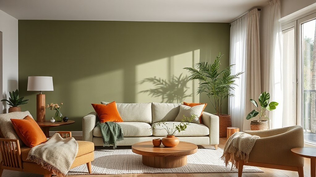
Because sage and olive green carry earthy, muted undertones, they tame orange’s intensity and make the pairing feel grounded rather than loud. Use them as your base on walls, cabinetry, or large upholstery, then add orange through pillows, art, or a single statement chair to control saturation. For Complementary color schemes, lean on orange’s relationship to green: keep the greens greyed and the orange slightly burnt so contrast stays refined. Balance the mix with warm neutrals like sand, camel, or matte black hardware to sharpen edges. Respect Cultural symbolism too: green often signals renewal and calm, while orange reads energetic and welcoming, so the room feels lively yet restorative. Finish with natural textures—linen, oak, rattan—to unify both hues.
Orange Colour Pairing: Blush Pink and Soft Peach
When you want orange to feel soft and polished rather than bold, pair it with blush pink and a muted peach to create a warm, tonal palette with built-in balance. You’ll get gentle contrast without sharp edges, especially when you keep undertones consistent (warm-warm). Use Complementary color theory as your guide: orange stays dominant, while pink and peach act as controlled tints that temper saturation and extend the gradient across the room. Lean on cultural symbolism too—orange reads as optimism and energy, while blush suggests care and ease.
- Choose terracotta over neon orange
- Layer blush in textiles and art
- Add soft peach on walls or bedding
- Repeat one brass accent for cohesion
- Ground the palette with light oak or cream
Orange Colour Pairing: Black for Crisp Contrast
Pair orange with matte black accents—hardware, lighting, window frames, or a slim console—to sharpen the space and keep the warmth controlled. Keep orange as the dominant field (walls, rug, upholstery) and use black in measured hits to define edges, anchor sightlines, and add structure. If the contrast feels harsh, soften the orange-black balance with warm neutrals and natural textures so it reads crisp, not heavy.
Matte Black Accents
Although orange brings instant warmth, matte black accents give it a crisp, grounded contrast that keeps the space looking intentional rather than overly bright. You’ll get the cleanest effect when black reads as a quiet framework: it sharpens edges, defines silhouettes, and adds visual weight without competing with orange. Use finishes that absorb light, so orange stays saturated and lively, not glaring. Pair your black elements with orange botanical arrangements to echo nature’s own high-contrast palette.
- Choose matte black hardware to outline cabinetry and doors.
- Specify black metal lighting to control glare and add structure.
- Add a black-framed mirror to sharpen sightlines and depth.
- Anchor seating with a black side table for practical contrast.
- Finish with black ceramic vessels beneath orange botanical arrangements.
Orange-Black Balance Tips
Because black can visually dominate faster than you expect, set a clear ratio before you add it to orange—treat orange as the warmth and black as the restraint. Aim for 70/30 in living rooms: orange on key surfaces (sofa, rug, art), black in thin lines (frames, legs, hardware) to sharpen edges without flattening the palette.
Choose complementary furniture that repeats each colour at least twice: an orange chair plus an orange cushion, a black coffee table plus black picture rails. Keep finishes consistent—either all matte or all satin—so contrast feels intentional. Use lighting accents to stop black areas reading heavy: place a warm 2700K lamp near black shelving, or add a slim brass sconce above an orange console. Add one pale neutral to buffer.
Orange Colour Pairings by Room (Living, Bed, Kitchen)
Where does orange work best in your home—on a living room feature wall, in bedroom textiles, or across kitchen cabinetry? Let function guide your pairings, and consider Seasonal decorating and Cultural symbolism when choosing shades and companions.
- Living room: Pair burnt orange with warm greige and walnut to anchor conversation zones.
- Living room accents: Match tangerine with matte navy and brushed brass for crisp contrast.
- Bedroom: Use terracotta with clay pink, linen, and soft black for a grounded, restful feel.
- Kitchen: Combine apricot with creamy white and pale oak to keep surfaces bright and clean.
- Kitchen details: Add rust with sage green and charcoal hardware for an earthy, modern finish.
Stick to consistent undertones across paint, textiles, and metals for coherence.
Orange Pairing Mistakes (Ratios, Clashes, Over-Saturation)
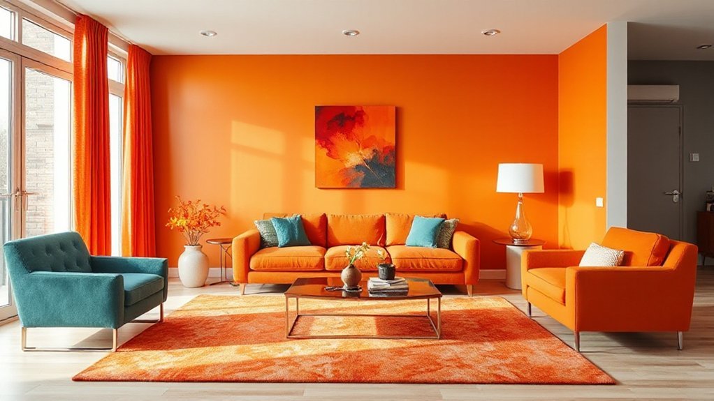
Room-by-room pairings give you a strong starting point, but orange can still go wrong if you misjudge proportions, mix undertones that fight each other, or stack too many high-chroma elements in one sightline. Keep ratios disciplined: treat orange as a 10–20% accent unless you’re committing to a feature wall, then quiet everything else. Watch undertones—pumpkin (yellow-based) clashes with blue-greys; terracotta (red-based) battles cool pinks. Use Color psychology: too much orange can read frantic, so anchor it with grounded neutrals or deep woods. Audit lighting effects before you buy; warm LEDs can push orange into neon, while north light dulls it to brown. Test swatches at morning and night.
Frequently Asked Questions
How Do I Pair Orange With Patterned Wallpaper Without Overwhelming the Room?
Choose wallpaper with small-scale patterns and muted orange tones, then limit orange paint to one accent surface. Add Textile accents in solids, repeat orange in minimal wall decor, and balance with neutrals and natural wood.
Which Orange Shades Work Best With Brass, Gold, or Chrome Finishes?
You won’t clash metals if you pick terracotta or burnt orange with brass/gold, and apricot or tangerine with chrome. Use Complementary color schemes and Texture and fabric pairing—matte linen tempers shine, velvet deepens warmth.
How Can I Use Orange in a Rental Without Painting Walls?
Use orange through Temporary decor: throw pillows, rugs, curtains, and table linens. Apply Wall decals for bold accents, then remove cleanly. Add lampshades, art, and ceramics, and layer textiles to control intensity.
What Lighting Temperatures Make Orange Look Best at Night?
Like sunset, like candlelight, you’ll make orange glow best at night with warm 2200–2700K color temperature. For balanced lighting ambiance, use 3000K only for task areas; avoid 4000K+ to prevent dull, brownish casts.
How Do I Balance Orange With Existing Multicolour Artwork?
Pull one or two hues from your multicolour artwork, then repeat them in textiles beside orange. Use Complementary accents sparingly for punch, or shift to Monochrome schemes with varied textures so orange doesn’t dominate.
Conclusion
When you pair orange well, you control its heat instead of letting it dominate. Choose your orange first—undertone, saturation, and light—then anchor it with reliable neutrals like white, cream, beige, or grey. Add warmth with tan, brown, and wood, or soften it with blush and peach. Use black sparingly for sharp definition. Room by room, keep ratios disciplined—think 60/30/10—so orange behaves like a campfire: bright, inviting, never scorching.