
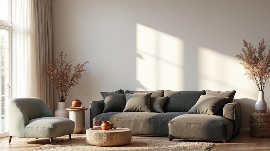
Start with your room’s light: track daylight, then test paint samples vertically under every bulb and dimmer setting. Choose a warm or cool direction early, and match colours by undertone against true white and neutral grey, not the label. Pick an anchor piece, pull 2–3 supporting hues, and build with the 60–30–10 rule. Balance warm and cool for comfort, repeat colours 3–5 times, and give accents one focused zone. Keep going to see how pros prevent surprise colour shifts.
Key Takeaways
- Assess natural and artificial light at different times; undertones change dramatically with window orientation, bulb temperature, and dimmer settings.
- Test paint samples vertically on the actual wall, and compare against true white/neutral grey plus existing floors, tiles, and metals.
- Choose a warm or cool temperature early, then repeat it across textiles, woods, and metals to keep the scheme cohesive.
- Build a palette from an anchor piece, using the 60–30–10 rule with light, mid, and deep tones for balanced contrast.
- Give accents a “home” by repeating each accent color at least three times, and use black, white, and wood to sharpen contrast.
Start With the Room’s Natural and Artificial Light
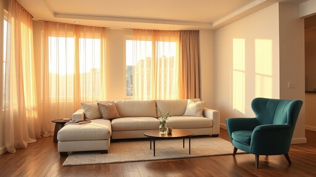
Before you pick a paint chip, look at how the room actually sees colour: through its light. Track Natural lighting for a full day—morning, midday, dusk—because the same wall can shift from crisp to muddy as the sun moves. Note window size, direction, and any trees or neighbouring buildings that tint what comes in. Hold samples vertically on the wall, not flat on a table, and view them from where you’ll actually sit.
Then audit your artificial lighting. Check bulb type, colour temperature, and dimmer settings, and turn on every fixture you’ll use at night. Layered lighting is trending for a reason: it exposes undertones and glare. Test with lamps, sconces, and overheads together before committing.
Choose Warm vs Cool Colours First
Once you’ve mapped the room’s lighting, decide whether your palette will run warm or cool, because that choice sets the undertone for every finish that follows. Warm schemes (creams, clay, caramel, terracotta) make spaces feel sociable and flattering, ideal for north-facing rooms or areas you want to soften. Cool schemes (stone, blue-grey, sage, icy whites) read crisp and spacious, suiting sun-soaked rooms or anywhere you want calm focus. Use Color psychology: warm hues energise and invite; cool hues steady and decompress. Factor in Cultural influences, too—white can signal purity in some contexts, mourning in others; red can feel celebratory or overwhelming. Commit early, then repeat that temperature through textiles, metals, and wood tones for cohesion.
Match Paint Colours by Undertone (Not the Label)
With your room’s warm-or-cool direction set, stop trusting paint names like “soft white” or “greige” and start reading undertones instead, because that’s what actually determines whether a colour sits comfortably in your scheme. Labels change across brands, and label misguidance is common: one “greige” skews green, another skews pink.
Do quick undertone coordination tests before you commit. Compare swatches against a true white sheet and a neutral grey card; the hidden cast shows fast. Then test paint samples beside your fixed finishes—flooring, tile, countertops, and metal trims—under daylight and evening lamps. If the colour suddenly looks jaundiced, icy, or muddy, the undertone’s fighting your materials. Choose the option that stays stable across light shifts.
Pick One Anchor Piece to Set Your Palette
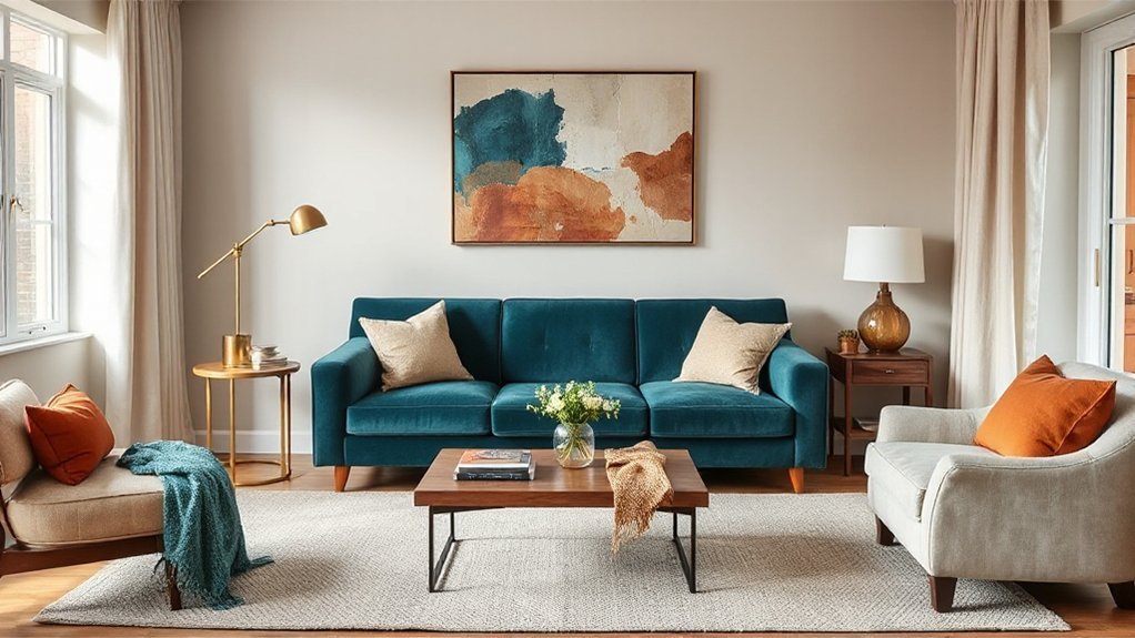
Start with one anchor piece you love—a rug, artwork, or sofa—and let it call the shots. You’ll choose a dominant colour from it, then pull two or three supporting hues that play well together for walls, textiles, and key furniture. Finally, you’ll echo its smallest accent tones in accessories to make the whole room feel intentional and current.
Choose A Dominant Color
Where do you begin when every paint chip and fabric swatch looks tempting? Start by choosing one dominant colour that will lead every decision. Look at your anchor piece—rug, artwork, sofa—and name the hue you’ll see most often and from the doorway. That’s your base note.
Use color psychology to match function: deep blues steady a bedroom, earthy greens calm a living room, warm neutrals keep a dining space welcoming. Check Cultural influences too; colours carry different meanings across traditions, so pick a shade that feels right in your home’s context and your guests’ expectations. Then commit: repeat that dominant colour across major surfaces or large-scale elements so the room reads intentional, modern, and cohesive, not accidental or busy. Keep it consistent throughout.`
Pull Supporting Hues
Once you’ve locked in your dominant colour, let one anchor piece do the heavy lifting for the rest of the palette. Choose a rug, artwork, or upholstered chair that already mixes tones you love, then pull two to three supporting hues straight from it for walls, textiles, and joinery.
To keep it designer-clean, use this quick filter:
- One light neutral to give the room breathing space
- One mid-tone that bridges your dominant shade and wood/metal finishes
- One deeper colour for contrast and depth
This method naturally builds Complementary palettes without guesswork, because your anchor has already “auditioned” the colours together. You’ll also land on Mood enhancing hues that feel intentional, not random, since they’re tied to a single visual reference you see every day.
Echo Accent Tones
Although you’ll use an anchor piece to choose your main colours, you’ll get the “designed” look by echoing its smaller accent tones—think the thin stripe in a rug, the warm clay note in artwork, or the subtle brass thread in a cushion—across the room in tight, repeatable doses. Pick two or three Accent tones from that anchor and repeat each at least three times: once soft (textiles), once hard (ceramics, frames), and once structural (paint, trim, lighting). Keep the dosage small—5–10% per tone—so they read intentional, not busy. Vary texture, not hue, to maintain colour harmony: matte clay with glossy tile, brushed brass with lacquer. If the room feels flat, increase contrast by shifting value darker, not changing colour.
Build the Scheme With the 60–30–10 Colour Rule
If you want a room to feel cohesive without looking overly “matched,” build your palette around the 60–30–10 colour rule: 60% dominant, 30% secondary, and 10% accent. Start with the dominant hue on walls and large rugs; factor in paint durability so high-traffic zones hold up. Choose the secondary colour for upholstery and curtains to add depth without competing. Then punch in the accent through art, cushions, or a lacquered side table—use Color psychology to steer the mood (cool tones calm, warm tones energise). Keep finishes consistent, and repeat each colour at least twice so it reads intentional, not random. To apply it fast:- 60%: walls, main flooring, biggest textiles- 30%: sofa, drapery, secondary furniture- 10%: décor, lampshades, statement accessories
Layer Neutral Colours So the Room Feels Rich
Once you’ve set your 60–30–10 balance, make neutrals do more work by layering them, not flattening them. Mix warm and cool undertones, then vary texture and sheen—matte walls, nubby textiles, brushed metals—so the palette reads intentional and current. Finally, build tonal contrast with light-to-deep versions of the same neutral to give the room depth and quiet drama.
Mix Warm And Cool
Because most rooms live and die on their neutrals, you’ll get a richer, more intentional look when you mix warm and cool undertones instead of sticking to one temperature. Think of it as Temperature balancing: you’re building contrast without clutter, and you’ll land on effortless Color harmony. Start with one “anchor” neutral you love, then add a counter-neutral in the same depth so nothing feels mismatched.
- Pair a warm greige wall with a cool, stone-gray rug to steady the palette.
- Offset creamy whites with crisp, blue-based whites on trim for definition.
- Bring in a warm, earthy accent (camel, terracotta) against cool charcoal for polish.
Keep undertones consistent within each group, and repeat both temperatures at least twice across the room for cohesion.
Vary Texture And Sheen
Although neutrals read “safe” on a paint chip, they look flat fast when every surface hits the same finish, so vary texture and sheen to build depth without changing your palette. Start with a calm matte wall, then add a subtle eggshell on trim for a crisp edge that still feels modern. Bring in woven linens, bouclé, or a nubby wool rug to vary texture, and balance it with sleek moments like lacquered side tables, glazed ceramics, or satin metal hardware to vary sheen. If you’re using stone, mix honed counters with a lightly polished backsplash so light moves around the room. Keep upholstery mostly low-shine, then punctuate with one glossy accent so the space reads intentional, not busy.
Build Tonal Contrast
Even if you stick to an all-neutral scheme, you still need tonal contrast to keep the room from reading flat and “builder basic.” Layer light, mid, and deep neutrals—think warm white walls, a greige sofa, camel leather, and a few espresso accents—so your eye has places to land without introducing loud colour. This is Color psychology in action: deeper tones ground you, lighter tones lift the mood, and the in-betweens keep it calm. Aim for tonal harmony by repeating each depth at least twice, so nothing feels random.
- Choose one dominant neutral, one supporting mid-tone, and one anchoring dark
- Echo the darkest shade in hardware, frames, or a side table
- Add contrast with pattern, like a taupe rug with chocolate lines
Balance Warm and Cool Colours for Comfort
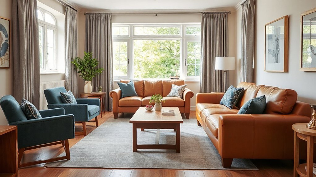
When you balance warm and cool colours, you control how comfortable a room feels—warm tones like terracotta and soft gold add coziness, while cool shades like sage, slate, and misty blue calm and visually open the space. Use colour psychology to guide your mix: warm hues energize and invite, cool hues steady and soothe, and the right ratio shapes the room’s emotional impact. Start with the room’s natural light—north-facing spaces often need warmth, while sun-soaked rooms benefit from cooler counterpoints. Aim for a clear 60/40 split so the palette feels intentional, not muddy. Repeat your temperature choices across large surfaces and textiles to keep *gradual* *shifts* *smooth* and lived-in. You’ll feel the difference immediately.
Give Accent Colours One “Home” in the Room
To keep accent colours from feeling random, you need to give them one clear “home” in the room. Anchor the accent by repeating it in two or three small, intentional hits—think cushions, art, and a vase—so it reads as a designed thread, not a mistake. Then concentrate the strongest dose in a single accent zone, so your space feels current, controlled, and easy to style.
Anchor Accents With Repeats
Although accent colours can feel like the “fun part,” they’ll look scattered unless you give each one a clear home in the room. The designer move is Accent repetition: you echo the same accent in at least three places so it reads intentional, not random. Aim for colour consistency by repeating the exact tone (not “close enough”) across materials, especially in open-plan spaces.
- Repeat one accent in textiles, art, and one small decor piece
- Keep finishes aligned: warm brass with rust, cool chrome with cobalt
- Scale your repeats: one larger hit, two smaller echoes for balance
If your accent shows up only once, it’s a stray. If it shows up everywhere, it’s the new main colour. Keep it edited.
Create One Accent Zone
Even if you love a bold pop of colour, it lands best when you assign it one clear “zone” in the room—think the sofa wall, the reading corner, or the dining nook—so your accents feel curated instead of sprinkled. Pick one hero hue, then build a tight cluster around it: a statement rug, one piece of accent furniture, and two to three supporting details (art, cushion, lamp). Keep the rest of the palette calm so the eye knows where to rest. Use color psychology to choose the effect: terracotta warms and socialises, cobalt sharpens focus, sage softens stress. Limit accents to that zone’s sightline, and echo the hue subtly elsewhere with a tiny repeat—like a book spine or vase—so it feels intentional, not random.
Add Contrast With Black, White, and Wood Tones
When your colour palette starts to feel flat, you can sharpen it instantly by layering in black, white, and wood tones. Black accents carve out definition, white backgrounds open the room, and wood textures add warmth that keeps everything feeling livable. Your goal is contrast balance: enough edge to create visual interest, not so much that you lose colour harmony. Keep it crisp for design simplicity, then let one or two pieces do the heavy lifting.
- Use matte black in hardware, lighting, or frames to outline shapes.
- Keep white backgrounds on walls or large upholstery to steady the palette.
- Add wood textures through tables, slatted panels, or floors for depth.
If you edit with intention, you’ll land on aesthetic cohesion every time.
Repeat Your Colours in 3–5 Places for Flow
If you want a room to feel pulled together instead of patched together, repeat each key colour in 3–5 spots across the space. That’s the designer shortcut to instant cohesion, and it works in every style, from warm minimalism to modern vintage.
Pick one dominant hue, one supporting shade, and one accent. Then place each one strategically: a rug stripe, a throw, artwork, ceramics, lampshades, or book spines. This color repetition guides your eye around the room, creating visual flow without matching sets. Keep placements varied in scale—one large, two medium, a couple small—so it feels layered, not themed. If you’re using bold colour, repeat it in smaller doses to avoid overwhelm. In open-plan rooms, echo colours in adjacent zones to connect them.
Frequently Asked Questions
What Are the Best Paint Finishes for High-Traffic Rooms?
Choose washable satin or semi-gloss for high-traffic rooms; they resist scuffs and clean easily. Use eggshell for softer paint texture on walls, and semi-gloss on trim. Compare sheen options to balance durability with warmth.
How Do I Choose Colours That Increase My Home’s Resale Value?
You boost resale by going neutral, neutral, neutral—then refining. Choose warm greige, soft whites, muted blues; use color psychology and mood enhancement to signal calm, clean, updated spaces. Don’t over-personalize; keep contrast crisp, cohesive.
Can I Use Colour Rules Successfully in Open-Plan Layouts?
Yes, you can apply colour rules in open-plan layouts if you anchor a unified base palette, then zone with accents. Use Color psychology for mood shifts, and maintain Palette harmony by repeating finishes throughout.
Which Colour Combinations Make Small Rooms Look Larger?
You’ll make small rooms look larger with monochrome schemes in light, cool tones—soft whites, pale greys, misty blues—then add minimal contrasting accents in trims or decor. Keep ceilings lighter and finishes matte-to-satin.
How Do I Coordinate Wall Colours With Existing Flooring and Countertops?
Match your wall colour to your flooring and countertops by pulling one dominant undertone, then choosing a lighter wall shade. For Color pairing, repeat it in textiles. Use Accent wall ideas to echo veining or wood.
Conclusion
When you follow these colour rules, you won’t just get a “pretty” room—you’ll get one that feels intentional from morning light to lamplight. Start with warm vs cool, check undertones, then let one anchor piece lead while the 60–30–10 rule keeps everything balanced. Here’s a useful stat: rooms painted in light, cool tones can feel up to 10% larger to the eye. Repeat shades 3–5 times, and you’ll create effortless flow.