
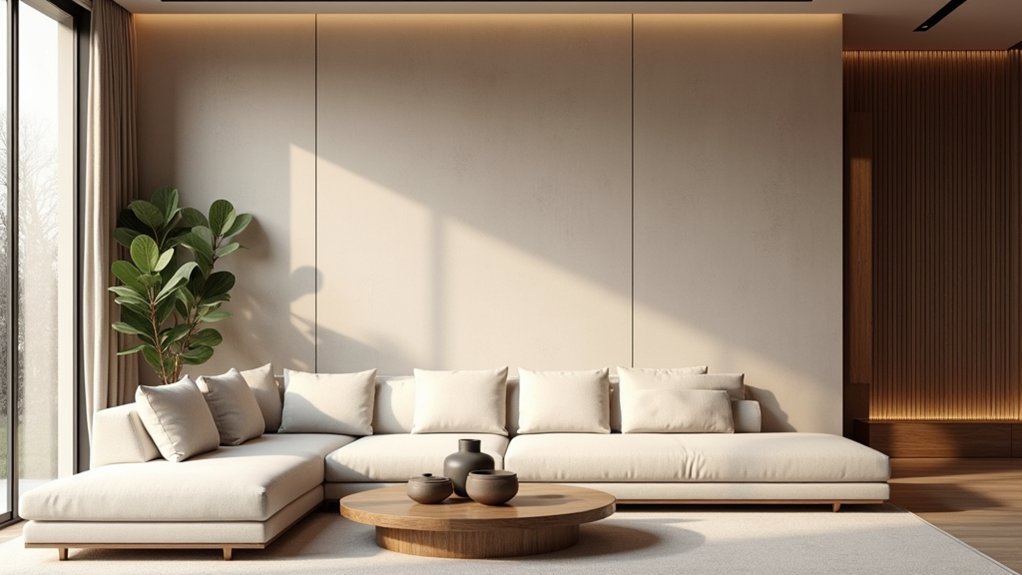
Choose a wall that’s already a focal point—behind a headboard, fireplace, or built-ins—so it feels intentional, not random. Skip loud contrast, word decals, and harsh chevrons; they date fast. Pick your method first (paint, wallpaper, or paneling), then use a muted, timeless color like charcoal, olive, or warm clay, only 1–2 shades deeper than surrounding walls. Add texture with limewash, grasscloth, or trim, and test swatches in day and lamplight—next up, the key finishing details.
Key Takeaways
- Choose a natural focal wall aligned with main sightlines, like a fireplace, bed wall, or built-ins.
- Avoid dated looks like high-contrast feature colors, chevrons, heavy faux finishes, ultra-gloss paint, and word-art decals.
- Use timeless hues with depth—charcoal, espresso, olive, forest, terracotta—and keep contrast to one or two shades from adjacent walls.
- Add subtle texture through limewash, Roman clay, grasscloth, or low-contrast wallpaper patterns, and always sample in room lighting.
- Integrate trim, paneling, and built-ins with consistent proportions, and match undertones to floors, trim whites, metals, and wood tones.
Spot the Details That Date an Accent Wall
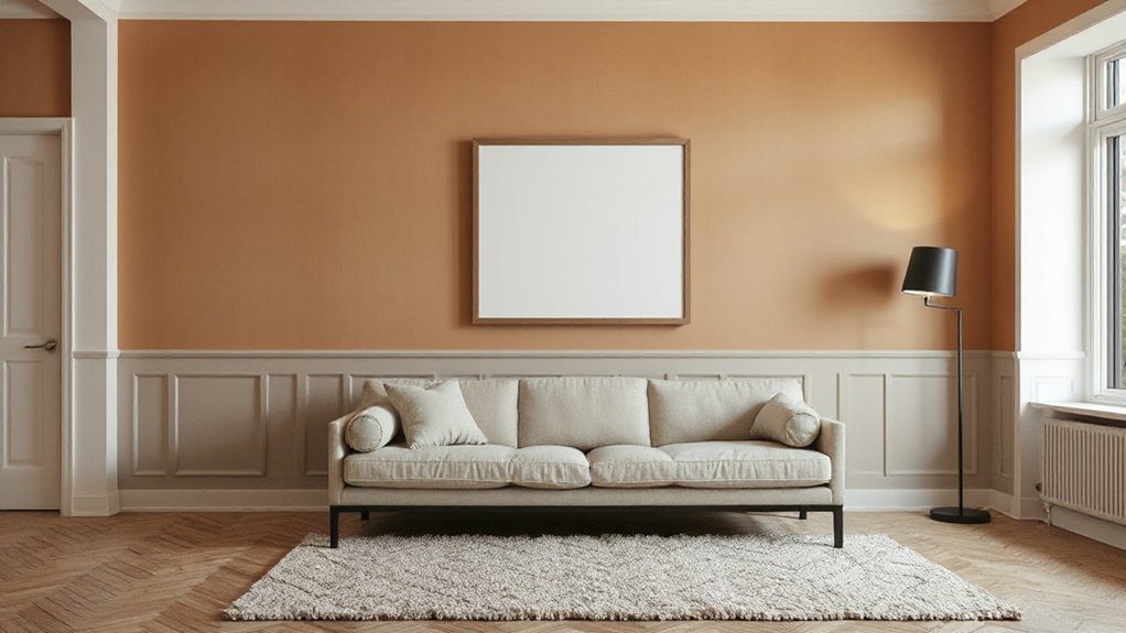
While accent walls can still look sharp, a few telltale choices instantly pin them to a specific decade: high-contrast “feature” paint colors with no connection to the room’s palette, harsh geometric stencils or chevrons that dominate the sightline, and heavy faux finishes (sponge, rag roll, Tuscan texture) that read more theme than design. You also date a wall with ultra-gloss paint that telegraphs every patch, or with peel-and-stick patterns that repeat too perfectly. Watch for narrow horizontal stripes that shrink the room, builder-basic stacked-stone panels, and word-art decals—classic outdated motifs. If you love Vintage decor, keep it intentional: choose muted, complex hues, subtle texture, and scaled pattern. You’re aiming for depth and continuity, not a shouty backdrop.
Pick the Right Wall for Your Layout
Start by choosing a wall that already acts as a natural focal point—think the fireplace surround, the headboard wall, or the built-in you notice first when you enter. Then check your sightlines: the accent should read cleanly from the main entry and primary seating, not get chopped up by doors, windows, or awkward corners. Finally, follow the room’s flow so the accent supports how you move through the space, guiding attention forward instead of stopping it short.
Identify Natural Focal Points
Before you commit to paint or wallpaper, spot the room’s natural focal point and let it lead your accent-wall choice. In most spaces, that’s the fireplace surround, a built-in bookcase, a statement headboard wall, or the wall that frames a large window. Choose the surface that already earns attention so the accent reads intentional, not random.
Use furniture placement to reinforce it: center the sofa on the fireplace wall, align nightstands to the bed wall, or anchor a dining buffet to the strongest plane. Then refine with lighting techniques—wall washers, picture lights, or directional recessed trims—to graze texture and deepen color. If the focal area includes trim, niches, or shelving, treat them as part of the accent for a tailored, current finish.
Consider Sightlines And Flow
Because you experience a room in motion, not as a single snapshot, the right accent wall is the one that makes sense from your main sightlines—entry, seating, and the path you walk most. Stand at the doorway, then sit where you lounge, and note which wall naturally anchors the view without forcing your eye to swivel.
Let furniture placement lead: choose the wall behind a sofa, bed, or console so the accent reads intentional, not random. Avoid walls chopped up by multiple doors or awkward bump-outs. Factor lighting considerations, too—natural light can wash out pale paint, while sconces or picture lights can spotlight texture. If you’ve got a TV, keep contrast controlled so glare and visual noise don’t win.
Choose Your Accent Wall Method First
Before you pick a pattern or hue, decide your accent-wall method: paint, wallpaper, or paneling. Then choose the look you’re after—clean color blocking or a tactile texture that reads intentional and current. Finally, commit to the coverage, because a full wall and a strategic section create very different visual weight and balance.
Paint, Wallpaper, Or Paneling
Whether you’re aiming for subtle depth or a statement moment, you’ll get a more timeless accent wall when you choose the method first—paint, wallpaper, or paneling—then tailor the color, pattern, and texture to the room. Paint suits quick updates and cleaner architecture; pick a durable finish and crisp cut lines so it reads intentional. If you want nuance without busyness, consider Faux finishes like limewash or Roman clay for soft movement that won’t scream “trend.” Wallpaper works best when you commit to quality: match repeat, align seams, and choose a substrate that removes cleanly. Paneling adds permanent structure; specify proportions, edge profiles, and a clear termination at trim. Use Metallic accents sparingly in hardware or lighting to complement, not compete.
Color Block Or Texture
If you start with the visual move—color block or texture—you’ll land on an accent wall that feels designed, not dated. Decide whether you want graphic punch or tactile depth, then keep every choice intentional. Color blocking works best when you repeat one tone elsewhere (pillows, art, rug) so it reads cohesive, not trendy. Texture layering shines when you combine matte and sheen or mix subtle relief with clean lines, adding dimension without visual clutter. Use these checks before you commit:
- Choose a dominant undertone (warm, cool, or neutral) and stick to it.
- Limit contrast: two hues or one material family keeps it modern.
- Match finish to light; high gloss amplifies daylight, while matte softens glare.
Full Wall Or Section
Two routes keep an accent wall from looking like a leftover trend: commit to a full wall, or treat it as a deliberate section. Choose full-wall when you want architectural clarity—one uninterrupted plane behind a bed, sofa, or dining table. It reads intentional, especially with tight Color pairing to adjacent walls and trim.
Choose a section when the room already has visual breaks: a nook, fireplace bump-out, built-ins, or a headboard zone. Don’t “stop anywhere”; align edges to natural lines, then cap it with a crisp termination—corner, reveal, molding, or a floating shelf. Section accents shine with Texture layering: slatted wood, limewash, or grasscloth framed by clean paint. Either way, keep one clear focal point and repeat the finish once elsewhere for cohesion.
Start With Timeless Accent Wall Colors
Because accent walls date fastest when they chase “of-the-moment” shades, start by anchoring yours in timeless color families that designers return to year after year. Use Color psychology to pick a hue that supports how you live: deep navy reads focused, olive feels grounded, and warm clay stays welcoming without screaming trendy.
Choose a shade that complements your fixed finishes and guides furniture placement, so the wall frames key pieces instead of fighting them. Prioritize:
- Classic neutrals with depth (ink, charcoal, espresso) for steady sophistication.
- Heritage greens (olive, forest) to echo nature and age gracefully.
- Earth-forward warms (terracotta, tobacco) to flatter wood tones and skin tones.
Test large swatches in daylight and lamplight, then commit once undertones stay consistent.
Use Muted Accent Wall Contrast
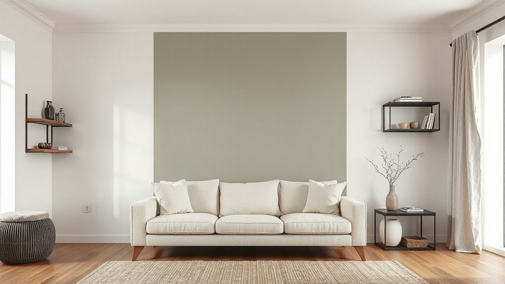
Use muted contrast to keep your accent wall current, not shouty. Pair soft neutrals with dusty tones—think greige against clay, sage, or powdery blue—so the shift reads intentional and layered. Balance the color change with texture like limewash, slatted wood, or subtle plaster to add depth without harsh contrast.
Pair Soft Neutrals
While bold color can date a room fast, soft neutrals keep an accent wall feeling current by relying on muted contrast instead of high drama. You’ll get depth without shouting, and your space stays flexible as trends shift.
Use a gentle value change—one to two shades darker or lighter than adjacent walls—so your eye reads it as intentional. That subtlety works with your neural pathways and cognitive biases: you’re primed to trust calm, coherent palettes that feel “right” over time.
- Pair warm off-white with greige, then repeat that undertone in textiles.
- Match finishes: matte paint plus natural wood keeps contrast soft, not stark.
- Anchor with black or brass accents sparingly, so the wall stays the quiet lead.
Try Dusty Color Tones
If you want an accent wall that feels fresh in five years, reach for dusty tones—muted sage, clay rose, stormy blue, or softened terracotta—rather than saturated “statement” paint. Dusty tones read curated, not trendy, because gray or brown undertones soften the shift between wall and furnishings.
Pick accent hues that echo what you already own: pull the green from an olive throw, the rose from artwork, or the blue from ceramics. Test large swatches in morning and evening light; dusty colors can flip cool or warm depending on exposure and bulb temperature. Aim for a mid-value shade so the wall defines the zone without overpowering the room. When you coordinate trim and ceiling whites, keep them slightly warm for harmony.
Balance Contrast With Texture
Even when you want a crisp focal point, dialing back the contrast and layering in texture keeps an accent wall from looking like a leftover “feature wall.” Choose a muted value shift—think two to three shades deeper than your main wall—and let materials do the heavy lifting: limewash, Roman clay, slatted wood, grasscloth, or a low-sheen paint that catches light. Prioritize Color harmony by matching undertones across finishes, then add Material diversity so the wall reads intentional, not loud. Keep the contrast subtle, but make the surface rich.
- Use matte or eggshell to soften edges and hide harsh transitions.
- Repeat one texture elsewhere (a headboard, rug, or drapery) for cohesion.
- Limit the palette to three tones, and vary texture instead of saturation.
Try Finishes Beyond Flat Paint
Instead of relying on a single flat color, give your accent wall depth by choosing a finish that changes with the light. Swap matte for eggshell or satin to keep color rich while hiding minor wall flaws. If you want a bolder, current look, use Glossy finishes strategically: high-gloss lacquer reads tailored and graphic, especially behind built-ins or a bar. Keep sheen consistent across the wall so it feels intentional, not patchy. Consider color-washing or a limewash-like paint for subtle movement without looking busy. For a modern luxe edge, add metallic accents through pearlescent topcoats or mica-infused paint; they catch evening light and elevate neutrals. Test samples at morning, noon, and night before committing.
Add Texture for a Modern Accent Wall
Sheen adds dimension, but texture gives an accent wall the kind of modern depth you can feel. Instead of relying on color alone, build a tactile surface that catches light, hides minor drywall flaws, and reads intentionally designed.
- Use Textured wallpaper like grasscloth-look vinyl, plaster-effect, or linen embossing for instant relief with clean installation and easy removal.
- Layer Faux materials—slatted MDF “wood,” stone veneer panels, or microcement kits—to get architectural weight without the cost or structural demands.
- Add subtle shadow with vertical battens, thin picture-frame molding, or ribbed panels, then finish with a low-luster topcoat to keep highlights controlled.
Keep progressions crisp: caulk seams, align edges, and cap corners with trim for a built-in look.
Keep Accent Wall Patterns Subtle and Sized
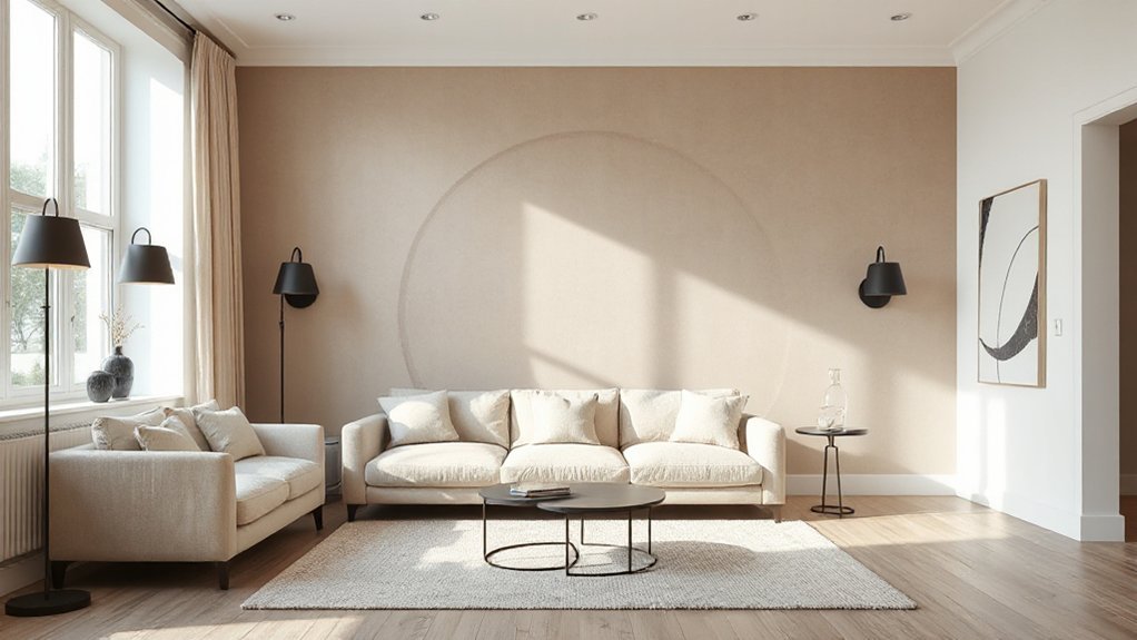
Because pattern reads louder than paint, you’ll keep an accent wall from feeling dated by choosing motifs that stay subtle at a distance and sizing them to the room’s scale. Favor low-contrast geometrics, tone-on-tone florals, soft stripes, or micro-checks over high-contrast murals and oversized medallions. Your pattern options should support the room’s architecture and sightlines, not compete with them.
Make smart size considerations: in small rooms, choose tighter repeats and finer linework so the wall doesn’t visually shrink the space; in larger rooms, step up to medium repeats that read intentional from across the room. Keep the busiest pattern on the least interrupted wall, and align repeats carefully at corners. If you’re using wallpaper, sample at full scale and view it in day and evening light.
Use Trim or Paneling for a Classic Look
When you want an accent wall that won’t date itself in five years, add trim or paneling and let the relief do the talking. Trim details read architectural, not trendy, so your wall feels intentional even as paint colors change. Choose proportions that suit the room: tighter grids in small spaces, wider spacing in open plans, and align rails with door casings for a seamless look. Keep Paneling styles crisp and consistent, then finish everything in one sheen for a tailored, modern effect.
- Picture-frame molding for clean, gallery-like structure.
- Board-and-batten for vertical lift and subtle shadow lines.
- Applied box panels for classic depth without heavy millwork.
Use durable semi-gloss on trim, matte on fields, and you’ll get contrast without chaos.
Use Built-Ins as Your Accent Wall
Trim and paneling add architectural relief, but built-ins take that same idea further by giving your accent wall purpose. You turn a “feature” into storage, display, and zoning—without relying on a loud paint color. Specify full-height bookcases, a media surround, or a shallow ledge system, then keep lines crisp with consistent reveal gaps and simple hardware. Paint everything one finish for a seamless, custom look, or spotlight niches with subtle texture.
Style shelves like a pro: repeat shapes, vary heights, and leave breathing room. If you want extra definition, use Decorative borders inside backing panels or along shelf edges. Skip random art clusters; instead, try removable Wall decals only on the back of select cubbies for controlled pattern. Add integrated lighting for depth.
Balance Your Accent Wall Undertones
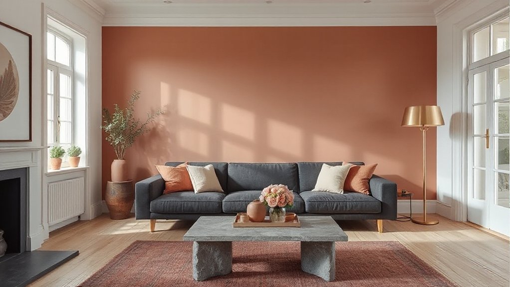
Even if you nail the perfect “statement” color, your accent wall can still read off if its undertones fight the room. To keep it current, you’ve got to manage Undertone balance, not just lightness and saturation. Start by reading the fixed finishes: flooring, stone, and large upholstery set the baseline temperature. Then align your paint choice so it supports Color harmony instead of competing.
- Identify dominant undertones: red/orange (warm), blue/green (cool), or neutral-leaning greige.
- Match adjacent whites: a creamy trim makes icy grays look dirty; a crisp white can flatten warm beiges.
- Echo metals and woods: brass and walnut favor warmth; chrome and ash skew cooler.
When undertones agree across surfaces, the wall looks intentional, not trendy-chasing.
Test Your Accent Wall Before Painting
Before you open a can, you’ve got to test the accent color in the actual room, because paint shifts dramatically with exposure, sheen, and surrounding finishes. Start with large paint swatches, not tiny chips: paint 24″–36″ squares on two walls, or use peel-and-stick samples. Do your color testing in the same sheen you’ll use, since eggshell reads softer while satin can spike contrast. View samples morning, midday, and at night under your real bulbs; LEDs can push greens gray and make blues look inky. Check the color next to trim, flooring, and your largest textile, then step back across the room to judge depth. If it looks too loud, dilute with a grayer version or lower sheen.
Frequently Asked Questions
How Much Does It Cost to Create an Accent Wall on Average?
You’ll typically spend $200–$1,500 to create an accent wall, depending on paint, wallpaper, or paneling. For a solid cost estimate, compare materials and labor; smart budget planning includes prep, tools, and finishing details.
Can I Make an Accent Wall in a Rental Without Damaging Walls?
Yes—you can make an accent wall in a rental without damage if you choose Temporary wallpaper or Removable decals and prep properly. Clean, dry walls, test a corner, avoid textured paint, and remove slowly with heat.
How Long Does an Accent Wall Project Typically Take to Complete?
You’ll typically finish an accent wall in 4–8 hours, or over a weekend. You’ll plan Color palettes, prep surfaces, apply paint, add Wall textures, and clean up. Drying time and detailing drive timelines.
Do Accent Walls Affect a Home’s Resale Value or Buyer Appeal?
Yes, accent walls can boost buyer appeal and resale value when you use tasteful Color contrast and prioritize Design versatility. You’ll attract attention, define spaces, and signal updates. Overly bold, niche choices can turn buyers off.
Should the Accent Wall Match Existing Furniture and Decor Styles?
Yes, you should loosely match it. Use Color coordination to echo key tones in your furniture, and maintain Style consistency with finishes and patterns. You don’t need identical matches—aim for cohesive contrast that feels current.
Conclusion
To create an accent wall that won’t feel dated, you’ve got to sweat the details: choose the wall your layout naturally highlights, decide on paint, paneling, trim, or built-ins first, and keep contrast muted. Stick with timeless, undertone-friendly colors that play well with your flooring and adjacent rooms. Remember, “measure twice, cut once”—test swatches in morning and evening light before committing. When everything’s balanced, your accent reads intentional, not trendy.