
You can make a room feel larger before you move a single piece of furniture, just by choosing colour with intention. Start by checking your light, because north-facing rooms need warmth while south-facing spaces can handle cooler tones. Then use pale, reflective shades to bounce daylight and keep transitions smooth across walls, trim, and ceilings. If you place deeper colour in the right spot, you’ll add depth without closing things in—but only if you avoid a few common traps…
Check the Light First (North/South, Warm/Cool)
Before you pick up a paint swatch, check the light your room actually gets because it decides whether colours feel open and airy or tight and flat. Stand in the room morning, midday, and evening, and note how the colour temperature shifts.
North-facing rooms get cooler, bluer light, so crisp whites can look icy and greys can turn steely. Balance that with warmer undertones: creamy neutrals, soft greige, or muted clay.
South-facing rooms receive warmer, stronger light, so warm paints can read overly yellow and saturated hues can feel louder. Steer toward cooler undertones: clean off-whites, blue-based greys, or softened greens.
East light brightens early and cools later; west light does the opposite, so test swatches at both ends of the day.
Use Light Paint to Make Rooms Feel Bigger
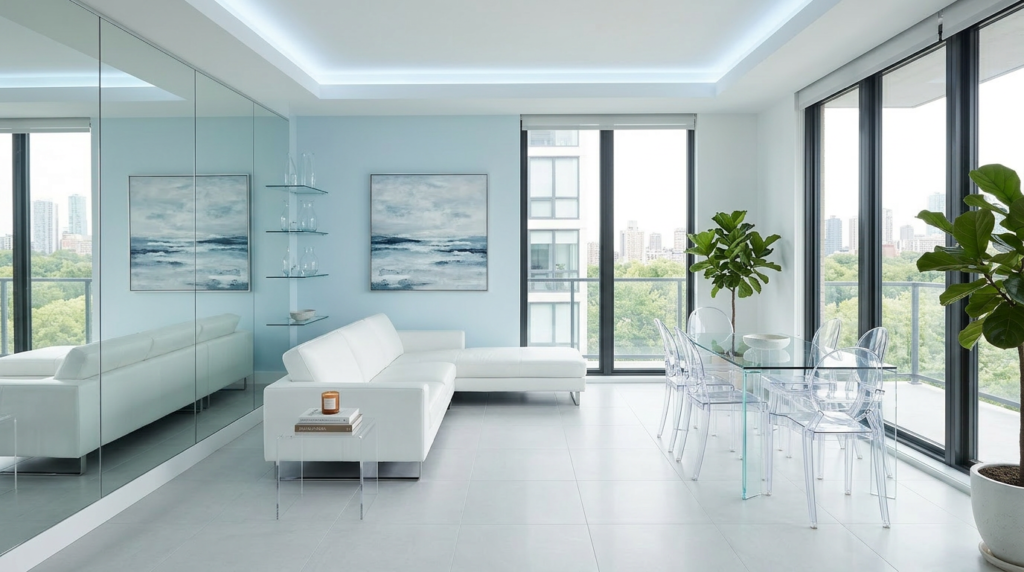
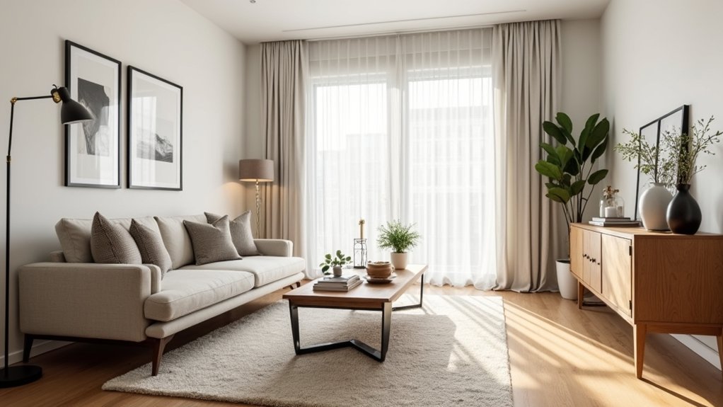
In most rooms, light paint instantly buys you visual space by bouncing daylight around instead of soaking it up. Choose soft whites, pale greys, and airy pastels to lift walls and make corners recede.
If your room lacks natural light, pick a warm-leaning light tone; if it’s bright, a cooler light shade keeps it crisp.
Carry that light colour across trim, doors, and ceilings so your eye reads fewer breaks, and the envelope feels larger.
Use a low-sheen finish on walls to reduce glare and keep the surface calm, then reserve higher sheen for areas that need wipeability.
Before you commit, paint big samples on different walls and check them morning, afternoon, and night under your bulbs too.
Add Depth With Dark Colour in the Right Places
Although dark paint seems like it would shrink a room, you can use it strategically to add depth and make boundaries feel farther away. Put a deep tone on the wall you want to visually “push back,” like the far end of a long room or the wall behind a sofa, and you’ll increase perceived distance.
Use dark colour to frame a view, anchor an oversized piece of art, or define a nook so it reads as intentional rather than cramped. Pair it with lighter surrounding walls and reflective accents so the contrast creates dimension, not heaviness.
Choose cool, muted darks for a calmer recession, and warm darks when you want intimacy without clutter. Keep the finish consistent to avoid patchy shadows.
Paint Ceilings and Trim to Change Proportions
Dark walls can make a boundary recede, but you can reshape how big a room feels even faster by changing what happens overhead and at the edges. Paint the ceiling a shade lighter than the walls to lift it, or match it to the walls to blur corners and feel cocooned.
If your room’s long and narrow, carry the wall colour onto the ceiling by 10–20 cm to visually widen it.
Trim works like a frame. Paint skirting boards, door casings, and crown moulding the same colour as the walls to erase outlines and make surfaces read larger.
Want height? Keep trim lighter and crisp so your eye tracks upward. For balance, choose a satin finish on trim and matte on walls.
Zone Open-Plan Spaces With Colour (No Clutter)
When your kitchen, dining, and living areas share one footprint, colour can do the job of walls without stealing light or floor space. Pick a base shade that runs through the whole zone, then assign one supporting colour to each function to create clear edges.
Paint an accent wall behind the sofa to anchor lounging, or wrap a deeper tone around a dining nook to make it feel intentional. In the kitchen, use the same hue on lower cabinets or a backsplash to signal “work mode” without adding screens.
Keep transitions clean: stop colour at natural lines like corners, bulkheads, or cabinetry ends. Repeat each zone colour in one accessory so the plan feels connected, not cluttered.
Avoid Paint Mistakes That Make Rooms Feel Smaller
Ever wonder why a freshly painted room can still feel tight? You might be shrinking it with colour choices and sloppy transitions. Don’t chop the walls with a dark band or a high-contrast feature stripe; it lowers the perceived ceiling and narrows the perimeter.
Skip heavy saturation on every surface when light is limited—use softer tints or warm off-whites to keep bounce. Avoid painting trim darker than walls; it frames edges and makes the box feel smaller.
If you’ve got low ceilings, don’t stop colour at the crown; carry the wall shade onto the ceiling or use a lighter version to blur the line.
Finally, test samples in morning and evening light before committing.
Conclusion
Before you pick a shade, check your room’s light and let it guide you. You’ll make spaces feel bigger by leaning on pale, reflective colours and keeping walls, trim, and ceilings closely matched for a seamless flow. If you want depth, place darker tones at the far end or behind key furniture, not everywhere. Use ceiling and trim colour to tweak proportions, and zone open plans subtly—so you add space, not clutter.


