Design pathways that guide and enhance by defining their job early: move people smoothly, keep them safe, and make wayfinding intuitive. Observe desire lines at peak and off-peak times, then choose a line, loop, or network layout that minimizes crossings and matches operations. Set standards-based widths for wheelchairs, carts, and passing zones, and keep them consistent through curves and pinch points. Use clear alignment, strong edges, and sightlines, plus lighting, textures, and landmarks at decision points. Keep going for practical methods and checklists.
Key Takeaways
- Define pathway purpose, user groups, and movement zones to prioritize safety, capacity, and intuitive flow.
- Choose a clear layout (line, loop, or network) with route hierarchy that minimizes crossings and supports operations.
- Set accessible widths, turning radii, and consistent clearances through curves, gates, and pinch points to prevent conflicts.
- Use alignment, edges, surface patterns, lighting, and landmarks to reinforce sightlines and make primary routes obvious without excess signage.
- Validate designs with observations, counts, and user testing, then refine transitions, signage placement, and nighttime comfort based on evidence.
Define the Pathway’s Job (Flow, Safety, Wayfinding)
Before you pick materials or lay out curves, define exactly what the pathway must do: move people smoothly, keep them safe, and make navigation intuitive.
Start by mapping who uses it—guests, staff, carts, strollers, mobility devices—and set a target clear width, passing zones, and turning radii that meet applicable accessibility standards.
Confirm where the path must speed movement (entries, queues) and where it should slow it (intersections, drop-offs).
Address safety with predictable crossings, sightlines, slip-resistant surfaces, lighting levels, and safety barriers at edges, slopes, water, or vehicle conflicts.
Lock in a wayfinding system early: wayfinding signage locations, message hierarchy, and decision-point visibility.
Document performance criteria so bidders deliver consistent results and inspections verify compliance.
Study Desire Lines (Observe, Track, and Measure)
Although your plan may look clean on paper, people will still take the route that feels fastest and safest, so you need to study desire lines to align the pathway with real behavior. Start with field observation at peak and off-peak times, noting informal cut-throughs, pauses, conflicts, and weather-driven detours.
Verify patterns with lightweight counts, video, or anonymized sensor data, and map tracks against entrances, transit stops, and destinations. Measure width demand, crossing frequency, slope tolerance, and nighttime comfort, then compare findings to accessibility and safety standards you’re accountable for.
Add brief intercept interviews to capture behavior insights you can’t see, including cultural considerations like group walking, stroller use, and preferred edges. Document evidence, assumptions, and thresholds so your client can justify decisions and budgets confidently.
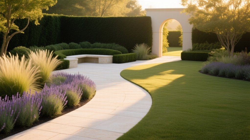
Pick a Layout: Line, Loop, or Network
Once you’ve mapped desire lines and verified them against counts and accessibility/safety criteria, you can choose a pathway layout that formalizes real movement without creating new conflicts. Use a line when you need direct, legible access between anchors like entries, transit stops, and key amenities; keep sightlines clear and intersections predictable.
Choose a loop to support recreation and wayfinding, letting users circulate without dead ends while maintaining consistent node spacing and clear decision points. Build a network when multiple origins and destinations compete; prioritize hierarchy, limit unnecessary crossings, and align routes with operational zones and emergency access.
Apply Color psychology to differentiate primary routes from secondary connectors and to reinforce cues at nodes. Specify Material sustainability with durable, low-impact surfaces and maintainable edges.
Set Widths for Comfort and Capacity
Because width determines whether people can pass comfortably without stepping off the edge, you should size every path to its peak two-way demand and its accessibility requirements, not its average use. Set a clear minimum and document it in your details so construction can’t “value-engineer” it away.
For most pedestrian routes, provide enough clear width for two wheelchairs to pass, plus shy distance from walls, railings, and planting. Where you expect strollers, carts, or service access, widen locally and protect that clearance with edging and drainage inlets placed outside the travel zone.
Maintain Width consistency through curves, pinch points, gates, and bollards, since abrupt narrowing creates conflicts and wear. Confirm user comfort by checking turning space, passing frequency, and surface cross-slope tolerances in your submittals and field inspections.
Use Alignment to Keep Routes Obvious
You keep routes obvious by aligning paths with primary sightlines so users can confirm direction at a glance.
You use straight runs strategically to connect key destinations, reduce decision points, and maintain clear, code-compliant navigation.
You repeat cues—consistent edges, lighting, signage, and surface patterns—so the route stays legible from entry to endpoint.
Align Paths With Sightlines
When paths line up with clear sightlines, people read the route instantly and move with confidence instead of pausing to guess. You achieve this by aligning entries, junctions, and destinations so the next decision point stays visible from typical approach angles.
Use Visual framing—trees, lighting, walls, or planting bands—to bracket the corridor and reinforce direction without signage overload.
Establish a Sightline hierarchy: prioritize views to primary entrances, accessible routes, and key amenities, then support secondary paths with consistent cues.
Check alignments at pedestrian eye level and from mobility-device heights to meet inclusive-design expectations.
Verify that curves, grades, and landscape elements don’t block forward visibility at intersections.
Document these sightline targets in your plan set, and coordinate with lighting and wayfinding teams for compliance.
Use Straight Runs Strategically
Clear sightlines set expectations; straight runs confirm them by keeping the route legible from entry to the next decision point. Use strategic alignment to connect doors, gateways, major program nodes, and accessible entries so visitors don’t hesitate or drift.
Prioritize straight runs where you need predictable flow: primary approach walks, campus spines, building-to-parking links, and service routes that must stay intuitive under peak load. Apply straight run advantages deliberately—fewer conflicts, simpler wayfinding, faster emergency egress, and easier maintenance planning.
Keep grades compliant, manage cross-slopes, and hold consistent clear widths to meet accessibility and operations standards. When a bend is unavoidable, place it after a natural threshold (plaza, landing, or entry court) so the change feels intentional, not confusing.
Repeat Cues Along Routes
Although a route may be technically continuous, it won’t read as obvious unless you repeat the same directional cues at predictable intervals. You should align edges, centerlines, and planting bands so the path’s direction stays legible from one decision point to the next.
Use repetition patterns: consistent paving module, joint orientation, bollard spacing, or lighting rhythm that reinforces forward movement. Maintain cue consistency across material progressions by matching widths, curb reveals, and tactile indicators.
When the route bends, keep the inside edge clean and continuous, and mirror the same curb or railing detail through the turn. Place wayfinding signs where sightlines open, not after confusion occurs.
Audit every 30–50 feet: confirm the next cue is visible and aligned.
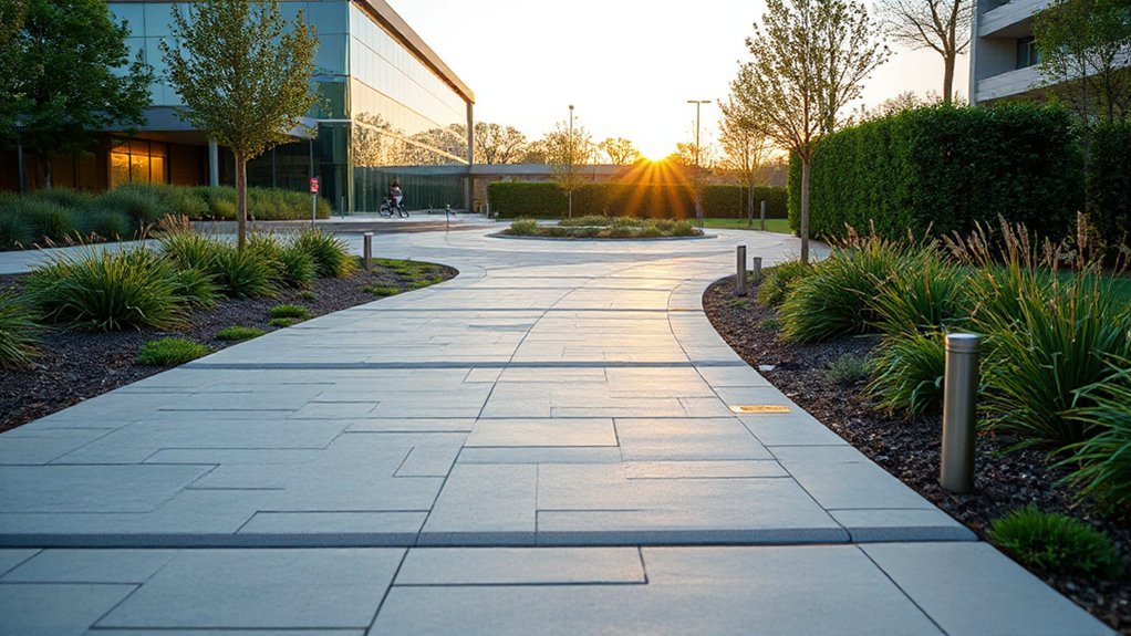
Add Rhythm With Edges, Patterns, and Repeats
You’ll strengthen wayfinding when you define pathway edges with clear contrast in material, color, or elevation, so users can read boundaries at a glance.
You’ll then repeat a consistent pattern—paver modules, joint lines, lighting spacing, or planting bands—to set a steady cadence that supports safe, intuitive movement.
You’ll keep these cues uniform at shifts and intersections to meet accessibility standards and deliver a cohesive experience for your client.
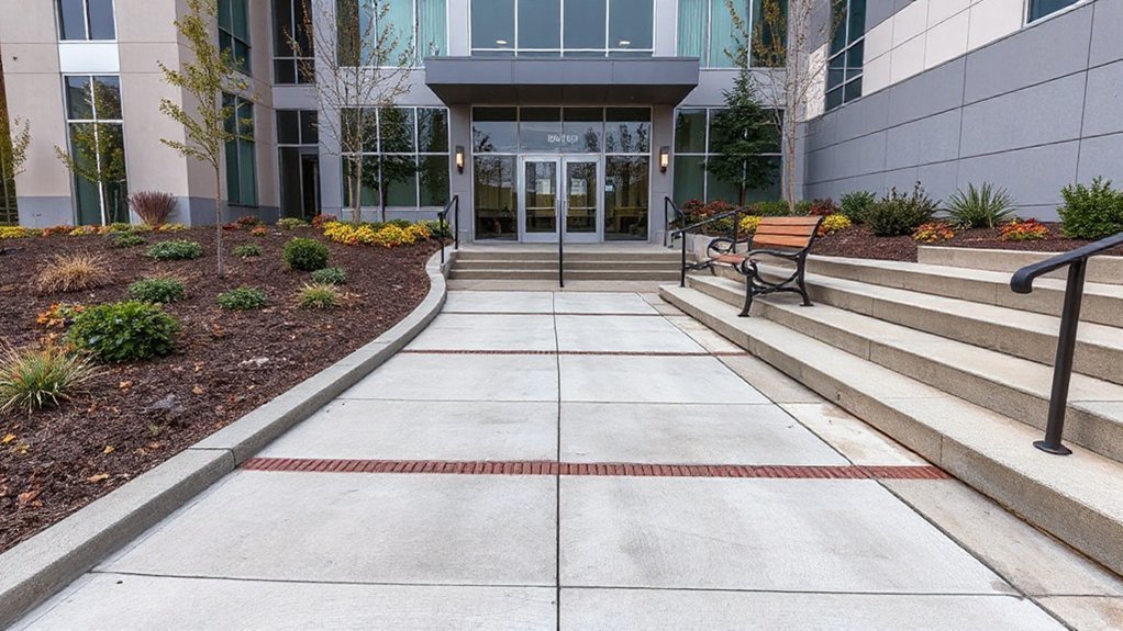
Define Edges With Contrast
To make a pathway read as intentional and safe, you need edges that contrast clearly with the walking surface. Use edge contrast to create immediate visual separation between where you want people to walk and where they shouldn’t. Specify a curb, soldier course, or metal edging that differs in color and texture from the paving, and keep the reveal consistent so the line stays legible.
Detail the transition at slopes and crossings: maintain flush joints at accessible routes, avoid toe-catching lips, and verify drainage won’t undermine the edge. If lighting is low, select finishes that hold contrast when wet.
Coordinate edging with maintenance needs—mowers, snow tools, and sweeping—so the boundary doesn’t degrade. You’ll guide movement without signs while meeting usability expectations.
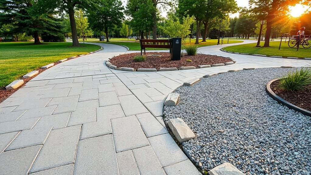
Repeat Patterns For Flow
When a pathway repeats a clear edge and module, it reads as continuous, organized, and easy to follow. You create flow by locking in Pattern consistency across widths, joint spacing, and edge treatment, so users don’t re-interpret the route at every step.
Specify a repeating unit—paver size, scoring grid, or board length—and keep it constant through turns, landings, and progression. Use visual repetition with curb lines, banding, or inlay strips to reinforce direction without extra signage.
Align pattern joints to key destinations, crossings, and door thresholds to meet accessibility expectations and reduce trip risks. Where materials must change, maintain the same module and edge line, and document tolerances so installers can match the rhythm precisely.
This keeps circulation legible and cohesive.
Use Texture to Signal Speed and Priority
Although color and signage often get the credit, texture does the quiet work of guiding movement by communicating speed and priority through your users’ feet, wheels, and touchpoints.
Use texture contrast to set hierarchy: smoother, low-resistance surfaces invite faster travel, while rougher finishes slow pace near entries, crossings, and decision points.
Specify tactile signals that are legible under varied footwear, mobility aids, and weather conditions.
Align selections with accessibility standards: keep running slopes, cross slopes, and joints within tolerance, and avoid loose aggregate that creates trip risk or wheel drag.
Detail coefficients of friction for wet and dry conditions, and require mockups so you can verify perception at real walking speeds.
Maintain consistency in maintenance plans so textures don’t polish away or clog over time.
Design Transitions Between Zones and Moods
You’ll guide people smoothly between zones by specifying gradual material shifts—tightening joint lines, changing aggregate size, or shifting from pavers to boardwalk—so the route reads clearly without abrupt breaks.
You’ll reinforce the mood change with controlled lighting cues, adjusting color temperature and spacing to meet safety and accessibility standards while supporting your desired pace.
You’ll finish the shift with plant cues—height, density, and fragrance—so users sense arrival before they reach the next space.
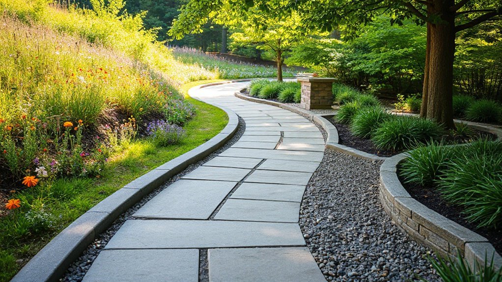
Gradual Material Shifts
As a pathway moves from one zone to the next, gradual material shifts keep the progression legible and comfortable instead of abrupt. You plan each material transition to match function: durable, slip-resistant paving near entries; warmer textures where you want a slower pace.
Use surface variation in controlled increments—change aggregate size, joint pattern, or finish before you change the base material.
You maintain consistent module sizes and align joints to preserve clean sightlines and reduce trip risk. You specify thresholds with flush tolerances, stable edging, and proper compaction so wheels and heels roll smoothly.
Where grades or drainage conditions differ, you adjust subbase depth and permeability rather than forcing a sudden top-surface change. You also test samples in situ to confirm color continuity and comfort underfoot.
Lighting And Plant Cues
When you shift from an active, circulation-heavy zone to a quieter garden room, lighting and plant cues should signal the change before the paving does.
Use layered lighting to slow movement: tighter beam path lights at intersections, then softer, shielded washes and lower lumen levels as you approach the retreat. Keep glare below IES-style comfort expectations by aiming fixtures down and specifying warm CCTs for evening calm.
Reinforce the progression with planting structure: upright grasses and clipped hedges for guidance, then broader leaves, scent plants, and understory texture for biophilic integration.
Maintain clear sightlines at decision points and preserve required path illuminance for safety.
Repeat key species and fixture finishes so you achieve aesthetic harmony across zones, not abrupt contrast.
Light the Route for Nighttime Navigation
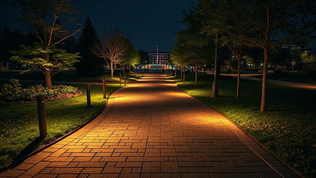
Although a pathway can look flawless in daylight, it won’t perform after dark without a deliberate lighting plan that defines edges, reveals grade changes, and guides movement from entry to destination.
Start by setting target light levels that support safe walking while preventing glare; use full cutoff fixtures and warm CCTs to protect comfort and night adaptation.
Apply illumination techniques that layer low bollards for edge definition, shielded step lights for risers, and downlights where you need uniformity on longer runs.
Keep spacing consistent, verify photometrics, and avoid hot spots that hide trip hazards.
Add pathway signage with reflective faces or internally lit panels so directions stay legible in rain and low contrast conditions.
Specify weather-rated components, tamper-resistant hardware, and maintenance access so performance remains predictable year-round.
Design Intersections People Don’t Misread
At intersections, you need to make right-of-way unmistakable with compliant signs, markings, and geometry so people don’t guess. You establish an unambiguous visual hierarchy by prioritizing the primary route with consistent line weight, contrast, lighting, and sightlines.
When you standardize these cues across the site, you reduce hesitation, conflicts, and client liability.
Clear Right-Of-Way Cues
Because intersections compress decisions into seconds, you need right-of-way cues that read instantly and consistently for every user—drivers, cyclists, and pedestrians. Use high color contrast at conflict points: bold crosswalk bars, stop lines, and bike crossings that meet local MUTCD/TSM and accessibility requirements.
Reinforce priority with surface texture changes—rumble strips before yield lines, tactile warning domes at curb ramps, and skid-resistant coatings on crossings—so cues remain legible in rain, glare, and snow. Place signs where sight lines support them, and pair them with pavement markings so one element backs up the other.
Control approach speeds using tightened curb radii and raised tables that still maintain drainage, emergency access, and ADA-compliant slopes and landings.
Unambiguous Visual Hierarchy
When you establish a clear visual hierarchy at an intersection, you prevent users from inventing their own rules in the moment. You do it by ranking paths with consistent width, materials, and alignment so priority reads instantly.
Use Color contrast to separate main routes from secondary spurs, and keep the palette compliant with accessibility targets.
Reinforce decisions with visual cues: directional paving patterns, curb reveals, bollard spacing, and overhead lighting that traces the preferred line of travel.
Place signage where sightlines naturally pause, not where it’s convenient to install.
Confirm that crosswalks, ramps, and tactile indicators align with the dominant flow and meet local standards.
Then field-test with first-time users and adjust any ambiguous merge points.
Add Landmarks for “You Are Here” Clarity
Even if your pathway layout is technically correct, users won’t feel confident moving forward unless they can confirm “you are here” at a glance. Build certainty by placing recognizable markers at decision points, entries, and wayfinding connections, so users can self-locate without asking for help.
Use landmark symbolism that matches your brand and context—distinct planting palettes, sculptural elements, lighting signatures, or numbered pylons. Give each landmark visual prominence through contrast in color, material, height, and illumination, and keep it unobstructed.
Pair landmarks with consistent naming in maps and signage, using accessible typography, adequate size, and high contrast. Validate placement with walk-throughs and wayfinding tests, then standardize details in your documentation so every installation performs reliably.
Shape Sightlines to Draw People Forward
Although your pathway may meet every dimension and code requirement, you’ll only get smooth, confident movement if you intentionally shape what people can see next. Align turns so the destination or next decision point stays visible, and avoid visual dead-ends created by tall plantings, opaque screens, or misplaced signage.
Use gentle curves to reveal features in sequence, but keep focal points steady at eye level so people don’t hesitate. Control clutter: consolidate signs, coordinate lighting, and place furnishings outside primary sightlines.
Reinforce direction with Color contrast at edges, crossings, and key nodes, so the route reads instantly in day and night conditions. Specify finishes that hold that contrast over time; Material durability protects legibility against wear, staining, and weathering.
Validate sightlines with on-site mockups before final installation.
Build Accessibility In From the Start
How early should you lock in accessibility decisions for a pathway? At concept stage, because alignment, grades, and cross-slopes drive every downstream detail and budget. Use Inclusive design criteria alongside local code, ADA/ISO guidance, and client operations needs.
Set clear targets: continuous accessible route, minimum clear widths, stable slip-resistant surfaces, and predictable edge conditions. Keep running slopes within limits, provide level landings at required intervals, and design drainage so water doesn’t pond or ice.
Specify tactile cues at crossings, contrasting materials at hazards, and lighting levels that support low-vision navigation. Coordinate barrier-free features with planting, furnishings, and maintenance access so they don’t become obstacles later.
Document tolerances and inspection points so construction matches intent.
Test With Real Users and Iterate Fast
Once you’ve set your accessibility targets, validate them with the people who’ll actually use the pathway—early, often, and with measurable criteria. Run short, scripted sessions and benchmark success rates against WCAG-aligned acceptance tests. Treat each round as user centered design: you’re not defending assumptions, you’re verifying outcomes, then shipping improvements fast.
- Recruit users with diverse abilities, devices, and assistive tech
- Test critical tasks end-to-end, not isolated screens
- Capture user feedback plus timestamps, errors, and completion rates
- Prioritize fixes by severity, frequency, and business risk
- Re-test after changes and document evidence for stakeholders
You’ll iterate in days, not quarters, because you define clear pass/fail thresholds, maintain traceable decisions, and keep the client’s service goals on track.
Frequently Asked Questions
How Do You Estimate Pathway Construction Costs and Lifecycle Maintenance Budgets?
You estimate pathway construction costs and lifecycle maintenance budgets by using cost estimation from quantities, unit rates, contingencies, and standards. You’ll apply budget planning with lifecycle models, inspections, inflation, and replacement schedules, then validate with bids.
What Permits or Approvals Are Typically Required for New Pathways?
Like a passport for your path, you’ll typically need zoning/site plan, grading, stormwater, and erosion-control permits, plus utility, environmental, and ADA reviews. You’ll navigate permit requirements and approval processes with inspections and final occupancy sign-off.
Which Materials Perform Best in Freeze-Thaw Climates and Heavy Rain?
You’ll get best results with air-entrained concrete, frost-rated pavers, or dense asphalt over free-draining base and geotextile; they maximize Material durability and Climate resilience. You’ll meet standards by sloping 1–2% and sealing joints.
How Can Pathways Incorporate Stormwater Management and Drainage Features?
You’ll integrate stormwater management by grading paths to swales, adding trench drains and catch basins, using permeable surfaces over stone reservoirs, and directing overflow to rainwater harvesting cisterns, meeting local codes and maintenance plans.
What Are Common Liability and Insurance Considerations for Pathway Design?
Like a seatbelt, you manage common liability risk by meeting ADA and local codes, specifying slip-resistant surfaces, ensuring lighting and sightlines, documenting inspections, and coordinating indemnities, limits, and additional insureds for adequate insurance coverage.
Conclusion
Now you’re ready to design pathways that perform with purpose. You’ll define the job, follow desire lines, and choose a line, loop, or network that fits your site and standards. You’ll set safe, scalable widths, align routes for obvious wayfinding, and place practical landmarks for “you are here” certainty. You’ll shape sightlines that subtly signal what’s next, build accessibility from day one, and test, tweak, and tighten fast.