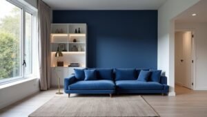
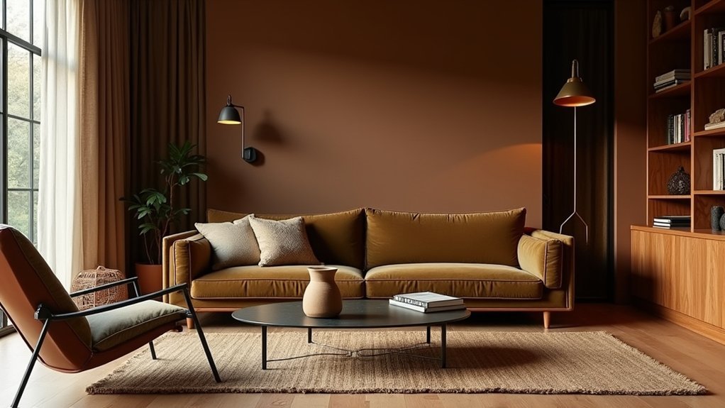
To make moody, earthy tones feel rich—not gloomy—you’ll stick to mid-to-deep shades like smoked terracotta, oxblood, walnut, and deep olive, then balance them with creamy off-whites and aged brass. Match undertones (warm with warm, cool with cool) so the palette stays clean. Use 60-30-10 to control visual weight, and layer light/mid/dark values at least twice. Add velvet, leather, and aged wood, plus warm dimmable lighting for depth. Keep going to see room-by-room combinations and avoid muddy, too-dark mistakes.
Key Takeaways
- Choose mid-to-deep earthy hues like smoked terracotta, oxblood, walnut, and deep olive, balanced with creamy off-whites and aged brass.
- Use the 60-30-10 rule: 60% earthy neutral base, 30% supporting tone, 10% accent for controlled contrast and focus.
- Match undertones to avoid muddiness: warm reds/ambers/olives feel cocooning, while cool grays/charcoals feel sleek and architectural.
- Layer values and textures—light, mid, dark plus velvet, leather, oiled wood, and boucle—to create depth and richness in low light.
- Use warm, dimmable, high-CRI layered lighting and varied sheens to keep dark rooms moody yet clear, not dull or cave-like.
Pick a Warm Moody Palette (Not Gloomy)
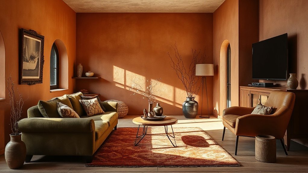
If you love the drama of deep color but don’t want your space to feel like a cave, build a warm, moody palette around rich mid-to-deep tones with softened undertones. Choose smoked terracotta, oxblood, walnut brown, or deep olive, then ground them with creamy off-whites and aged brass. Color psychology matters: these hues signal shelter, confidence, and intimacy, so you’ll feel calmer without losing sophistication. Keep contrast controlled by repeating one dominant shade across walls, upholstery, and art mats, and vary texture instead—velvet, oiled wood, boucle, and leather read luxe in low light. Pull from historical influences like Victorian libraries and Spanish Revival interiors: layered darks, burnished metals, and patinated finishes make depth feel welcoming, not heavy.
Match Moody Palette Undertones (Warm vs Cool)
To keep a moody palette intentional, you’ve got to spot whether your paint reads warm or cool, not just “dark.” Check undertone clues in the swatch—red/bronze casts signal warmth, while blue/green/gray casts signal cool—and confirm in your room’s lighting. Then pair neutrals to match the mood: creamy taupes and greiges sharpen warm depth, while crisp charcoals and cool off-whites support a cleaner, modern shadowy look.
Identify Warm Vs Cool
Because moody palettes rely on subtle undertones, you’ve got to identify whether your core colors read warm or cool before you commit to paint, upholstery, or wood tones. Warm moody hues lean toward red, amber, and olive, so they feel cocooning and intimate; cool moody hues lean toward blue, green, and charcoal, so they feel quieter, sleeker, and more architectural—classic Color psychology at work. Check your “anchor” shade first (usually the darkest): if it pairs best with brass, cognac leather, and walnut, you’re in warm territory; if it elevates chrome, blackened steel, and ash, you’re cooler. Historical influences matter too: Arts-and-Crafts rooms skew warm and earthy, while Bauhaus and Scandinavian modern read cooler and cleaner.
Undertone Clues In Paint
While paint chips look straightforward, their undertones shift fast under real-world light, so you need a few reliable tells before you lock in a moody palette. Start with the label: bases marked “yellow oxide,” “raw umber,” or “red iron” usually read warm; “black,” “phthalo blue,” or “green” often pull cool. Next, look at undertone clues in the wet paint line—warm shades flash brown, rust, or olive; cool shades flash slate, ink, or pine. Check the sample at three times: morning, midday, and night under your actual bulbs. Paint chemistry matters too: higher titanium dioxide can chalk and cool a color, while added black can green-shift certain browns. Test beside a true white card.
Pairing Neutrals With Moods
Once you’ve nailed a paint color’s undertone, you can pair neutrals to reinforce the mood instead of fighting it. Warm undertones (red, yellow, olive) read grounded and inviting, while cool undertones (blue, violet, slate) feel crisp, hushed, and architectural. Use Color psychology to keep your palette coherent, then fine-tune contrast so the room’s Emotional resonance stays intentional.
- Warm moody walls: choose creamy off-whites, camel, tobacco, and putty; avoid icy grays that dull the glow.
- Cool moody walls: use bone, greige, graphite, and charcoal; skip pink-beige that turns muddy.
- Mixed lighting: test samples at day/night, then repeat one neutral in trim, textiles, and rugs for continuity.
Use 60-30-10 to Balance Earthy Tones
Even if your palette leans heavily on terracotta, clay, taupe, and olive, you can keep it crisp by applying the 60-30-10 rule. Assign 60% to your dominant earthy neutral—think warm taupe on walls or a large rug—to establish calm, grounded continuity. Use 30% for a supporting tone like olive in upholstery, drapery, or cabinetry so the room feels curated, not monotone. Reserve 10% for an accent: rust leather, aged brass, or inky ceramic accessories for a controlled punch. This structure aligns with Color psychology by reducing visual noise and guiding the eye. It also supports Mood enhancement because you’re balancing comfort with intention. Track percentages by surface area, not item count alone.
Create Depth With Contrast (Light, Mid, Dark)
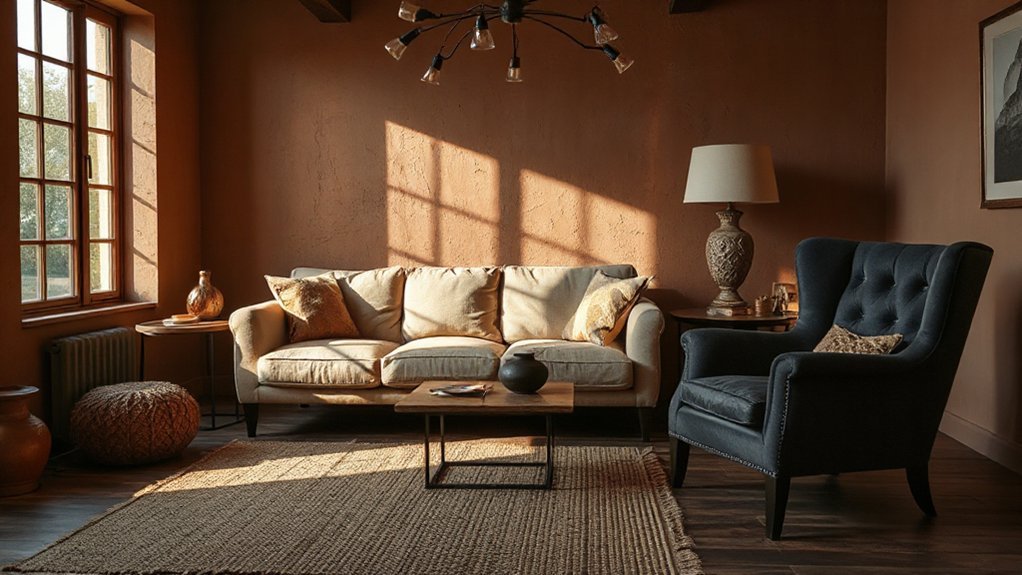
To create depth, you’ll layer light-to-dark values—think bright ceilings and trim, mid-tone walls, and deeper anchors in floors or key furniture. You’ll keep contrast intentional by repeating each value at least twice so the room reads cohesive, not choppy. Then you’ll balance the highs and lows with neutrals (warm whites, greiges, soft charcoals) to sharpen edges without overwhelming the palette.
Layer Light-To-Dark Values
Because your eye reads contrast before it notices color, layering light-to-dark values is the fastest way to create depth that feels intentional rather than flat. Start by mapping a value range, then repeat it across walls, upholstery, and accents so the room reads cohesive even in low light. Color psychology matters: lighter values lift mood and expand space, while darker values ground it and signal intimacy. Interior lighting changes everything, so test swatches morning, afternoon, and evening to keep your contrasts crisp, not muddy.
- Light anchor: choose a pale clay, oat, or bone for ceiling, trim, or a large rug.
- Mid bridge: use tobacco, olive, or terracotta on key upholstery or drapery.
- Dark punctuation: add espresso, charcoal, or forest in frames, metalwork, and small casegoods.
Balance Contrast With Neutrals
While high-contrast light/mid/dark layering gives a room its structure, neutrals keep that contrast looking curated instead of chaotic. Use warm whites, mushroom taupes, greige, or soft clays as your “pause” colors between deep olives, inky charcoals, and brighter highlights. In practice, anchor the darkest value on large surfaces (sofa, cabinetry, feature wall), place mids in rugs and drapery, then let light neutrals live on ceilings, trim, and key upholstery to lift the eye. This is Color psychology in action: neutrals signal calm and continuity, so bolder shades read intentional, not loud. For Mood enhancement, repeat one neutral across finishes—paint, stone, linen, wood tone—so contrast feels rich, grounded, and timeless.
Add Texture: Velvet, Leather, Aged Wood
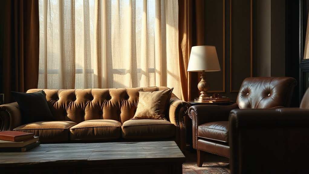
When your color palette feels flat, you can sharpen it instantly by layering tactile materials that catch light and create depth. Textural contrast keeps moody hues from reading muddy, while color psychology helps you steer the room’s emotional temperature—plush feels inviting, sleek feels controlled, raw feels grounded.
- Velvet: Use a velvet sofa or drapery in deep olive or ink; its pile shifts tone as you move, adding richness without adding new colors.
- Leather: Bring in cognac or oxblood leather chairs; the subtle sheen and patina sharpen edges and make dark walls feel intentional.
- Aged wood: Choose reclaimed oak, walnut, or weathered pine; open grain and imperfections give earthy palettes credibility and warmth.
Light a Moody Palette so It Stays Dimensional
Even if you’ve nailed the perfect charcoal-and-olive scheme, the wrong lighting can flatten it into a dull wash, so you need a layered plan that protects contrast and reveals undertones. Start with warm-dim ambient light (2700K–3000K) on a dimmer to keep shadows soft, not murky. Add directional accent lights to graze textured walls and cabinetry; that raking angle restores depth and boosts perceived saturation per Color theory. Use higher-CRI LEDs (90+), so greens don’t go gray and browns don’t skew red. Balance the room with a few lower-lumen task sources at eye level to prevent ceiling glare and “cave” corners. Finally, tune scenes: brighter for daytime clarity, lower for Mood enhancement at night.
Layer Rugs, Art, and Decor for Cohesion
Because color doesn’t live on paint alone, you’ll get a more cohesive scheme by repeating your key hues and undertones across rugs, art, and decor at different scales. Treat rugs as your ground note: pick one with a dominant earthy tone, then echo its accent shade in artwork and small objects. Use Color psychology to control mood—deep greens calm, rust energizes, inky blues feel refined—then reinforce that emotion with materials like wool, clay, and aged wood. Let Cultural influences guide pattern choices: Berber geometrics, Japanese wabi-sabi ceramics, or Andalusian tile motifs, but keep the palette edited so it reads intentional.
- Layer a low-contrast rug over jute for depth.
- Repeat one pigment in three artworks.
- Mix matte and sheen in decor pieces.
Apply Moody Palettes Room by Room
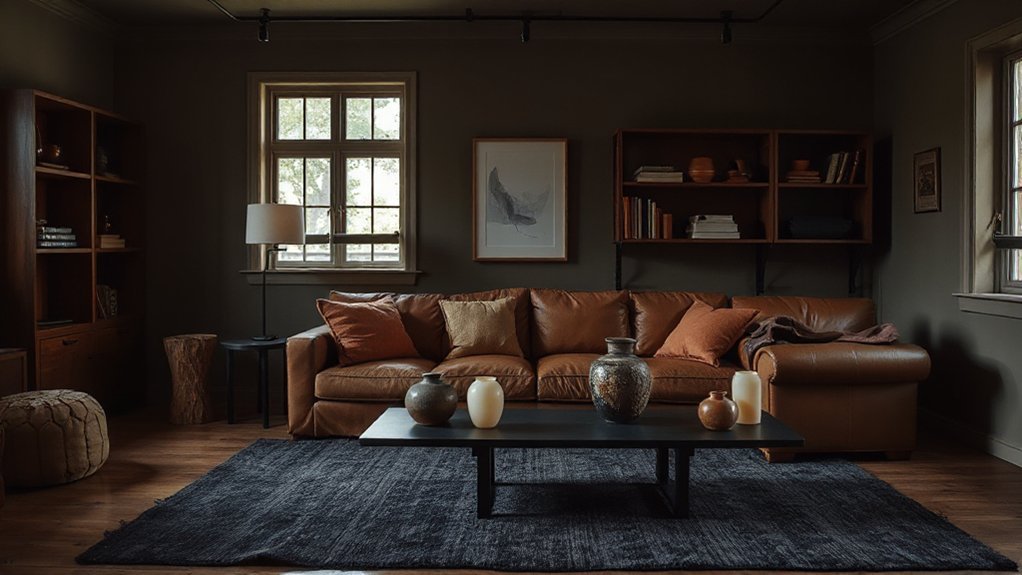
Although moody palettes read dramatic, you’ll get the most livable result by tuning depth and contrast to each room’s function and light exposure. In the entry, pick an inky wall color with a warm metal sconce so guests feel grounded fast—Color psychology supports darker hues for security and arrival.
In the living room, balance deep olive or charcoal with textured linen, light oak, and a high-contrast artwork to keep conversation areas energized. In the kitchen, lean earthy: smoked clay, umber, or muted forest on lowers, then pair with creamy stone and aged brass for appetite-friendly Mood enhancement. In bedrooms, prioritize calm: dusty plum, cocoa, or midnight blue behind the headboard, layered with matte bedding and blackout drapery. In baths, try slate, peat, or terracotta with warm backlit mirrors for spa-like ease.
Avoid Muddy Color and “Too-Dark” Mistakes
When you push a palette darker, you have to manage undertone, sheen, and contrast—or the room will read muddy, flat, and smaller than intended. Use Color psychology to guide depth: cool charcoals feel tailored and calm, while warm espresso reads cocooning for mood enhancement. Test swatches in morning and evening light; LEDs can skew green or purple and wreck your “earthy” intent.
- Balance value jumps: Pair deep walls with lighter ceilings, trim, or large rugs to keep edges crisp.
- Control sheen: Choose matte for walls, satin for millwork, and add glossy accents to bounce light.
- Build clean contrast: Layer metals, pale stone, and textured linens so dark hues look rich, not heavy.
Frequently Asked Questions
How Do Moody Palettes Affect Resale Value and Buyer Appeal?
Moody palettes can boost buyer appeal when you balance them with light, but they can reduce resale if they feel niche. You’ll leverage color psychology and emotional impact, staging with neutral anchors and broad-market finishes.
Which Paint Sheens Work Best for Deep Earthy Colors?
You’ll get the best results with a Matte finish on walls to deepen earthy pigments and hide flaws, while using Satin sheen for trim and high-traffic areas—it cleans easily and adds controlled, modern glow.
How Can I Test Moody Colors Without Repainting the Whole Room?
Use Color swatch testing with large peel-and-stick samples or poster boards, and move them around throughout the day. Try temporary wall coverings for full-wall impact, then evaluate under daylight, ламplight, and LEDs.
What’s the Best Way to Coordinate Moody Interiors With Existing Flooring?
Start by matching your flooring’s undertone—warm oak, cool gray, red-stained—then build paint and textiles around disciplined color pairing. Use lighting techniques: warm bulbs for warmth, cooler LEDs for contrast. Sample relentlessly; mistakes scream.
Are Moody Earthy Palettes Suitable for Small Homes With Low Ceilings?
Yes, you can use moody earthy palettes in small, low-ceiling homes if you prioritize Lighting enhancement and strategic furniture contrast. Keep ceilings lighter, use vertical lines, layer warm bulbs, and choose slim, leggy pieces.
Conclusion
You’re not chasing a cave; you’re crafting chiaroscuro—Caravaggio, not blackout paint. Keep your moody palette warm, align undertones, and let 60-30-10 pace the earthy tones. Build depth with light–mid–dark contrast, then add tactile polish: velvet, leather, aged wood. Light it in layers so shadows stay intentional, not flat. Tie it together with rugs, art, and repeats across rooms. Skip muddy mixes; edit ruthlessly.