
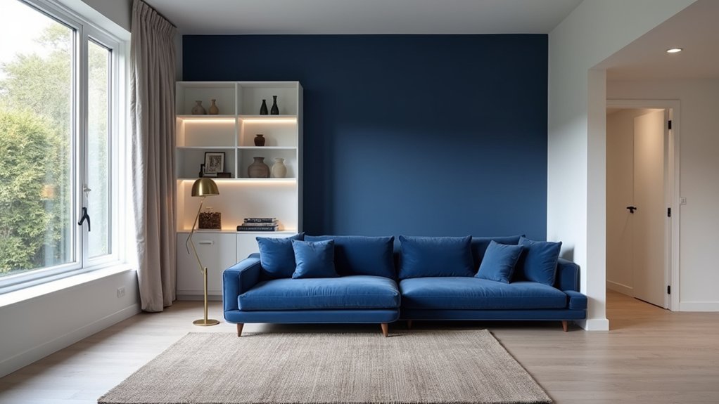
You’re seeing bold indigo and calming whites reshape modern interiors because the pairing feels tailored yet relaxed. Start with a crisp, warm white base, then repeat indigo at least three times through a rug, cabinetry, or a feature wall to control contrast and keep negative space. Test indigo on multiple walls for 48 hours since light shifts undertones, and use 2700K bulbs to soften it. Add oak, cane, and brushed brass for warmth—next you’ll see exactly how to apply it room by room.
Key Takeaways
- Use a crisp white base and layer bold indigo through rugs, sofas, or a feature wall for instant depth and contrast.
- Repeat indigo at least three times and protect negative space to keep the scheme tailored, calm, and uncluttered.
- Choose warm whites (cream, greige, linen) that match fixed finishes like oak, travertine, or brushed brass to avoid sterility.
- Test indigo and white samples across walls and lighting; bulb temperature shifts perception—2700K warms, 4000K sharpens.
- Apply indigo strategically by room: feature walls or lower cabinets, while keeping ceilings and major sightlines white for openness.
Get The Indigo-And-White Look In 3 Steps
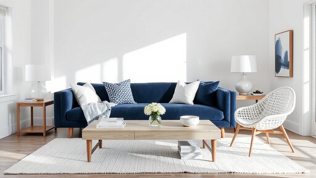
Three moves are all you need to nail the indigo-and-white look: start with a crisp white base that keeps the room bright, layer in indigo through one or two high-impact anchors (think a rug, sofa, or statement wall), then lock it in with tightly edited patterns and textures—block prints, stripes, and ceramics—that make the palette feel intentional, not nautical.
Next, control contrast with Interior design principles: keep hard lines clean, repeat indigo at least three times (art, cushions, lampshade), and leave negative space so white reads premium, not stark. Finally, refine the finish using Color psychology: choose inky, blue-black indigo for modern edge, or dustier indigo for softness, then balance it with warm whites and brushed metals. You’ll get a composed, editorial room, not a themed one.
Why Indigo And White Feels Bold But Calm
Once you’ve built the indigo-and-white look with a clean base, strong anchors, and edited pattern, the real payoff is how it reads in the room: bold, but calm. Indigo delivers depth and authority without the visual noise of brighter primaries, so your space feels grounded, not busy. White does the opposite: it opens sightlines, lifts edges, and gives negative space room to breathe.
Color psychology explains the balance: indigo cues focus and stability, while white signals clarity and reset. Together they create Interior harmony by keeping contrast crisp yet controlled. You get drama in the shadows and calm in the highlights, which makes furnishings look sharper and materials—linen, oak, brushed metal—feel more intentional. The result reads modern, tailored, and quietly confident.
Pick An Indigo Shade For Your Light (And Test It)
You’ve got to match your indigo to your room’s daylight, because north-leaning light cools it while warm afternoon sun deepens it. Lock in your bulb temperature next—2700K will soften indigo toward inky warmth, while 4000K+ sharpens it into a crisp, modern blue. Then test large samples on multiple walls and check them morning, midday, and night before you commit.
Match Indigo To Daylight
Because indigo shifts dramatically with changing daylight, the shade you choose has to match your room’s natural light, not just the paint chip. Start by mapping sun exposure: north-facing light reads cooler and can make indigo feel inky, while south-facing light lifts it toward saturated blue. For east-facing rooms, expect crisp mornings and softer afternoons; west-facing spaces intensify indigo late day, so go slightly muted to avoid heaviness. Prioritize lighting synchronization by testing large swatches on multiple walls, then reviewing them at three checkpoints: early morning, midday, and late afternoon. You’re looking for daylight compatibility—an indigo that holds depth without turning purple, gray, or flat. Commit only after a full-day read, not a quick glance.
Consider Bulb Temperature
Even if your indigo looks perfect in daylight, the bulb temperature you use at night can flip it from crisp to muddy in seconds. For today’s modern interiors, you’ll want to choose an indigo that stays saturated under your most-used lamps, not just under sunlit windows.
Start by mapping your lighting plan: warm 2700K boosts red, pushing indigo toward inky navy; neutral 3000–3500K keeps it balanced; cool 4000K sharpens it, sometimes turning it steely. If you love bold indigo, pair it with 3000K for a high-end, lounge-like lighting ambiance. Prefer calming whites nearby? Use the same Kelvin range to avoid a jarring shift between walls and trim. Keep it consistent across fixtures for cohesion.
Test Samples On Walls
Before you commit to an indigo, paint large sample swatches directly on multiple walls and watch them shift from morning daylight to your evening lamp glow. Keep each swatch at least 2×2 feet so undertones read clearly, and place one near trim, one in shadow, and one by a window. This is color testing that matches how you’ll actually live with the hue. Tape crisp edges, label each mix, and view it against your key whites, floors, and textiles. If the indigo turns sooty at night, move warmer; if it skews violet in sun, choose a cleaner blue base. Live with it for 48 hours, then commit to wall paint that stays saturated, calm, and modern in every corner.
Choose A Warm White That Won’t Look Stark
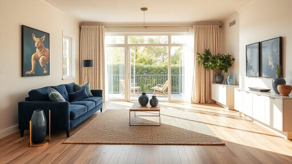
While crisp whites still dominate mood boards, you’ll get a more modern, lived-in look by choosing a warm white with subtle beige, cream, or greige undertones that keeps walls bright without reading icy or clinical. To choose well, check the undertone against your fixed finishes: oak floors, travertine, brushed brass, and warm grays all pair better with a Warm white than a blue-leaning shade. In north light, pick a slightly deeper warm white so it won’t turn flat; in south light, avoid yellow-heavy whites that can feel buttery. Aim for clean warmth: think linen, ecru, or soft alabaster. This approach strengthens color harmony with bold indigo accents and prevents your “white” from looking like primer.
Use A 70/20/10 Rule For Balance
A warm white sets the tone, but you’ll keep a modern space from feeling washed out by applying the 70/20/10 rule: 70% dominant color (often your wall paint and large upholstery), 20% secondary layer (rugs, drapery, accent chairs, wood tones), and 10% punchy accent (indigo, terracotta, brass, or black). Build the 70% with creamy whites and quiet textures so the room reads calm, not flat. Use the 20% to control contrast—mid-tone woods, oatmeal textiles, and soft grays add depth without clutter. Reserve the 10% for sharp, curated hits that guide the eye. Color psychology matters: warm neutrals reduce visual stress, while darker accents add focus. Check your interior lighting; LEDs can skew whites, so balance undertones accordingly.
Paint An Indigo Feature Wall (Or Go For Trim)
If you want instant depth without losing a clean, modern feel, indigo delivers. Paint a single feature wall behind your sofa or bed to anchor the room and sharpen sightlines. Choose a blue-leaning indigo for crisp contrast, or a violet-tinged indigo for a softer, moodier read. In Color psychology terms, indigo signals calm focus and quiet confidence, so it works best where you want concentration or decompression.
If you can’t commit to a full wall, use indigo on trim: baseboards, window casings, interior doors, or picture rails. This approach keeps walls bright while adding tailored definition and high-end structure. Pair it with warm whites and matte finishes, then repeat the hue in small Interior accents for cohesion.
Try Indigo Cabinets With White Walls
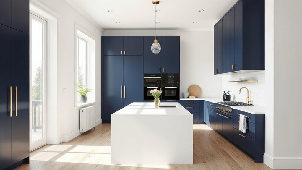
Pair indigo cabinets with crisp white walls to keep the room bright while giving the cabinetry a high-contrast, designer edge. You’ll want to balance the palette with the right cabinet finish—matte for a modern look, satin for easy upkeep—and choose hardware in brushed brass, black, or polished nickel to sharpen the style. Then you can warm the scheme with wood tones, tan leather, and soft neutrals so the indigo reads rich, not cold.
Balancing Indigo And White
While all-white interiors can feel sterile, indigo cabinets instantly add depth and direction without overwhelming the room when you keep the walls crisp white. You’ll create Color harmony by letting the cabinetry act as the visual anchor and the walls function as clean negative space that sharpens edges and highlights silhouettes.
Balance the contrast with proportion: if your cabinets run full height, keep countertops and backsplashes light and simple so the indigo reads intentional, not heavy. Bring in warm neutrals through wood stools, woven shades, or tan runners to prevent the palette from turning icy. For mood enhancement, layer lighting: bright task light for clarity and softer ambient light to make indigo look velvety at night. Repeat indigo in small doses—art, textiles, or a vase—to unify the room.
Cabinet Finishes And Hardware
Because indigo cabinetry already delivers strong contrast against crisp white walls, the finish and hardware you choose will determine whether the look reads modern and tailored or heavy and dated. Choose a low-sheen satin or matte lacquer to keep the color inky and current; skip high-gloss unless you’re committing to a sleek, reflective aesthetic. Add depth with subtle grain or a tight paint finish, not distressed glazing. For hardware, go slim and linear: edge pulls, flat bar pulls, or minimal knobs with crisp backplates. Align the metal with your lighting fixtures so the room feels intentional. Then balance the weight with countertop materials that stay clean and bright—light quartz, pale marble-look, or white solid surface—so the indigo reads sharp, not overpowering, in daylight and at night.
Styling With Warm Accents
Once you’ve locked in indigo cabinets against white walls, warm accents keep the contrast from feeling cold and overly graphic. Lean into Color psychology: indigo reads stable and refined, while honeyed woods and soft metals add approachability. Choose oak or walnut stools, a cane-front bar cabinet, or a leather banquette to bring tactile heat into the palette. Swap stark chrome for brushed brass or aged bronze; it echoes the cabinet depth without competing. For textiles, layer terracotta runners, camel linen, or rust velvet to break up large white planes. In Furniture styling, prioritize rounded silhouettes and visible grain to soften indigo’s structure. Finish with amber glass pendants and warm-dim bulbs (2700K) so the space stays calm, not clinical, at night.
Layer Indigo Textiles On White For Easy Wins
If you want a high-impact refresh that still reads clean and modern, layer indigo textiles over a crisp white base. You’ll get instant color contrast without repainting, and the look stays sharp because white amplifies indigo’s depth and inkiness. Start with textile layering that builds from large to small: an indigo area rug, then a throw, then pillows in mixed weaves. Choose one bold pattern—shibori, ticking stripe, or oversized geometrics—then balance it with solid indigo pieces to keep the scheme controlled. Vary texture for a more premium finish: linen, cotton canvas, and nubby wool read tailored against smooth white bedding or upholstery. Keep edges tidy and placement intentional so the palette feels curated, not busy.
Warm Up Indigo And White With Wood + Brass
You’ll keep indigo and white from reading icy by anchoring them with natural wood tones—think oak, walnut, or ash in clean-lined furniture and open shelving. Then you’ll sharpen the palette with brass accent details, using pulls, tapware, picture lights, or a slim-framed mirror to add controlled warmth and reflectivity. Keep the wood matte and the brass softly brushed so the contrast looks current, not costume.
Natural Wood Tones
While indigo-and-white palettes deliver crisp contrast, natural wood tones add the warmth that keeps the look from feeling stark. You’ll get a layered, modern feel when you choose woods with visible grain, matte finishes, and mid-to-light stains that amplify daylight. Natural textures and Organic patterns read intentional here, especially when you balance cool painted surfaces with tactile timber.
- Choose white oak, ash, or beech for a clean, Scandinavian-leaning warmth.
- Use walnut or smoked oak sparingly to deepen indigo without making rooms heavy.
- Repeat wood in casework, shelving, and frames to create continuity across zones.
- Pair wood with woven textiles and stoneware to reinforce a grounded, lived-in edit.
Keep edges simple, avoid high gloss, and let grain do the detailing.
Brass Accent Details
Because indigo and white can skew cool and high-contrast, brass accent details add the warm, reflective note that makes the palette feel tailored rather than stark. Use a Brass finish on cabinet pulls, tapware, and picture lights to echo the richness of indigo without competing with it. Pair it with natural wood from your last layer—oak, walnut, or ash—and you’ll get a balanced spectrum of cool, warm, and neutral. Keep placements intentional: repeat brass at three touchpoints per room (hardware, lighting, small decor) so it reads cohesive. In Minimalist decor, choose slim profiles and brushed or satin brass to avoid glare and fingerprints. Anchor the look with crisp white walls and let brass provide the soft glow.
Make It Work Room By Room (And Avoid Mistakes)
Even if you love a headline colour trend, it won’t land the same way in every space, so tailor it room by room to control light, scale, and function. Use Color psychology to match mood: indigo steadies focus, crisp whites reset visual noise. Then plan furniture placement before you paint, so undertones align with sightlines and key surfaces.
- Living room: Put indigo on the wall behind the main seating; keep ceilings white to lift contrast.
- Kitchen: Use warm whites on cabinetry; add indigo only in lower units or stools to prevent heaviness.
- Bedroom: Choose softer, chalky whites; reserve indigo for headboards or drapery for calm depth.
- Bath: Go high-gloss white with indigo accents; avoid dark walls in low light.
Frequently Asked Questions
What Accent Colours Pair Best With Indigo and White Interiors?
Pair indigo and white with warm brass, terracotta, blush, or saffron accents, plus sage or emerald. Use Complementary textiles in linen or velvet, and layer Decorative accessories like ceramics and metallics for contrast.
Is Indigo-And-White Suitable for Small Apartments or Only Larger Spaces?
Indigo-and-white works отлично in small apartments—you just balance depth and light. Use smooth wall texture and limit indigo to one feature wall. Add crisp white trim and strong furniture contrast to keep rooms airy.
How Do I Keep Indigo Paint From Fading in Sunny Rooms?
In a sunlit room, indigo can wash out like denim on a line, so you’ll use UV-blocking window film and lined drapes for sunlight protection. Choose high-quality, UV-resistant paint and topcoat for fading prevention.
What Are Budget-Friendly Ways to Achieve an Indigo-And-White Look?
Choose cost effective decor: thrifted white linens, secondhand frames, and indigo pillows. Apply DIY painting tips—paint one accent wall or furniture, use sample pots, and refresh hardware in matte white to keep it current.
Do Indigo and White Trends Affect Home Resale Value or Buyer Appeal?
Yes, you’ll typically boost buyer appeal with indigo-and-white, if you apply it strategically. Indigo color psychology signals confidence; whites read clean but demand white interior maintenance. Keep accents reversible, balance contrast, and avoid oversaturation.
Conclusion
With indigo and warm white, you get a look that’s practically impossible to mess up—bold, calm, and undeniably current. Keep your palette balanced with the 70/20/10 rule, then tailor indigo to your room’s light and your white’s undertone. Add texture through textiles, ground it with wood, and sharpen it with brass. Room by room, you’ll avoid harsh contrast and create modern depth that still feels effortless.