
How to Choose the Right Colour Palette for Your Home Style
Choosing a colour palette for your home is one of the most personal and most consequential design decisions you will make — and one of the most commonly approached in the wrong order. Understanding a few principles before you reach for the paint chart will save you from expensive mistakes and help you create spaces that feel coherent, intentional, and genuinely yours.
Key Takeaways
- Start with what you already own, not with a blank canvas — existing furniture, rugs, artwork, and textiles are the fixed points around which a colour palette should be built, not afterthoughts.
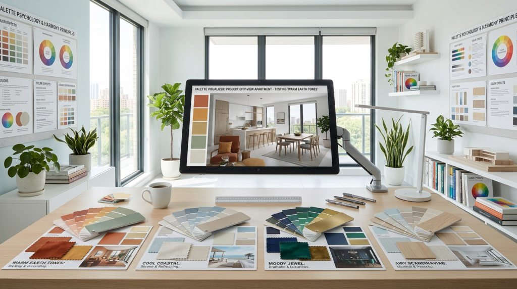
- The 60-30-10 rule provides a reliable foundation — 60% dominant colour (walls, large surfaces), 30% secondary colour (upholstery, curtains), 10% accent colour (cushions, accessories) creates balance without formula.
- Warm and cool tones behave very differently in natural light — a colour that looks perfect in a north-facing room can look flat and cold in a south-facing one, and vice versa. Always test paint in the actual room before committing.
- Neutrals are not colourless — every “neutral” has an undertone (warm, cool, yellow, pink, green) that reacts to the light in the room and the colours around it. Two whites that look identical in a paint shop can look entirely different on a wall.
- A cohesive home palette connects rooms through colour — a colour that appears in the living room as the dominant tone can reappear in the hallway as an accent, creating visual flow without repetition.
- Fashion colours fade; your own honest preferences do not — the colour scheme you will live happily with for ten years is built on what you are genuinely drawn to, not on what was on trend in the season you decorated.
- Test before you commit — paint large test patches (at least A3 size) in the actual room, at different times of day, before ordering full quantities. The difference between a sample card and a painted wall is always significant.
Why Colour Choices Feel So Difficult
The paralysis that many people experience when choosing paint colours comes from a combination of factors: too many choices (there are thousands of paint colours available from any major manufacturer), too little context (a small paint chip bears almost no relationship to a painted wall in a specific room with specific light), and too much advice (the internet produces infinite, often contradictory, guidance on what colours work and what colours do not).
The most useful reframing is to understand that there is no objectively correct colour palette for any room — there are only palettes that reflect the room’s character, suit its light, and express the sensibility of the person living in it. The goal is not to make the room look like a photograph in a magazine. It is to make it feel like yours.
Step 1: Start With What You Have
The single most common error in choosing a colour palette is treating the room as an empty canvas and choosing colours first, before considering the furniture, textiles, and objects that will actually inhabit the space.
In almost every room, several elements are fixed — or near-fixed — before the paint colour is chosen. The sofa. The rug. The curtains from the previous house that are being reused. The artwork collected over twenty years. These items have colours embedded in them, and those colours are the starting point for any palette that will work in context.
Take the dominant colours in your most important fixed pieces and note them. These are not necessarily the colours you paint the walls — they may be the colours you pick up in cushions and accessories, or the colours that inform which paint shade you choose to complement rather than compete. A warm terracotta sofa calls for different wall colours than a deep teal one. A Persian rug with red, navy, and gold suggests a different palette than a natural jute rug.
If you are starting a room genuinely from scratch — every piece of furniture to be chosen — then the wall colour can lead. But even then, begin by identifying the colours you are genuinely drawn to in the clothes you buy, the art you find compelling, the spaces you feel most comfortable in. These preferences are not accidental.
Step 2: Understand the Room’s Light
Colour is not a fixed property — it changes with light. The same paint colour can appear warm and inviting in a south-facing room in afternoon sun and cold and flat in a north-facing room on an overcast day. Understanding your room’s light before choosing colour saves enormous trouble.
North-facing rooms receive cooler, indirect light throughout the day. Blues, grey-blues, and cool neutrals tend to read as chilly in these spaces. Warm colours — ochre, terracotta, warm white, earthy red — are more flattering in north-facing rooms. Deep, rich colours (dark green, deep navy, burgundy) can also work well in north-facing rooms because they stop competing with a light that isn’t there and instead create their own atmosphere.
South-facing rooms receive warm direct light for much of the day. They can handle cool colours without them reading as cold — a pale blue or soft grey that would look clinical in a north-facing room can look fresh and elegant in a south-facing one. They are also the rooms that can accommodate very pale colours without them washing out.
East-facing rooms receive warm morning light and cooler afternoon light. They suit colours that respond well to both conditions — mid-toned warms and certain greens often work well.
West-facing rooms receive cool morning light and warm afternoon and evening light. They are often the best-lit rooms for entertaining and tend to flatter warm and earthy palettes in the evening hours when they are most used.
Artificial light adds another variable. Incandescent and warm LED bulbs add a warm orange-yellow cast that intensifies warm colours and neutralises cool ones. Cool daylight LEDs do the reverse. If a room is primarily used in the evening under artificial light, test paint colours in the evening under your actual lighting conditions — not just in daytime conditions.
Step 3: Choose Your Dominant, Secondary, and Accent Colours
The 60-30-10 rule is a proportion guide rather than a rigid formula, but it provides a useful framework:
60% — the dominant colour is the one that covers the most surface area: typically the walls, the ceiling (which may be a lighter version of the wall colour), and any large upholstered pieces in the room. This is the colour that sets the room’s overall atmosphere.
30% — the secondary colour provides contrast and visual interest without competing with the dominant: typically upholstered furniture, curtains or blinds, a large rug, or built-in cabinetry. The secondary colour should be clearly different from the dominant but harmonious with it — either a complementary tone on the opposite side of the colour wheel, a lighter or darker shade of the same hue, or a neutral that supports the dominant.
10% — the accent colour is used sparingly but with intention: cushions, throws, artwork, ceramic vases, candles, plants, and accessories. The accent is the opportunity to introduce a colour that would overwhelm if used broadly but that adds energy and specificity when used in controlled quantities.
This proportion naturally produces a room that feels resolved without being monotonous — the dominant colour gives identity, the secondary creates rhythm, the accent provides life.
Step 4: Build a Cohesive Whole-Home Palette
A home that feels coherent moves through spaces with visual continuity — each room related to the next without being identical. The most effective mechanism for achieving this is to identify a limited palette of colours that can appear in different proportions in different rooms.
A practical approach: choose three to five colours for the whole house. One or two of these should be the colours that appear most frequently — a wall colour that works in multiple rooms, a trim colour that is consistent throughout. The remainder are accent and secondary colours that move through the house at different proportions — the colour that is dominant in one room appears as an accent in the adjacent one.
The hallway connects all rooms and is seen in the context of each of them. A hallway colour that works with both the living room it opens into and the kitchen visible beyond it creates flow. A hallway colour chosen in isolation, without reference to the spaces it connects, frequently creates a jarring transition.
Step 5: Understand Undertones
The most common source of disappointment in paint colour choices is the undertone — the underlying hue that is visible in context but not always apparent on a small chip.
Every white has an undertone. “Pure White” from one manufacturer may have a slightly pink undertone; the same name from another may be slightly yellow. A white with a pink undertone next to warm timber will look cold and clinical; the same white next to cool stone will look perfectly balanced. A “greige” (grey-beige) may have a pink undertone that reads as beige in warm light and pink in cool light.
To identify undertones: look at the colour next to a pure white — the undertone will be apparent in contrast. Look at paint chips in different light conditions. And most reliably, test on the actual wall in the actual room.
Common undertones and their behaviour:
- Warm yellow/gold: Flattering in cool-light rooms; can look intense in south-facing rooms
- Warm pink/red: Cosy and advancing; can read as stark against cool surfaces
- Cool blue/grey: Fresh in south-facing rooms; cold in north-facing ones
- Green: Highly reactive to surrounding colours; can shift dramatically between warm and cool depending on context
- Neutral/balanced: The most versatile but often the least interesting option
Colour Psychology: What the Evidence Actually Suggests
Colour psychology is frequently overstated in interior design advice — the claim that blue universally calms, that red universally energises, that yellow universally promotes happiness are generalisations with limited evidential support. Cultural background, personal experience, and the specific shade and application of the colour all affect how it is experienced far more than any universal psychological association.
What is more reliably true:
Saturation affects energy. High-saturation colours (intense, vivid versions of any hue) are more stimulating and energising than low-saturation versions of the same colour. A vivid cobalt blue is more energising than a pale, greyed blue-grey — even though both are “blue.”
Value affects perceived space. Lighter colours reflect more light and make rooms feel larger and more airy. Darker colours absorb light and make rooms feel smaller and more enclosed. This is a reliable effect, though “smaller and more enclosed” is not always undesirable — a dark-painted room can feel cosy, intimate, and rich rather than cramped.
Warmth versus coolness affects perceived temperature. Warm colours genuinely produce a small but measurable perception of warmth. This is worth knowing for rooms used primarily in cold seasons.
Beyond these general tendencies, trust your own response to colour. The colours you find yourself drawn to, in the clothes you buy, the art you respond to, the spaces you feel most comfortable in, are your most reliable guide to what will make you happy in your own home.

Practical Testing Before You Commit
No amount of research replaces testing paint in the actual room. The following testing protocol eliminates the most common colour selection mistakes:
Buy sample pots of your two or three top choices and paint patches at least A3 in size (ideally larger — 30cm x 40cm or more) directly on the wall. Do not paint on white card and hold it up to the wall — the card reflects differently from a painted surface and gives a misleading result.
Observe at multiple times of day — morning light, midday, afternoon, evening under artificial light. A colour that looks perfect at noon may be unacceptable at 7pm.
Observe next to all your fixed elements — move the sofa beside the patch, hold a cushion against it, place a favourite piece of artwork near it.
Live with the sample for at least a week before deciding. Initial reactions to colour often shift after a few days of living with a sample — colours that seem bold become comfortable, colours that seem safe become dull.
Paint the ceiling — even a single line of colour along the top of the wall, or a patch of the ceiling colour, changes how the wall colour reads significantly.
The extra time and cost of proper sample testing (a few pounds per sample pot, an hour of application time) is one of the best investments in any decorating project. A paint colour you regret costs considerably more to correct than a sample pot you did not buy.
The Colours That Endure
The colour schemes that people live happily with for ten years share a common characteristic: they were chosen for the right reasons. Not because they were fashionable in the season they were chosen (fashion colours date; your home is not a fashion piece). Not because they seemed safe (safe colours are forgotten the moment they are applied). But because they genuinely expressed something about the person living in the space — their honesty preferences, their honest response to colour, their honest sense of the atmosphere they wanted to create.
The most enduring colour decisions are also often the bravest. The decision to paint a room in a deep, rich colour rather than defaulting to magnolia. The decision to commit to a palette that feels genuinely distinctive rather than reliably inoffensive. The decision to trust your own taste rather than the consensus of too many opinions.
Your home should look like you — and the colour palette is one of the most direct ways it achieves that.


