
If you want a spa-like bathroom, you can’t treat colour as an afterthought. You’ll get the most calm from low-saturation tones like warm greige, soft white, misty sage, or pale aqua, then you’ll support them with natural textures and a gentle sheen on the walls. But the real difference comes from how your paint works with tile, metals, and lighting—and that’s where most choices go wrong…
How to Choose Bathroom Colour Ideas for a Spa-Like Feel
If you want your bathroom to feel like a spa, start by choosing a calm, cohesive colour palette that works with your space’s light and finishes. Look at your tile, vanity, and metal tones first, then pick one main wall colour that complements them. Keep saturation low so the room feels restful, not busy.
Aim for a simple three-part scheme: a dominant hue, a supporting shade, and a small accent. Use the accent on towels, art, or a niche to add depth without visual noise.
Test paint swatches at different times of day and under your vanity lighting. Repeat your chosen tones across grout, textiles, and storage to make the space feel intentional and serene.
Soft Neutral Bathroom Colour Ideas for Low Light
Because low-light bathrooms can make colours read flatter and darker than you expect, soft neutrals work best when they’re warm-leaning and slightly lifted with a hint of undertone. Choose creamy off-whites, pale greige, light mushroom, or sandy beige to keep the room calm without turning dingy.
If you want definition, pair them with crisp white trim and a slightly deeper taupe on cabinetry or a vanity for gentle contrast.
Test swatches where the light actually falls, and check them at night under your bulbs; warm LEDs (2700–3000K) help neutrals glow.
Keep finishes reflective: satin or eggshell on walls, glossy tile, and brushed nickel.
Add warmth with natural wood, linen towels, and stone-look surfaces for a spa-like softness.
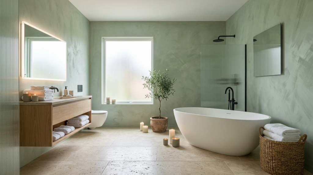
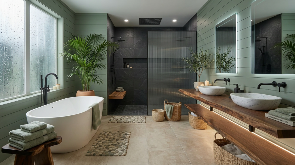
Misty Green Bathroom Paint Colours for Calm
Misty green brings that same soft, light-lifting calm as warm neutrals, but with a spa-like freshness that makes a bathroom feel cleaner and more restorative. Choose a greyed, sage-leaning green to keep it quiet and grown-up, not sugary or loud. You’ll get the most soothing effect when you pair it with warm whites, pale stone, and matte black or brushed nickel hardware.
Paint it on every wall for an enveloping cocoon, or use it on wainscoting to balance tile and mirrors. If your bathroom runs dark, pick a misty green with a higher LRV so it won’t turn muddy.
Finish with soft textiles—oatmeal towels, natural wood accents, and a plant—to reinforce the calm without adding visual clutter.
Watery Blue Bathroom Colour Ideas That Feel Clean
While crisp whites can feel stark, watery blue softens the room and still reads unmistakably clean. Choose a pale aqua or diluted sky tone for walls to bounce light and make tile lines look sharper.
If you’ve got limited daylight, pick a blue with a hint of grey so it won’t turn childish under LEDs. Pair it with bright white trim, glossy subway tile, and chrome or nickel to keep the look hygienic.
You can add depth without heaviness by painting the vanity in a slightly deeper blue, then repeating that shade in towels or a bath mat. Keep patterns minimal—thin stripes or micro-geometrics feel fresh.
Finish with clear glass and crisp grout to seal the spa vibe.
Warm Earthy Bathroom Colour Ideas With Depth
Watery blues keep things bright and crisp, but warm earthy tones bring a calmer, more grounded spa mood with extra depth. Try clay, terracotta, and cinnamon to add gentle warmth that still feels restorative.
If you want something quieter, choose sandy beige, oat, or mushroom for a soft, enveloping look.
Go deeper with olive, moss, or umber when you crave a cocooning retreat. These shades make the room feel intentional, not stark, and they hide everyday smudges better than bright whites.
For a modern spa edge, use warm taupe or muted camel as your main colour, then add a single darker accent wall for dimension. Keep finishes matte or eggshell so the colour reads velvety and serene.
Coordinate Bathroom Colour With Tile, Fixtures, and Lighting
Even the most soothing paint colour can fall flat if it fights your tile, fixtures, or lighting, so start by matching undertones across the room.
If your tile reads warm (beige, travertine, creamy white), pick paint with a soft yellow, peach, or greige base.
If it reads cool (blue-gray, bright white, concrete), stay in crisp whites, cool grays, or muted blue-greens.
Next, echo your fixture finish.
Brushed nickel loves cooler palettes; brass pops against warm whites, sand, and clay; matte black looks sharp with smoky neutrals or deep green.
Finally, test colour under your bulbs: warm LEDs deepen creams, cool LEDs flatten warmth, and daylight shifts all hues.
Paint large swatches beside tile, then view morning and night.
Conclusion
You create a spa-like bathroom by keeping your palette calm, cohesive, and softly toned. In low light, you’ll lean on warm greige and creamy whites to lift the space without glare. If you want nature-driven calm, you can choose misty sage or eucalyptus green. For a fresh, clean feel, go watery blue with crisp trim. Add depth with warm clay or sand, then coordinate tile, fixtures, and lighting for a seamless finish.


