
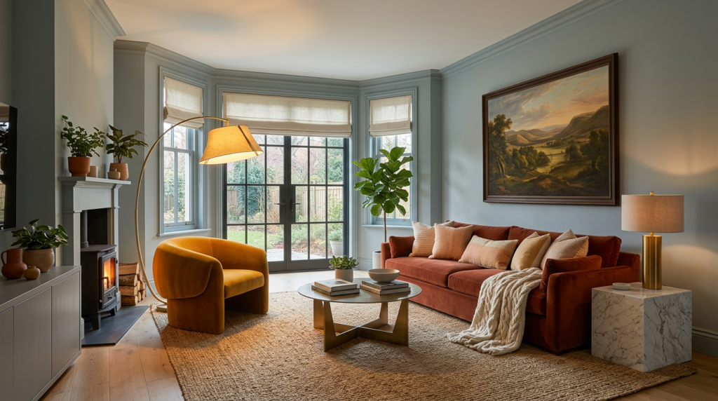
Are you wondering about the best paint colours for north-facing rooms, to choose? If your room faces north, you’re working with light that stays cooler and often pulls paint toward blue or grey. You can balance that by choosing warm whites and soft neutrals with beige, greige, or rosy undertones, then testing oversized samples from morning to night. The right shade won’t just look “fine” at noon—it’ll stay comfortable after sunset too. But a few popular colours can backfire fast…
Why North-Facing Light Makes Paint Look Cooler
Because north-facing windows rarely get direct sun, the daylight you see is mostly cool, blue-leaning ambient light reflected from the sky. That shift pulls warmth out of paint, so creamy whites read sharper, beiges lean gray, and many greiges tip greener or flatter than you expected.
You’re not imagining it: without sun’s golden wavelengths, cool pigments get amplified while warm pigments get muted.
This light also reduces contrast, so midtones can look heavier and darker on the wall, especially in matte finishes. If you choose a color with a subtle cool undertone, it can feel icy all day.
To balance it, you’ll often need warmer undertones, softer saturation, or slightly lighter values than you’d pick in a south-facing room.
How to Test Undertones With Samples (AM, PM, Night)
Although a paint chip can look perfect at noon, you’ll only spot its true undertone in a north-facing room if you test it across the full day—morning, late afternoon, and at night under your lamps.
Paint three large swatches or use peel-and-stick samples on multiple walls, especially the one opposite the window. Keep each sample at least 12×12 inches so it reads like a real wall.
In the morning, check for green, blue, or violet casts. In late afternoon, watch how shadows deepen and whether the colour turns muddy or chalky.
At night, switch on the bulbs you actually use and note any sudden pinking, greying, or yellowing.
View each sample beside your flooring and trim, and photograph it at each time for comparison.
Warm White Paint Colours for North-Facing Rooms
When you’re dealing with north-facing light, a warm white can keep the room from looking flat or chilly without tipping into obvious cream. Look for whites with a subtle beige, greige, or rosy warmth that still read “white” on the wall.
In cool northern light, these undertones counteract blue shadows and help trim and ceilings feel clean, not stark.
Start by choosing the surface: walls can handle more warmth than cabinetry or ceilings. Pair your warm white with warmer LEDs (2700K–3000K) so the colour doesn’t snap cold at night.
If your room has lots of grey finishes, pick a white with a touch of pink or taupe; if you’ve got warm woods, choose a quieter greige-white. Keep contrast soft for calm depth.
Creamy Neutral Paint Colours for North-Facing Rooms
If your space has lots of shadow, choose a creamy neutral in a light-to-mid value so corners don’t look dull or flat.
In brighter north light, you can go slightly deeper for a cozy, enveloping feel.
Pair these colours with warm metals, natural wood, and textured linens to keep the palette balanced.
Always test a large swatch on multiple walls and check it morning, afternoon, and night under your bulbs, too.
Greige and Taupe Picks for North-Facing Light
North-facing light can pull grey undertones forward, so greige and taupe work best when they carry a hint of warmth to counter that cool cast. Choose a greige that leans beige, not icy cement, and you’ll keep walls looking balanced from morning to late afternoon.
If your room reads dim, pick a lighter greige with a soft, creamy base; it’ll reflect more available light without turning stark.
For a cozier, tailored look, go mid-tone taupe with subtle brown or mushroom undertones, and you’ll avoid that flat, silvery drift.
Test swatches on multiple walls and check them beside your flooring and upholstery. In north light, undertones matter more than depth alone.
Earthy Colours That Warm Up North-Facing Rooms
Greige and taupe set a balanced base in cool light, but earthy shades add the extra warmth that can make a north-facing room feel inviting. Reach for clay, terracotta, and cinnamon tones to counteract the blue cast without going neon. You’ll get a cozy glow, especially on walls that don’t receive direct sun.
If you prefer a calmer look, try warm putty, mushroom, or soft ochre; they keep depth while staying sophisticated. Olive and muted sage also work well, but choose versions with brown undertones so they don’t read gray.
Pair these colours with creamy trims, natural wood, and brass accents to amplify warmth. Test large swatches morning to evening, and watch how the shade holds its richness.
Muted Pastels That Won’t Look Icy in North Light
While cool light can drain the sweetness from pastels, muted versions with warm undertones still read soft and welcoming in a north-lit room. Choose dusty blush with a hint of beige to flatter skin tones and keep walls calm.
Try a muted peachy apricot for kitchens or hallways; it lifts the space without turning sugary. For bedrooms, reach for a greyed lavender that leans rosy rather than blue, so it stays cozy at dusk.
Soft, clay-tinged mint works beautifully with oak, cane, and brass, giving you freshness without chill. Keep the finish in eggshell or matte to reduce glare, and test large swatches near windows and interior corners before committing.
North-Facing Paint Mistakes (Colours to Avoid)
Because cooler daylight can exaggerate blue and grey undertones, you’ll want to avoid colours that already lean icy—otherwise the room can feel flat, shadowy, and a bit unwelcoming. Skip crisp, blue-based whites, steely greys, and pale icy blues; they’ll read colder and can highlight every shadow.
Be cautious with cool taupes and greige that carry a violet cast, since north light can push them toward dingy. Don’t default to ultra-dark navy, charcoal, or black on all walls unless you’ve got strong layered lighting; they can swallow light fast.
Neon brights and stark primaries can also look harsh against cool daylight. If you’re unsure, test swatches at different times and under your evening bulbs too.
Conclusion
North-facing light can make even “neutral” paint read cooler, so you’ll get the coziest results by choosing shades with warm undertones. Test large samples morning, afternoon, and at night to catch sneaky shifts toward blue or grey. Stick with warm whites, creamy neutrals, greige, taupe, and earthy hues like terracotta to add balance to your living room. If you want color, pick muted blush or peach—skip icy whites and cool greys.


