Navy blue can make your bedroom feel like a tranquil retreat because it absorbs visual noise and adds calm, cocooning depth. Use it on one anchor surface, like the headboard wall, or layer it through bedding and curtains so the room doesn’t turn heavy or cave-like. Balance navy with warm whites, sandy neutrals, and textured linen or velvet. Add pale oak, walnut, and brass accents, plus warm 2700–3000K lighting. Keep going for placement, paint, and palette tips.
Key Takeaways
- Use navy on one anchor surface to create calm depth without making the room feel heavy or cave-like.
- Balance navy with warm neutrals—ivory, cream, sand, and greige—to soften contrast and keep the space restful.
- Add warm woods and brass accents to lift shadows, add warmth, and prevent navy from feeling cold or stern.
- Layer textures like linen, velvet, boucle, and matte finishes to add tactile comfort and visual depth.
- Counter navy’s light absorption with warm, high-CRI, dimmable lighting (2700–3000K) using ceiling light, lamps, and sconces.
Navy Blue Bedroom Basics: Light, Size, Mood
Because navy blue absorbs more light than mid-tone hues, you’ll want to size up your room’s daylight, ceiling height, and the mood you’re aiming for before committing to it. In a north-facing or shaded bedroom, treat navy as an accent wall or anchor it with crisp whites and reflective metals to keep the space from feeling heavy. If you’ve got tall ceilings or generous windows, you can wrap more surfaces in navy for a cocooning, hotel-level calm. In a small room, keep large furniture lighter and streamline visual clutter; modern minimalism makes navy read intentional, not tight. For coastal themes, pair navy with sandy neutrals, pale oak, and airy linen so it feels breezy, not nautical kitsch.
Pick the Best Navy Paint (Undertones + Finish)
While “navy” reads like a single color, the best navy paint for your bedroom comes down to undertones and finish: in daylight it can skew inky-black, green-leaning, or purple-cast, and at night it can look flat unless you pick the right sheen. Start Navy shade selection with samples on multiple walls, then check them morning, afternoon, and lamp-lit. If your room runs warm (cream textiles, brass), choose a navy with a subtle green undertone to avoid a muddy cast; if it runs cool (gray, nickel), a violet-leaning navy keeps it crisp. For paint finish options, matte hides wall flaws but can burnish; eggshell balances softness with wipeability; satin boosts depth yet highlights texture. Choose based on durability needs.
Where to Use Navy: Walls, Bedding, or Accents
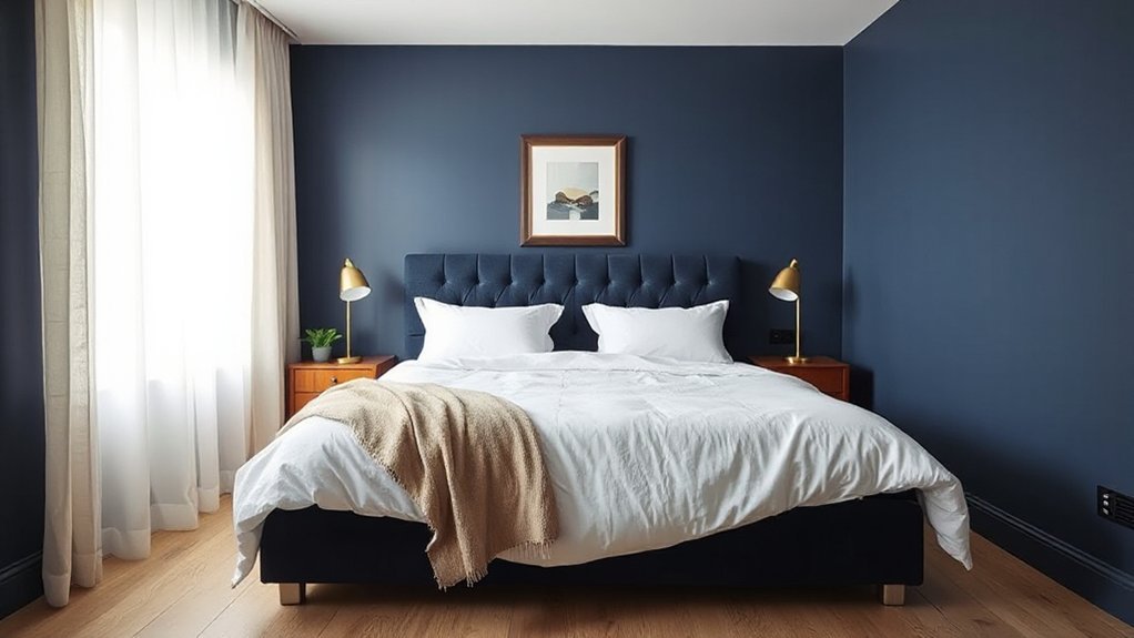
Once you’ve landed on the right navy paint sample and sheen, decide how much of that color you want in the room—full commitment on the walls, a layered look through bedding, or a lighter touch with accents. If you paint all four walls, you’ll get the most immersive effect; Navy color psychology supports this as grounding and sleep-forward, especially with dimmable lighting.
If you’re hesitant, put navy on bedding first: duvet, quilt, and shams create depth without permanently darkening the space, and you can rotate patterns seasonally. For accents, choose a single hero piece—headboard, curtains, or an area rug—so the room looks intentional. Prioritize furniture coordination: pair navy with warm woods, matte black hardware, or brass to keep the look current and tailored.
Calming Neutrals for a Navy Blue Bedroom Palette
Even if you love navy’s depth, you’ll get the most restful, designer-finished bedroom by pairing it with calming neutrals that soften contrast and keep the space feeling open. Start with warm whites, creamy ivories, or pale greige on trim, ceilings, and large textiles to prevent navy from reading heavy. Add sandy beige, stone, and putty through rugs, curtains, and upholstered pieces for a layered, quiet look. This approach aligns with Navy blue psychology: deep color signals stability and calm, while neutrals control visual weight and reduce stimulation. For subtle nautical decor themes, choose crisp white bedding, oatmeal linen, and faint stripe patterns instead of bold motifs. Finish with matte, low-sheen paint and soft, nubby textures to keep everything soothing.
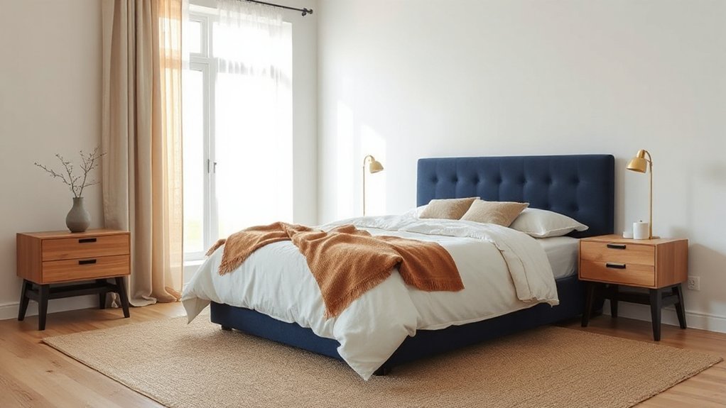
Warm It Up With Wood and Brass Finishes
Because navy can read cool and saturated in low light, you’ll get a richer, more inviting bedroom by balancing it with warm wood tones and brass finishes. Choose walnut, white oak, or teak for a grounded counterpoint; their visible grain softens crisp navy edges and adds tactile depth. If your walls are navy, add a wood headboard or nightstands; if your bedding is navy, layer in a wood bench or vintage dresser to break up the field of color.
Keep metals consistent: unlacquered brass pulls, picture frames, and a mirror edge deliver a mellow glow and a tailored, updated look. This pairing respects Navy blue symbolism—stability, trust, quiet authority—while tapping Cultural associations of maritime heritage and classic menswear. You’ll end up with calm that still feels warm.
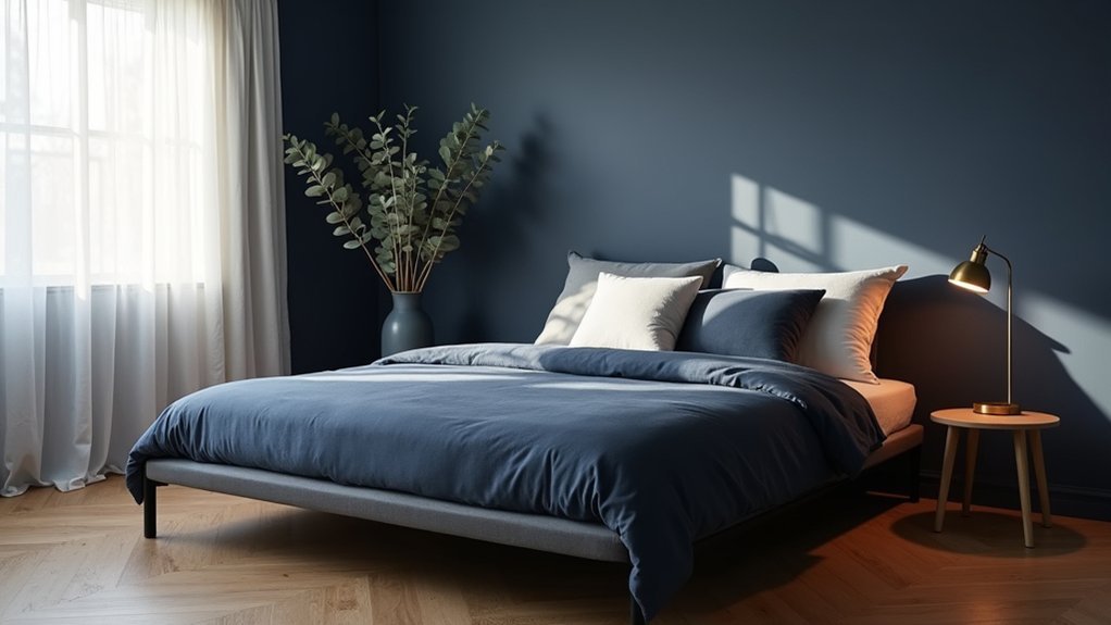
Navy Blue Bedroom Lighting: Bulbs, Layers, Placement
In a navy blue bedroom, you’ll get the richest color payoff when you choose the right bulb temperature—typically warm white around 2700K–3000K to keep the space cozy, not cold. You can’t rely on a single overhead light, so you’ll layer ambient, task, and accent lighting to add depth and highlight texture. Then you’ll place fixtures with intent—bedside sconces at reading height, a centered ceiling fixture on a dimmer, and subtle uplighting or picture lights to keep dark corners from flattening the room.
Best Bulb Color Temperatures
While navy blue walls and textiles create instant depth, your bulb’s color temperature decides whether that depth reads cozy and luxe or cold and flat. For bedrooms, aim for warm-white 2700K for a candlelit calm that complements Navy blue symbolism of trust and steadiness, reinforcing restful intent. If you want a crisp, tailored hotel vibe, choose 3000K; it keeps navy looking saturated without turning it gray. Avoid 4000K–5000K in most sleeping spaces—those cooler temps can make navy feel inky and severe, clashing with your wind-down routine. Prefer high CRI (90+) so blues don’t skew purple and wood tones stay rich. Consider tunable-white bulbs so you can shift warmer at night, slightly cooler for morning dressing.
Layered Lighting For Depth
Even if you’ve nailed the right Kelvin range, navy blue can still look flat unless you build light in layers. Start with a soft ambient base that lifts shadows and keeps the room from feeling inky. Add task lighting to sharpen contrast where you read, dress, or journal, so navy stays rich rather than murky. Finish with accent light to graze texture—woven linens, matte paint, or velvet—creating depth that feels boutique-hotel current.
Use dimmers on every layer so you can shift from energized evenings to true wind-down. This supports mood enhancement while honoring color psychology: navy reads secure and calming, but only when highlights and midtones stay visible. Choose high-CRI LEDs to preserve undertones and prevent gray cast. Keep each layer independently controllable.
Fixture Placement Strategies
Because navy absorbs light, fixture placement matters as much as bulb choice—put sources where they’ll bounce, graze, and define the room instead of disappearing into dark paint. Anchor your plan around your bedroom furniture layout, then aim light at planes: ceilings, headboards, art, and textiles. Keep glare off the bed, but don’t leave corners dead; navy needs intentional highlights to feel luxe, not cave-like.
- Center a semi-flush or small chandelier over the bed zone, not the room’s midpoint
- Mount swing-arm sconces 60–66 inches high for focused reading without harsh spill
- Add uplights behind tall dressers to lift the ceiling and soften contrast
- Aim picture lights to wash navy walls and spotlight Navy blue accessories
- Use low-level toe-kick LEDs under nightstands for hotel-style wayfinding at night
Art, Rugs, and Curtains That Add Navy Softly
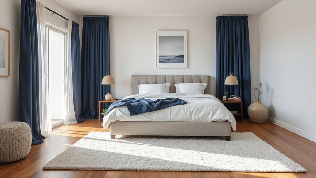
If you want navy in your bedroom without committing to painted walls or a bold headboard, layer it in through art, rugs, and curtains. Choose prints with indigo washes, navy linework, or photographic seascapes to echo Navy blue symbolism—calm, depth, and quiet confidence—while nodding to Cultural associations like maritime heritage and tailored menswear.
Anchor the room with a low-pile rug that mixes navy with warm ivory or camel; this keeps the palette serene and current. Pick a subtle pattern (micro-stripe, faded Persian, or geometric) so the navy reads as texture, not a block. Finish with curtains in linen-blend or velvet; go navy with a light-filtering lining, or select off-white panels with navy borders for a soft frame.
Navy Blue Bedroom Mistakes (and Quick Fixes)
If you use too much navy, your bedroom can read heavy and flat instead of tailored and modern—so you’ll want to balance it with crisp whites, softer mid-tones, and negative space. If your lighting skews cool or underpowered, navy turns inky and dull, so switch to warm 2700K bulbs and layer ambient, task, and accent fixtures. And if you ignore warm accents, the room feels cold, so bring in brass, oak, terracotta, or camel textiles to keep the palette current and inviting.
Using Too Much Navy
While navy blue can make a bedroom feel tailored and high-end, using it on too many surfaces can quickly tip the room into heavy, cave-like, and visually flat. You’ll lose depth when walls, bedding, drapery, and large furniture all land in the same inky value. Since Navy blue symbolism often signals authority and calm, and Cultural associations link it to uniforms and formal spaces, overuse can read stern rather than restorative.
- Limit navy to one “anchor” surface, like a headboard wall
- Add warm neutrals (ivory, sand, camel) to soften contrast
- Introduce varied textures: velvet, linen, boucle, matte paint
- Break up mass with lighter wood, brass, or stone accents
- Use pattern in small doses to create visual rhythm without noise
Poor Lighting Choices
Because navy absorbs light instead of bouncing it around, poor lighting choices can turn your bedroom into a dim, muddy space where the color reads flat and almost black. You’ll notice it most with a single overhead fixture or cool, underpowered bulbs that throw harsh shadows and kill depth.
Fix it by layering light: add dimmable ceiling lighting, balanced bedside lamps, and a targeted reading sconce so the walls stay even and the navy looks intentional. Choose high-CRI bulbs (90+) so textiles and paint show true undertones; aim for 2700–3000K to keep the mood calm without looking yellow. From a color psychology standpoint, consistent, soft illumination supports relaxation. In bedroom feng shui, you’ll sleep better when light feels gentle, symmetrical, and controllable.
Ignoring Warm Accents
Good lighting keeps navy from looking flat, but the room can still feel chilly when you skip warm accents. In color psychology, navy signals calm and depth, yet without heat it reads austere, not retreat-ready. Balance the cool base with targeted warmth so your eye lands on comfort, not contrast. Use a tight palette and repeat materials to keep it modern, not rustic.
- Add brass or aged-gold hardware to lift shadows
- Layer cream linen bedding for softer contrast
- Bring in walnut or oak nightstands for organic warmth
- Choose terracotta, rust, or blush art to humanize walls
- Ground the space with a warm-toned rug (camel, sand, taupe)
You’ll keep navy’s serenity while restoring a welcoming, lived-in glow at night.
Frequently Asked Questions
What Are the Best Plants to Pair With Navy Blue Bedroom Decor?
Pair navy blue decor with snake plants, ZZ plants, pothos, and peace lilies; you’ll get indoor air purifiers and low maintenance plants. Add a fiddle-leaf fig for height and modern contrast, keeping lines clean.
How Do I Match Navy Blue With Existing Hardwood Floor Tones?
Match navy with hardwood by echoing undertones: pair cool navy with ash/gray floors, warm navy with honey/oak. Like my swatch test, Color contrast guides choices; finish with brass, cream, and accent accessories.
Is Navy Blue Suitable for Renters Using Removable Wallpaper or Decals?
Yes, navy blue’s ideal for renters because you can use temporary wallpaper and peel and stick decals without damage. You’ll get a high-end, on-trend look; just test adhesion, avoid textured walls, and remove gently.
How Can I Incorporate Navy Without Repainting or Buying New Furniture?
You don’t need paint or new furniture—ironically, you’ll get navy’s drama easiest. Add a peel-and-stick Accent wall, then layer decorative accessories: velvet pillows, throws, ceramic lamps, framed prints, and navy bedding.
What Bedding Materials Feel Most Soothing With a Navy Blue Color Scheme?
Choose washed linen or percale cotton for crisp calm, and add breathable bamboo-viscose sheets. Layer a merino or cashmere throw for Textile textures. Use matte sateen for subtle sheen and refined color contrasts.
Conclusion
Navy blue won’t shrink your bedroom—you’ll make it feel deeper and calmer by balancing it with warm whites, sandy beiges, and layered light. Choose a paint with the right undertone, commit where it counts (a feature wall or upholstered bed), then soften the look with natural wood, brushed brass, and tactile textiles. Add dimmable bulbs, bedside sconces, and a plush rug to quiet the space. You’ll sleep better, stylishly.