
If you want your home to feel calm and connected, you can’t pick paint colours room by room and hope they’ll cooperate. You need an anchor neutral that fits your floors and fixed finishes, then you build a small palette around it while watching undertones under real light. You also plan where colours change, so transitions feel intentional. The tricky part is knowing which tests actually prevent costly surprises…
Choose an Anchor Paint Colour for Your Home
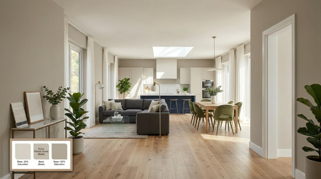
Where do you start when every paint chip looks different at home than it does in the store? You start by choosing one anchor colour to guide the rest of your palette. Pick a shade you can live with daily and that suits your home’s mood: calm, bright, cozy, or crisp.
Test it first in the space you see most, like a main hallway or living area, so it becomes your reference point. Paint large swatches on multiple walls and view them morning, afternoon, and night. Notice undertones shifting under lamps and daylight.
Once you commit, you can build a flowing set of lighter, darker, or softer companions that stay consistent from room to room.
Match Paint Colours to Floors, Cabinets, and Counters
Because your floors, cabinets, and counters take up so much visual space, you’ll get the best results by matching your paint to their undertones instead of their exact colour.
Start by choosing the fixed finishes you’re not changing soon, then pull paint options that relate to them. If you’ve got warm oak floors, pick warm whites, greiges, or muted clay tones so the room feels intentional.
If your cabinets run cool (painted white, gray, or navy), lean into crisp whites or soft cool neutrals on the walls.
With busy granite or quartz, keep wall colour quieter and let the counters lead; with simple counters, you can go deeper or more saturated.
Always test a large swatch beside each surface, at different times of day.
Spot Undertones So Paint Colours Don’t Clash
Even if two paints look like the same “neutral” on a chip, their undertones can fight once they’re on your walls. To spot them, compare each candidate to a true white and a true gray. If it suddenly reads pink, green, blue, or yellow, that’s the hidden bias you’ll carry room to room.
Next, pull one undertone family through connected spaces. If your fixed finishes lean warm (golden oak, beige stone, brass), choose warms: creamy, greige, or taupe with yellow or red notes.
If they lean cool (ash wood, white marble, chrome), stick with cool grays or blue-based off-whites. When two adjoining paints share a base, they’ll shift in depth without clashing.
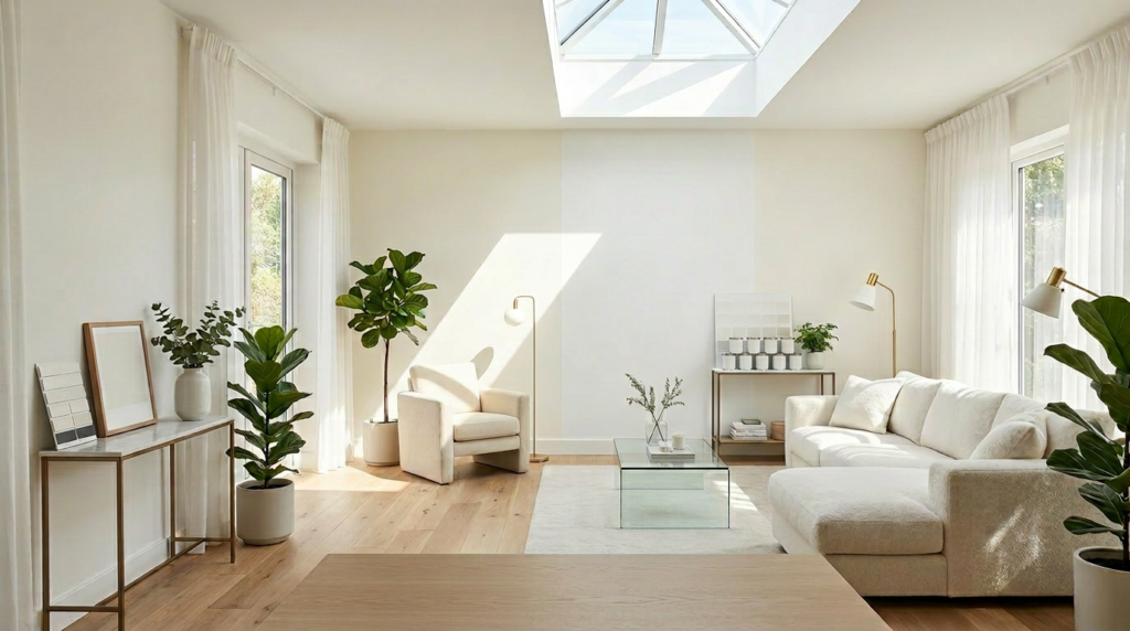
Use Natural and Artificial Light to Tweak Paint Colour
Since light changes colour more than the paint chip ever will, test your picks in the exact lighting the room gets all day and night. Paint large swatches on two walls and move around the space; what looks calm at noon can go muddy at dusk.
In north-facing rooms, cool daylight can make greys feel bluer, so you may need a warmer version. In south-facing rooms, bright sun can wash colour out, so choose slightly deeper or more muted.
Then check your bulbs: warm LEDs push whites creamy and boost reds; cool LEDs sharpen blues and greens. If you can’t change paint, tweak light instead—swap bulb temperature, add dimmers, or layer lamps to control shifts.
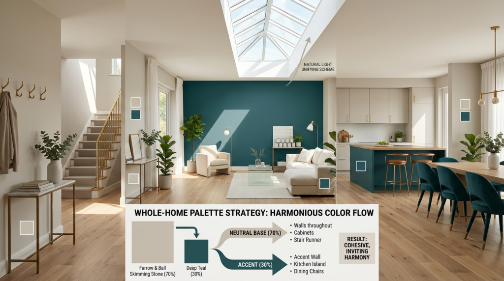
Build a Whole-Home Paint Colour Palette (3–5 Shades)
Although you can choose paint room by room, you’ll get a calmer, more cohesive result if you build a whole-home palette of just 3–5 shades and repeat them throughout.
Start with one “anchor” neutral for main walls, then add a second neutral for trim or cabinetry. Choose one mid-tone for depth in offices or dining rooms, plus one accent colour for doors, built-ins, or a single feature wall.
If you love colour, make the fifth shade a muted version of your accent so it layers easily. Keep undertones consistent (warm with warm, cool with cool) and stick to the same paint brand and finish family for predictable results.
Test your palette together on one board so you can compare quickly.
Plan Paint Colour Transitions in Hallways and Open Areas
When your hallway feeds into an open-plan space, you need a clear plan for where one paint colour stops and the next begins. Use natural breaks first: door casings, cased openings, corners, and ceiling changes. If there’s no trim, create a boundary at the inside corner where the hallway wall meets the larger room, or align the change with a structural beam or column so it feels intentional.
Keep sightlines in mind. Stand at the front door and pick the dominant wall colour you’ll see most; let it run into the open area to avoid a choppy look. Use the second shade on side walls or shorter runs.
For long corridors, continue the hallway colour until you reach the main gathering zone, then switch. Repeat the rule at every threshold for consistency.
Add Accent Paint Colours That Still Feel Connected
If you want an accent colour to look intentional instead of random, tie it to your main palette with at least one shared undertone or depth level. Start by picking accents that echo something already present: a warm greige can support terracotta, while a cool gray can handle navy or sage.
Keep contrast controlled by matching value—pair light walls with a mid-tone accent, or mid-tone walls with a deeper feature. Repeat the accent at least twice, such as a powder room door and a built-in niche, so it reads as a deliberate thread.
Use the 60-30-10 rule to limit the accent to trim, furniture, or one focal wall. Let metals, rugs, and art bridge colors between rooms too.
Test Paint Colours With Samples Before Painting
Before you commit to gallons of paint, test your top choices on the actual walls, because lighting, sheen, and nearby finishes can shift a colour fast.
Paint large swatches (at least 12×12 inches) on multiple walls, especially near windows and in shadowy corners. If you can, use peel-and-stick samples to move colours room to room and compare them to adjacent spaces.
Live with the samples for a few days and check them morning, afternoon, and night under your bulbs. Hold them next to flooring, countertops, and big fabrics so undertones don’t surprise you.
Test the exact sheen you’ll use; eggshell and satin read differently. When one option still looks right in every light, you’re ready to buy confidently.
Conclusion
When you want paint colours that flow, you’ve got to think beyond one room. Start with an anchor neutral that fits your home, then build a simple 3–5 colour palette with consistent undertones. Check how your floors, cabinets, and counters affect each shade, and watch colours shift in daylight and lamplight. Use doorways and hallways to guide transitions, and choose accents in muted, related tones. Always test samples before committing.


