
You can use colour to highlight architectural features and do more than sit quietly in the background. Start by choosing one element with a strong shape—like a fireplace, doorway, or window wall—and decide how much contrast you can handle in the room. Then control light and dark, temperature, and saturation so the feature feels intentional, not random. The tricky part is getting it right under real lighting without turning everything else into noise—so what should you test first?
Choose the Architectural Feature to Highlight
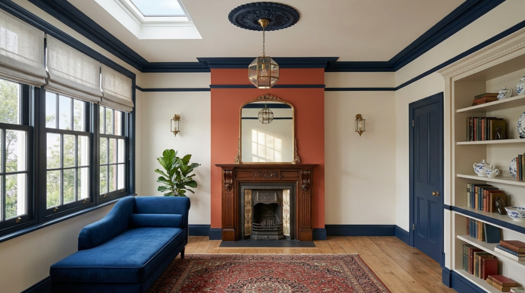
Where do you start when you want colour to draw the eye? You start by choosing one architectural feature that deserves attention. Walk the space and note what already has strong shape: a fireplace surround, arched doorway, stair balustrade, ceiling beam, bay window, or built-in shelving.
Ask what you want people to notice first when they enter, and what you’d rather let fade into the background. Consider function, too: highlight a front door for wayfinding, or a reading nook to define a zone.
Check sightlines from key viewpoints and choose a feature you can see often. Commit to one focal element so colour looks intentional, not scattered. Then plan your palette around it.
Pick a Contrast Level That Suits the Feature
Although a bold colour-block can make a feature pop instantly, you’ll get a more polished result if you choose a contrast level that matches the feature’s scale and role in the room.
For statement elements like a grand fireplace surround or built-in shelving, you can push contrast further so the form reads clearly from across the space.
For smaller details—picture rails, ceiling roses, trim profiles—keep contrast tighter so you don’t create visual noise or a patchwork effect.
Think about how the feature functions: if it’s a focal point, let it diverge from nearby finishes; if it’s a connector between zones, keep it closer to adjacent wall and ceiling colours.
Test swatches next to surrounding materials, then adjust until the feature feels intentional, not accidental.
Use Value (Light–Dark) to Define Details
Once you’ve settled on a contrast level that suits the feature, fine-tune the effect by adjusting value—the lightness or darkness of a colour. Push value apart to sharpen edges: paint trim, reveals, and window mullions a few steps lighter or darker than the wall so the profile reads from a distance.
Pull values closer to soften transitions on broad planes, letting materials and shadow do the work.
Use dark values to visually “cut in” recesses like alcoves, soffits, and niches; they’ll feel deeper and more defined. Use light values to lift projections such as cornices, columns, and balustrades, making them appear crisper.
Test swatches in place and view them in morning, noon, and evening light; value shifts more than you expect.
Adjust Colour Temperature to Set the Mood
After you’ve dialed in contrast and value, shift your attention to colour temperature—the warm–cool bias that changes how a facade feels at a glance. Warm hues read as inviting and human-scaled, so they suit entry alcoves, porch ceilings, timber details, and street-facing doors.
Cool hues feel crisp and receding, helping large wall planes look calmer and making metalwork and glazing lines appear cleaner. If you’re highlighting masonry arches or heritage trim, a slightly warmer note can echo sunlit stone.
For contemporary volumes, cooler neutrals can sharpen edges and emphasize shadow gaps. Test temperature under morning, midday, and night lighting, because LEDs and streetlights can skew perception.
Use temperature shifts to guide attention without changing brightness.
Dial Saturation Up or Down for Emphasis
When you control saturation—the intensity or purity of a colour—you decide what jumps forward and what quietly supports the composition. Turn saturation up on a single plane to make a bay, stair core, or projecting volume read as the building’s focal move.
Keep adjacent surfaces slightly muted so the highlight feels intentional, not noisy. Dial saturation down when you want form, shadow, and material texture to do the talking. A desaturated palette lets brick bonds, board marks, or metal seams appear sharper, because colour stops competing.
You can also use moderate saturation to connect related elements across a facade without flattening depth. Test your choices in different daylight: bright sun amplifies saturation, while overcast conditions soften it. Adjust accordingly for consistent emphasis year-round.
Frame Windows and Doors With Feature Colours
Saturation sets the hierarchy, but you can sharpen that hierarchy by putting colour right where eyes naturally land: at openings. Use a feature colour on the window and door surrounds to create a clear focal point and guide movement through the façade.
Pick one accent and repeat it across elevations so the building reads cohesive, not patched.
Choose contrast based on what you want: a darker surround makes glass feel larger and more recessed; a lighter surround pulls the opening forward and brightens shaded walls. Keep the feature colour slightly richer than the field colour so it holds attention without shouting.
Test it in morning and late light, because reflections and shadows can flip the perceived value. Match sheen for consistent depth and also durability.
Paint Trim and Mouldings to Sharpen Lines
Where do your eyes read a façade’s structure first? Along the trim, cornices, and mouldings that outline every plane. Paint these elements with intent and you’ll sharpen geometry without changing the building’s bones.
Use a lighter trim against a mid-tone wall to crisp up eaves, window heads, and belt courses; use a deeper trim to carve shadow lines and make recesses feel more pronounced. Keep mouldings one shade brighter or darker than adjacent surfaces so profiles stay legible, especially on ornate brackets and columns.
On interiors, paint baseboards and crown to frame the room and guide sightlines upward or outward. Match sheen to function: satin on trim resists scuffs and reads clean, while matte walls recede.
Test in Real Light and Avoid Common Mistakes
Before you commit to a colour scheme, test your samples in the actual light the building lives in, because daylight, shade, and artificial bulbs can shift undertones and contrast more than you’d expect. Paint large swatches on foam board, move them across elevations, and check them morning, noon, dusk, and under interior lighting spill. Stand back at street distance; details read differently when you’re not inches away.
Avoid the classic mistakes: picking colours from a screen, judging in a showroom, or matching to a tiny chip. Don’t ignore adjacent materials—brick, stone, roof, and landscaping will push colours warmer or cooler. Skip ultra-bright accents on ornate facades; they can flatten relief.
Finally, confirm sheen: too much gloss magnifies flaws, while dead-flat can mute trim.
Conclusion
When you use colour to highlight architectural features, start with one standout element and make it earn attention. Choose contrast that fits the room, then rely on light–dark values to sharpen edges and reveal detail. Warm or cool tones shift the mood, while saturation controls how bold the statement feels. Frame windows, doors, trim, and mouldings to guide the eye. Finally, test swatches in real lighting so your feature looks intentional, not accidental.


