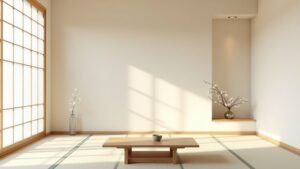
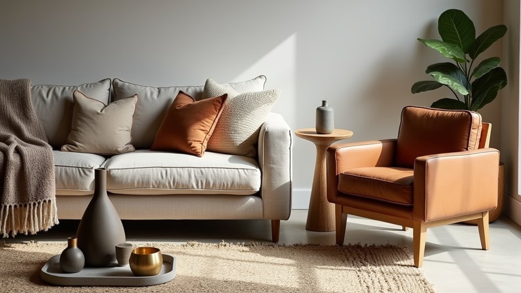
You open a finished, intentional room by layering texture through weave, grain, and sheen. Start with a base texture on big surfaces like floors and a sofa (oak, linen, concrete), then add contrast—matte with gloss, nubby with sleek—to control light and visual energy. Build depth with rugs, pillows, throws, ceramics, and repeat key textures twice for cohesion. Keep one hero texture per zone and limit high-relief hits to avoid clutter. Keep going for practical pairings and pitfalls.
Key Takeaways
- Texture shapes mood and light—matte absorbs glare, gloss reflects—making rooms feel warm, relaxed, tailored, or high-contrast.
- Layer with a 3-step method: choose a base texture, add contrasting finishes, then build depth with rugs, pillows, throws, and objects.
- Create hierarchy by letting one “hero” texture lead per zone; avoid equal material volumes that compete and flatten the design.
- Repeat each texture at least twice and use fine, medium, and bold scales to keep pairings intentional, cohesive, and uncluttered.
- Balance opposites—smooth with nubby, soft with structured, matte with sheen—bridging transitions so contrast feels deliberate, not accidental.
Texture in Interior Design: The Basics
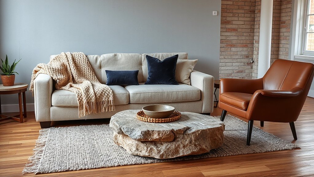
Although color and pattern usually get the spotlight, texture does most of the heavy lifting in interior design—it’s what makes a room feel warm, tailored, relaxed, or high-contrast before you even notice the palette. You read texture through touch cues and light: matte plaster absorbs glare, bouclé scatters highlights, polished stone reflects crisp edges. Treat it as a performance spec, not decoration. Pair coarse and smooth to control visual energy, and match tactile weight to function—linen slipcovers signal ease, while tight weaves and lacquer telegraph formality. Texture also steers Color psychology: velvets deepen moody hues; raw woods soften brights. Don’t ignore furniture ergonomics—grippy textiles stabilize seating, and soft pile reduces pressure points over long sits.
A Simple 3-Step Method to Layer Textures
Start by choosing a texture base that anchors the room—think a dominant material like boucle, oak, linen, or polished concrete across your largest surfaces. Next, add contrast by mixing opposing finishes (matte vs. glossy, nubby vs. sleek) so the space reads layered, not flat. Then build depth with mid- and small-scale textures—rugs, pillows, throws, and ceramics—so you’re hitting a balanced high/low mix that feels current and intentional.
Choose A Texture Base
Step one is choosing a texture base—the dominant, repeatable surface that quietly sets your room’s tactile tone and makes every other layer feel intentional. Pick one primary “feel” and commit to it across the largest planes: flooring, main upholstery, or wall finish. Use textural psychology: plush wools read cozy and sheltering, crisp linens feel calm and tailored, matte plaster signals modern restraint, and oiled woods communicate warmth and craft. Then vet the base for durability and light interaction; a low-sheen weave hides wear, while a honed stone softens glare. Finally, align with material sustainability by favoring certified woods, recycled fibers, low-VOC finishes, and traceable production. When the base is consistent, your choices look curated, not accidental, and still flexible later.
Add Contrast And Depth
Once your texture base feels locked in, you can build contrast and depth without making the room feel busy by following a simple three-step layering method: vary the scale (think a tight bouclé sofa against a chunky knit throw), mix the finish (matte, honed, brushed, and a single controlled hit of sheen), and introduce a counter-material that changes temperature or tactility (cool stone with warm wood, crisp linen with plush wool). Then, edit like a stylist: repeat each texture twice so it reads intentional, not random. Keep one “hero” texture per zone—statement plaster wall, ribbed oak, or mohair—then support it with quieter weaves. Manage color value to protect Visual harmony: pair light-on-light textures or anchor with one deep, grounding element. Prioritize Tactile sensations at touchpoints—armrests, pulls, pillows—so the room feels curated, not staged.
Why Layering Textures Makes Rooms Feel Finished
Because your eye reads a space through light and shadow, layering textures gives a room the depth that flat finishes can’t. When you mix matte, nubby, glossy, and plush surfaces, you create micro-contrast that makes styling look intentional, not accidental. You also build textural symbolism—cool stone reads tailored and modern; brushed metal signals precision; soft boucle feels relaxed—so your room communicates a point of view.
Use texture to sharpen your edit and elevate everyday sensory experiences:
- Pair smooth and rough for instant sophistication
- Repeat one texture twice to signal cohesion
- Add one reflective element to animate low light
- Balance crisp lines with touchable softness
Done well, texture layering acts like visual “finishing powder,” closing gaps and making the whole space feel curated, complete, and lived-in.
Choose a Texture Base Layer (Floors + Big Pieces)
Start with your flooring texture—it’s the largest surface in the room and sets the tone, whether you’re working with matte oak, polished concrete, or a low-pile wool rug. Then anchor that foundation with your biggest pieces, like the sofa, bed, or dining table, choosing upholstery and finishes that reinforce the mood (bouclé for softness, leather for edge, linen for relaxed modern). Once those base textures are locked in, every smaller layer you add will look intentional, not random.
Start With Flooring Texture
Before you layer in rugs, textiles, and décor, lock in your texture base with the surfaces that carry the most visual weight: your flooring and your biggest pieces. Start by reading the floor’s finish, grain, and reflectivity, because it dictates how every later layer will land. Matte oak feels warm and modern; polished stone reads sleek and high-contrast; concrete skews industrial; plush carpet softens acoustics fast. Use Color coordination to keep undertones consistent, then plan furniture placement around traffic flow so texture stays visible, not swallowed.
- Pick a dominant floor texture (wood, stone, concrete, carpet)
- Match undertones (warm/cool/neutral) across the palette
- Balance sheen: matte floors need glossy accents later
- Leave negative space to showcase grain, seams, or pile
Anchor With Large Furniture
Once your flooring sets the mood, your largest furniture pieces need to reinforce it, not fight it. Treat sofas, sectionals, beds, and dining tables as your texture base layer. If you’ve got matte oak or warm concrete underfoot, pick grounded, tactile upholstery—bouclé, brushed linen, or tight-weave wool—to add depth without visual noise. With glossy tile or polished stone, balance the shine with suede, velvet, or grained leather.
Use Anchor furniture to control contrast: keep one dominant texture consistent across big pieces, then vary only the undertones (warm/cool, light/dark). Let Statement pieces earn their role by changing texture, not scale—think a shearling chair or ribbed-wood credenza—so the room feels curated, not chaotic.
Layer Textures to Add Depth to Neutral Rooms
- Add linen drapery or relaxed Roman shades to soften window lines
- Introduce a woven leather or cane accent to break up cabinetry and casegoods
- Place a cut-pile or tonal pattern rug to deepen the floor plane
- Finish with matte ceramics, aged metals, or ribbed glass for subtle gleam
Keep tones aligned—ivory, sand, stone—while varying sheen, scale, and grain for depth.
Balance Smooth and Nubby Textures on Purpose
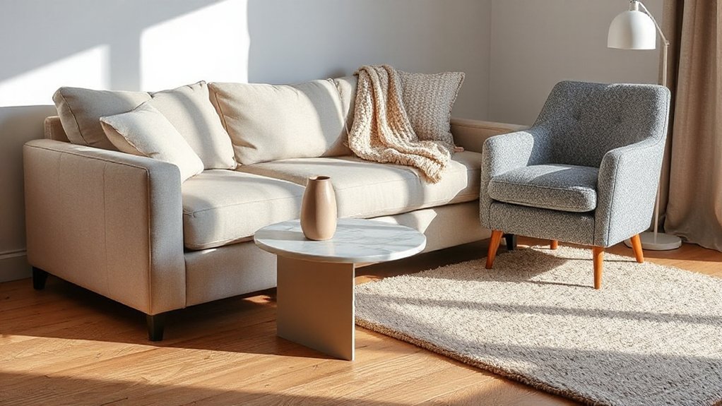
You’ll get a sharper, more intentional room when you pair sleek surfaces—lacquer, glass, tight-weave linen—with nubby notes like bouclé, jute, or chunky knits. Keep the contrast elevated by controlling scale: balance one large smooth plane (sofa or wall) with smaller, tactile hits (pillows, ottoman, shade), or flip it with a nubby rug under streamlined furniture. When you tune that smooth-to-textured ratio, the space reads modern and layered, not busy.
Pair Sleek With Nubby
Even if your palette stays neutral, pairing sleek surfaces with nubby textures keeps a room from reading flat and overly polished. When you pair sleek with nubby, you’re creating deliberate tension: light bounces off polished finishes, while tactile fibers absorb it and add depth. Aim for contrast you can feel, not chaos you can’t control, by anchoring smooth pieces with touchable layers.
- Glossy lacquer side table with a bouclé or tweed accent chair
- Polished stone countertop with a woven seagrass runner
- Glass-front cabinetry backed by slubby linen panels
- Satin metal lighting over a chunky knit throw
You’ll get a modern, editorial look that still feels livable. Keep transitions seamless, and repeat each texture at least twice so combining glossy with rough looks intentional, not accidental.
Control Contrast With Scale
Because texture contrast can read either intentional or chaotic at a glance, you need to control it with scale: let one surface lead and the other support. If your sofa is bouclé or chunky linen, keep the rug flatter—tight weave, low pile, subtle rib—so the room feels edited. If you’ve got a sleek performance velvet sectional, go bigger with nubby texture in a throw, oversized knit, or looped wool rug to add depth without noise. Aim for contrast control by limiting high-relief texture to one dominant plane per sightline. Then repeat the supporting texture in smaller hits—pillows, drapery, or lampshades—for scale harmony. This approach tracks with quiet-luxury styling: tactile, but disciplined, in every corner.
Mix Soft and Structured Textiles the Right Way
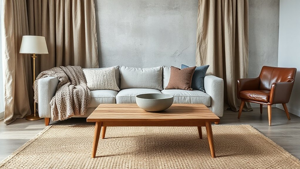
- Ground sofas and chairs with tailored slipcovers, then add one plush pillow.
- Use crisp drapery to frame windows; soften nearby with a nubby throw.
- Mix matte and subtle sheen finishes for depth without chaos.
- Plan seasonal textile changes: swap airy linens for woolens, keeping colors consistent.
Pick Rug Textures That Anchor Your Layout
Choose rug pile height with intent: low-pile and flatweaves keep high-traffic layouts crisp, while plush piles soften quiet zones and absorb sound. Balance patterns by letting the rug set the rhythm—go bold under streamlined furniture, or stay tonal when your upholstery already carries print. Lock it all in with weave choice, pairing chunky, nubby textures for warmth and grip with tighter weaves when you want a cleaner, more tailored read.
Choose Pile Height Wisely
When you get pile height right, your rug stops acting like an afterthought and starts anchoring the entire layout. Pile height controls how grounded a room feels, how furniture sits, and how your layers read from doorway to seating. For textural balance, match height to traffic, clearance, and the mood you’re building—plush isn’t always premium, and low isn’t always flat. Use these quick rules:
- Low pile (flatweave/short): crisp lines, easy chair movement, high-traffic friendly
- Medium pile: soft underfoot, stable under coffee tables, versatile in open plans
- High pile/shag: cozy zones, best where legs won’t wobble, keep edges taped down
- Layering tip: put the higher pile on top only if it won’t catch doors or heels
Balance Patterns And Weave
Although pile height sets the physical feel, pattern scale and weave structure decide whether your rug reads as a steady “base layer” or visual noise. For open-plan rooms, choose a low-contrast, large-field pattern—think tonal heathering, subtle geometrics, or quiet vintage motifs—so furniture silhouettes stay crisp. If your upholstery already runs bold, go solid or micro-pattern; if seating is plain, you can introduce a medium-scale repeat without fighting it, balancing patterns across the room. Weave matters: flatweaves and tight looped rugs look tailored and modern, while chunky knits and shaggy weaves add softness but demand simpler prints. When you’re layering textiles, keep one dominant pattern and let weave provide the secondary interest. Always sample under your actual lighting first.
Add Natural Texture With Wood, Stone, and Rattan
Because polished surfaces can read flat in even the most curated space, you’ll get instant depth by layering in natural materials like wood, stone, and rattan. Let the grain, veining, and weave do the heavy lifting: they introduce Natural materials and create Textural contrasts that feel elevated, not busy. Keep finishes intentional—mix matte with satin, and pair warm woods with cooler stone so the palette stays controlled. Use repetition to make it look designed, then vary scale to keep it current.
- Add a rattan accent chair to soften sharp-lined upholstery
- Ground the room with a stone side table or tray
- Bring in wood through a slatted bench or nesting stools
- Layer small objects: carved bowls, petrified-stone coasters, cane boxes
Aim for three distinct textures per zone to avoid clutter.
Use Wall Textures: Paint, Paneling, Plaster, Paper
Natural materials bring tactile depth at furniture level, but your biggest texture move lives on the walls. Start with paint that adds dimension: limewash or mineral paint creates soft movement and hides minor flaws while staying current. For structure, install paneling—reeded, beadboard, or slim Shaker profiles—to introduce shadow lines and architecture without major remodeling. Want artisan character? Choose plaster; a light Venetian or troweled finish delivers nuanced variation and a handcrafted feel, ideal for calm, modern rooms. For pattern and speed, use paper: grasscloth for organic weave, or vinyl-backed wallpaper where durability matters. Treat these as intentional Wall treatments, not afterthoughts. Layer Decorative finishes selectively so each surface has a role, and keep progressions clean at trim and corners.
Finish With Matte vs Glossy Accents (Without Glare)
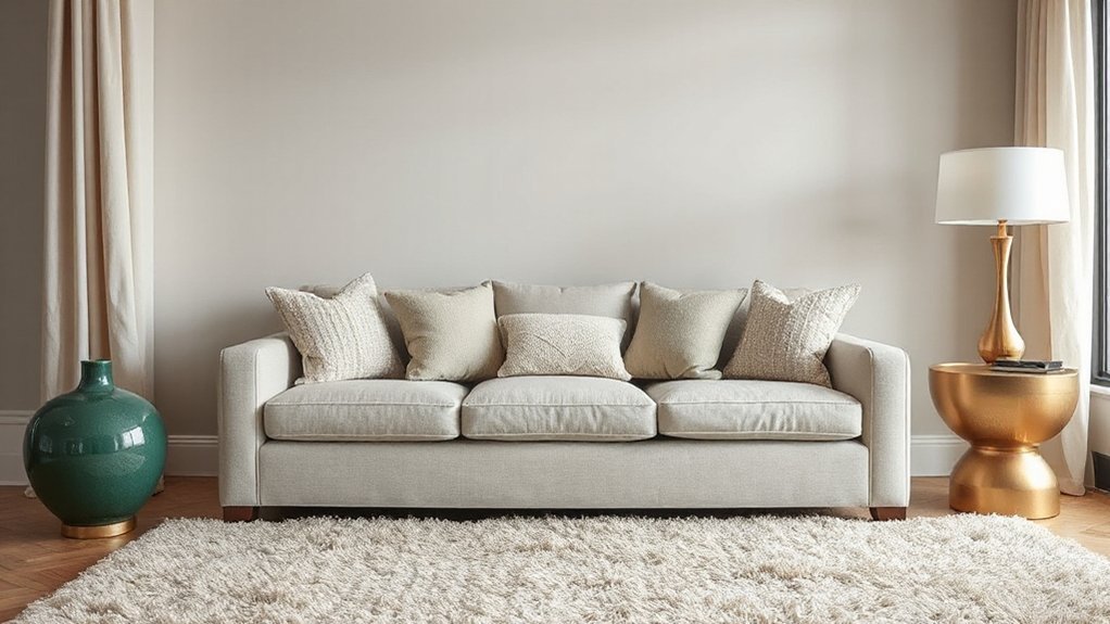
When you balance matte and glossy finishes intentionally, you control how light travels through the room—and you add texture without adding clutter. Start with matte finishes on large surfaces to calm reflections and keep color reading true. Then layer glossy accents in smaller, deliberate doses so they punctuate, not overwhelm. To prevent glare, place sheen where it won’t catch direct sightlines from seating, and avoid pairing high-gloss with busy patterns.
- Use matte paint on walls and ceilings to diffuse hotspots.
- Choose satin or eggshell on trim for a crisp edge without shine.
- Reserve high-gloss for one or two focal pieces, not every surface.
- Offset shine with textured textiles or natural wood grain nearby.
This contrast feels current, tailored, and visually quiet.
Add Texture With Lighting, Metal, and Glass Details
Although textiles do a lot of the heavy lifting, lighting, metal, and glass create the crisp, high-definition texture that makes a room feel finished. Use layered Lighting techniques: combine ambient glow, targeted task beams, and tight accent spots to rake light across plaster, grain, or stone so surfaces read richer. Choose warmer dimming (2700–3000K) to soften edges, then add a cooler highlight where you want contrast and sparkle.
Dial in Metal finishes with intent: brushed brass for a velvety sheen, blackened steel for depth, polished nickel for sharp reflection. Repeat one finish in two to three touchpoints—hardware, lamp stems, frames—to feel cohesive. Introduce glass to refract and multiply light: ribbed shades, smoked panels, or beveled mirrors add tactile shimmer without competing with fabric.
Layer Textures in Small Spaces (Without Clutter)
Even if you’re working with a tight footprint, you can layer texture strategically so the room feels collected—not crowded. Start by choosing a tight palette, then vary tactile finishes: nubby bouclé, smooth lacquer, matte ceramic, and warm-grain wood. Keep surfaces edited so texture reads as intentional, not visual clutter, and let one hero piece lead (like a ribbed rug or linen sofa).
- Use Compact storage with textured fronts (fluted doors, cane, woven bins)
- Go vertical: a slatted wall panel or textured art replaces extra objects
- Stack “soft” layers: throw + cushion + lightweight knit, all tonal
- Mix one reflective accent (glass/metal) to lighten dense materials
Aim for repeatable textures in 2–3 places so the space feels designed, not busy.
Texture Layering Mistakes + a Quick Checklist
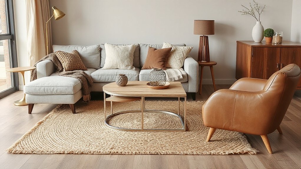
If your room feels fussy, flat, or oddly unfinished, you’ve likely layered texture without a clear hierarchy. The most common misstep is equal volume: too many “hero” materials competing. Another is mismatched sheen—high-gloss next to dead-matte with no bridge—making the palette look accidental. You also can’t ignore scale; tiny nubby weaves everywhere read like visual noise, while all-chunky knits feel heavy. Finally, skipping negative space kills modern restraint, a key trend right now. Build mistake awareness by editing, not adding.
Quick checklist: 1) Set one anchor texture (rug/sofa) and two supporting textures. 2) Mix 3 scales: fine, medium, bold. 3) Balance sheen: matte, satin, gloss. 4) Repeat one texture twice. 5) Leave one surface smooth.
Frequently Asked Questions
How Do I Layer Textures for Homes With Pets and Shedding?
Layer textures by choosing Pet friendly fabrics like performance velvet and tight-weave microfiber, then add Shed resistant textures such as flatweave rugs and leather accents. You’ll hide fur, reduce snagging, and keep spaces looking polished.
Which Textured Materials Are Easiest to Clean and Maintain?
Easy come, easy go: you’ll clean best with performance microfibre, top-grain leather, and washable slipcovers; skip Silk upholstery. Choose sealed Concrete countertops, porcelain tile, and low-pile rugs. You’ll wipe, vacuum, and maintain fast.
How Can I Add Texture on a Tight Budget Using DIY Projects?
You can add texture cheaply by upcycling throw pillows as Fabric accents, weaving no-sew macramé, and layering thrifted rugs. Create Wall treatments with peel-and-stick panels or DIY limewash, then seal for durability.
What Textures Work Best for Allergy-Sensitive Households?
Choose smooth, low-pile textures that don’t trap dust—like tightly woven Natural fibers, leather, and washable cotton. Think of a clean gallery, a Nordic retreat: add sealed wood, wipeable rugs, and Acoustic panels to cut allergens.
How Do I Update Textures Seasonally Without Redecorating Completely?
Swap only soft goods: rotate throws, pillow covers, and slipcovers using Seasonal color schemes. Use Texture switching techniques like wool-to-linen, boucle-to-cotton, and jute-to-sisal. Add one seasonal rug pad and refresh curtain panels.
Conclusion
When you layer textures with intention, your room stops feeling flat and starts feeling designed. Use a grounded base (floors and key upholstery), build depth with mid-layer fabrics and natural materials, then finish with balanced matte and gloss accents that catch light without glare. One stat to remember: the human eye can distinguish around 10 million colors, but it relies on texture to read depth and comfort quickly. Keep edits tight, and your space will feel complete.