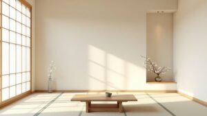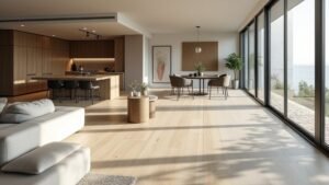
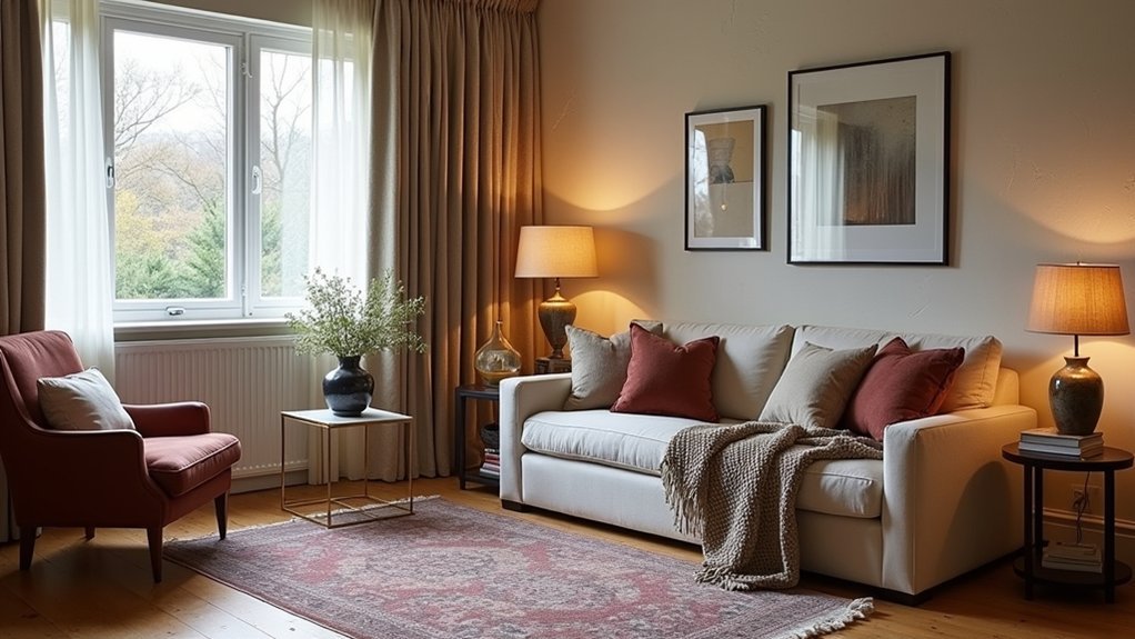
Layering in interior design means you build depth and a “finished” feel by stacking a base layer (paint, flooring, large furniture), a middle layer (textiles, secondary pieces, tiered lighting), and a finish layer (art, plants, hardware, styled objects). You control contrast, scale, and repetition so the room stays cohesive, not cluttered. You keep a tight color stack and add dimension through texture, pattern limits, and ambient/task/accent light on dimmers. Keep going to see it applied room by room.
Key Takeaways
- Layering builds depth by stacking color, lighting, texture, pattern, and decor to avoid a flat, unfinished room.
- Use a three-step formula: base (walls, floors, large furniture), middle (textiles, lighting), and finish (art, greenery, details).
- Create cohesion by controlling contrast, scale, repetition, and negative space instead of adding random accessories.
- Balance tactile finishes and limit patterns per zone to three, mixing distinct types while keeping colors aligned.
- Apply tiered lighting—ambient, task, accent—with dimming and warm evening temperatures to shape mood and visual hierarchy.
What Does “Layering” Mean in Interior Design?
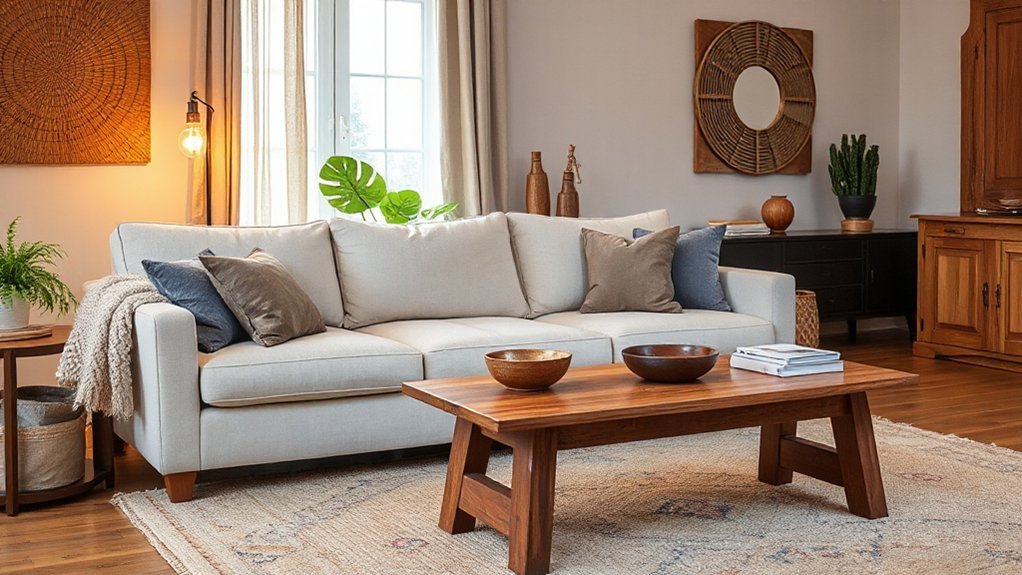
Often, “layering” in interior design means you’re building depth by deliberately stacking elements—color, lighting, texture, pattern, and decor—so the space reads as cohesive but visually complex. You don’t just “add stuff”; you control contrast, scale, and repetition so each component supports the room’s function and sightlines. You tune lighting in tiers (ambient, task, accent) to create hierarchy and to prevent flatness. You balance tactile finishes—matte against gloss, nubby against smooth—to manage glare, acoustics, and comfort. You also align placement with Feng shui principles, guiding flow, entry views, and energy centers. Historical influences matter: you can echo Bauhaus restraint, Art Deco geometry, or midcentury warmth while updating proportions and materials for today’s living.
The Simple Layering Formula: Base, Middle, Finish
You can keep layering consistent by using a simple three-step formula: base, middle, finish. You’ll establish the base with foundational elements like wall color, flooring, and large-scale furniture, then build the middle with textiles, secondary furniture, and lighting to add depth and function. You’ll add the finish with accents—art, decor, greenery, and high-contrast details—that sharpen the look and align it with current trends.
Establishing The Base
Where does a well-layered room actually start? You start with the base: the room’s fixed envelope and primary layout decisions. Lock in your backdrop first—paint, flooring, and large surfaces—so every later choice has a stable reference. Use color psychology to set the room’s operating mode: cool, desaturated hues for focus; warm mid-tones for sociability; low-contrast palettes for calm. Then place the foundational furniture pieces with furniture ergonomics in mind: confirm clear circulation paths, correct seat heights, and comfortable reach zones before you commit to anything decorative. Trend-wise, choose timeless base materials (matte paint, natural wood, textured stone-look) that photograph well but won’t date fast. This base becomes your measurable framework for everything that follows.
Building The Middle
After the base is set, how do you make the room feel designed instead of merely furnished? You build the middle by adding medium-scale elements that connect structure to style: secondary seating, an area rug, layered window treatments, and key casegoods like a media console or sideboard. Prioritize proportional balance—keep clearances consistent, align furniture heights, and anchor conversation zones with a rug sized to catch front legs. Create Textural contrast by mixing matte and sheen, nubby and smooth: bouclé with leather, oak with lacquer, linen with metal. Maintain Color harmony by repeating two to three tones across upholstery, rugs, and drapery, then shifting value (light/medium/dark) for depth. This stage should read cohesive, functional, and current.
Adding The Finish
Finally, how does a space shift from cohesive to undeniably finished? You add the finish layer: precise, high-impact details that sharpen the concept and guide the eye. Treat it like calibration—tighten Color harmony, then amplify Textural contrast so the room reads intentional, not staged. Keep edits small but specific; one strong move beats five random accessories. Use today’s trend toward mixed materials and warm metals, but keep your palette disciplined.
- Swap generic hardware for statement pulls in brushed brass or blackened steel
- Add a sculptural lamp with directional light to define zones and shadows
- Finish with a curated object trio (vary height, sheen, and texture)
Check sightlines, spacing, and negative space. If it feels crowded, subtract.
Why Layered Rooms Feel Finished (Not Cluttered)
Although “layering” can sound like adding more stuff, it actually gives a room visual structure—clear foreground, midground, and background—so your eye reads the space as intentional rather than busy. You control that read by varying scale, texture, and contrast, not by stacking random decor.
Start by defining zones with tight furniture grouping, then repeat materials across layers (wood tone, metal finish, linen) to create continuity. Use negative space as an active layer: leave breathing room around silhouettes and keep pathways clean. Limit your palette, then add depth through tactile swaps—bouclé, ribbed glass, nubby wool—rather than more colors. For seasonal updates, rotate small, high-impact pieces (pillow covers, throws, stems) while keeping core textures consistent. Edit with rules: one hero, two supporting accents, and balanced asymmetry throughout.
Start With Anchors: Sofa, Bed, Dining Table
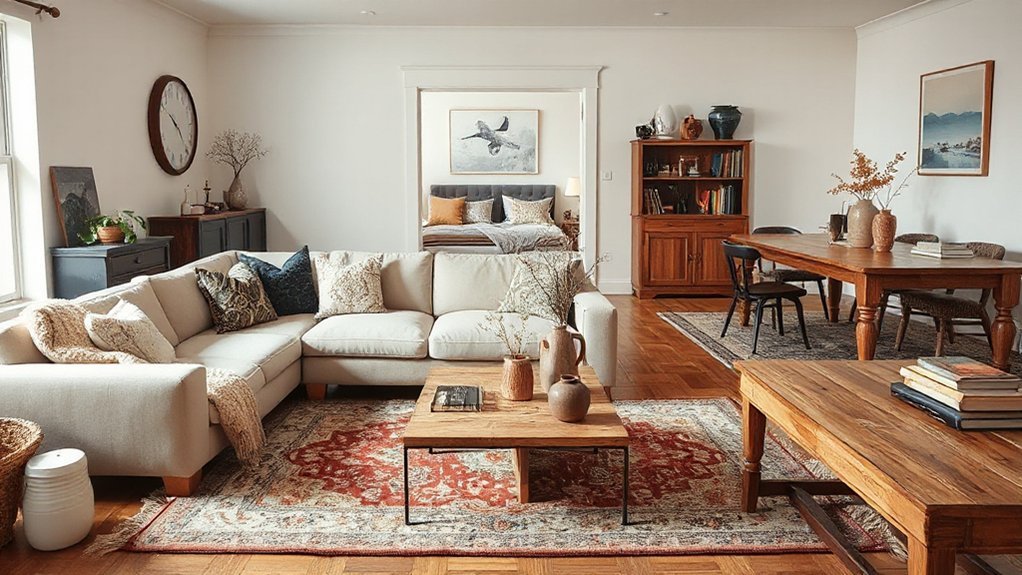
Once you lock in the room’s anchor piece—your sofa, bed, or dining table—you set the scale, circulation, and visual “weight” that every other layer has to support. Start by measuring clearances: you want comfortable pathways and pull-out zones before you add anything else. Then check furniture ergonomics: seat depth, table height, and headboard height should match how you actually lounge, sleep, and host.
- Map traffic flow with tape so doors, drawers, and chairs clear cleanly
- Choose proportions that balance ceiling height, window size, and rug footprint
- Use Color psychology to validate the anchor’s mood (calming, social, focused) without committing to a full palette yet
Pick durable, current silhouettes—low-slung sofas, platform beds, or rounded tables—to future-proof the layers you’ll build.
Set Your Color Stack: Neutral, Bridge, Accent
A clean color stack keeps your layers cohesive without locking you into a one-note scheme. Start with a neutral base (walls, large rugs, big upholstery) to control glare and make edits easier. Then choose a bridge color that links warm and cool notes across the room; think muted clay, olive, or smoky blue to support Color harmony without dominating.
Finish with a tight accent range—one high-contrast hue plus one metallic or ink-dark—used in small, repeatable hits. Tie accents to furniture placement: echo the accent near key anchors, then step it outward to secondary zones so your eye travels. Keep ratios disciplined (70/20/10) and test swatches in morning and evening light before committing to paint or large pieces.
Add Texture Fast: Wood, Metal, Fabric, Leather
Four materials can upgrade your room’s depth in a single afternoon: wood, metal, fabric, and leather. Start with one dominant texture (often wood) to anchor the space, then layer in Textural contrast through finish shifts: matte, brushed, woven, or burnished. Keep Material pairing intentional—warm wood with blackened steel reads modern; oak with brass feels updated classic.
- Swap a wood tray or side table for instant grain and warmth
- Add metal via a lamp, cabinet pulls, or a framed mirror for crisp edges
- Use fabric and leather on touchpoints: a bouclé pillow, linen throw, or leather ottoman
Balance hard and soft by distributing each material across at least two locations, so it looks designed, not accidental.
Mix Patterns the Easy Way (And How Many to Use)
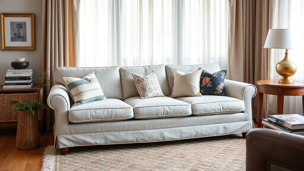
If pattern mixing feels risky, use a simple rule: pick one “hero” pattern (largest scale), one supporting pattern (medium), and one subtle pattern (small or near-solid), then repeat a shared color to keep it cohesive. Limit yourself to 3 patterns per zone; go to 4 only in open-plan spaces, and keep the extra one ultra-quiet (tone-on-tone). Apply Color psychology: blues and greens calm bedrooms, warm reds and terracottas energize dining, and neutrals stabilize busy prints. Distribute patterns through furniture arrangement, not random scatter—anchor the hero on a rug or drapery, place the medium on pillows or a chair, and reserve the subtle for throws or lampshades. Keep pattern types distinct (stripe + floral + geometric) so they don’t compete visually.
Balance Shapes: Curves, Straight Lines, Visual Weight
After you’ve set your pattern mix, you’ll want to balance shapes by pairing curves (arches, round tables, bouclé seating) with straight lines (casework, shelving, rectilinear rugs) so the composition reads intentional. Distribute visual weight by spreading dark tones, bulky silhouettes, and high-contrast pieces across the room instead of stacking them on one side. Use soft-versus-sharp contrast—like a curved sofa against angular lighting or a crisp console—to keep the layer stack current and visually stable.
Mix Curves And Lines
While layering often focuses on color and texture, shape does just as much heavy lifting—so mix curves and straight lines to control visual weight and keep the room from feeling rigid or overly soft. Start by pairing a rectilinear sofa with a round coffee table, or offset a curved lounge chair with a crisp console. This push-pull sharpens color harmony because repeated silhouettes read like a pattern, not clutter. Use furniture placement to create clean sightlines: align straight edges with architecture, then soften shifts with arcs at corners or in the center zone.
- Match one dominant line type with one contrasting accent shape
- Echo curves in lighting, mirrors, or rugs to build cohesion
- Use thin legs and open bases to keep shapes feeling modern and light
Distribute Visual Weight
Where does your eye land first when you enter the room? That focal pull reveals visual weight: size, placement, color intensity, and line direction. To distribute it, map the room into quadrants and check that no side carries all the mass. Use furniture arrangement to stagger larger pieces—sofa, console, bookcase—across the plan, and offset them with medium forms like chairs or poufs. Curves read lighter and keep circulation fluid; long straight lines feel heavier and anchor sightlines, so spread them along different walls. Apply Color psychology deliberately: saturated hues advance and gain weight, while muted tones recede. Repeat one “heavy” accent twice, then echo it with slimmer profiles elsewhere. Keep aisle widths consistent.
Contrast Soft And Sharp
Because your eye reads shape before it registers material or color, you’ll get a cleaner, more modern layer stack by pairing soft curves with sharp lines to balance visual weight. Use curves to slow the gaze and add comfort; use straight lines to frame zones and sharpen sightlines. Keep proportions intentional: one dominant geometry, one supporting, and one accent, so the room feels edited, not busy. Let Textural contrast do the heavy lifting—bouclé against lacquer, ribbed glass against smooth stone—while Color harmony keeps edges from feeling harsh. Track “visual weight” with scale and darkness: big, dark, angular pieces anchor; light, round forms float.
- Arc a round mirror over a linear console
- Pair a curved sofa with a rectilinear rug
- Offset boxy cabinetry with a soft pendant
Use 3 Lighting Layers: Ambient, Task, Accent
If you want a room to feel intentional and flexible from day to night, you can’t rely on a single overhead fixture—build your lighting plan in three layers: ambient, task, and accent. Start with ambient light to set baseline brightness: use dimmable ceiling fixtures, cove lighting, or evenly spaced recessed cans for glare control and consistent lux levels. Next, add task lighting where you work—pendants over counters, swing-arm sconces by seating, or under-cabinet LEDs—so you’re not over-lighting the whole room. Finish with accent lighting to guide attention and create depth: wall washers, picture lights, and uplights. Apply Lighting concepts like beam angle and CRI, and use Color psychology by shifting to warmer Kelvin at night for calm.
Layer Textiles: Rugs, Curtains, Pillows, Throws
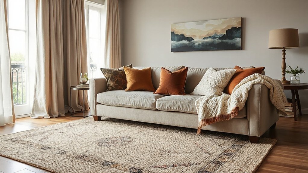
Next, you’ll build tactile depth by layering textiles: stack rugs to zone seating and add contrast in pile, pattern, and scale. You’ll get a cleaner, more tailored window by mixing sheers with heavier drapes, then tuning fullness, length, and hardware finish to match your style. You’ll finish the composition by styling pillows and throws in a tight palette, varying textures and sizes for a modern, curated look.
Layer Rugs For Depth
While a single rug can anchor a room, layering rugs creates instant depth and more control over scale, texture, and zoning. Start with a large, low-pile base (jute, sisal, flatweave) to stabilize furniture, then add a smaller accent rug on top for color, pattern, or plushness. Keep rug placement intentional: align edges to pathways, center the top layer under a coffee table, or angle it slightly to define a reading nook without moving furniture. Prioritize textile pairings that contrast but don’t clash—matte with sheen, tight weave with shag, neutral base with a bold motif.
- Use rug pads to prevent drift and reduce wear
- Match pile heights to avoid trip points at edges
- Echo one hue across both rugs for cohesion
Mix Curtains And Drapes
How do you make a window feel taller, softer, and more finished without changing the trim? Mix curtains and drapes with a two-track rod: a sheer inner layer for daylight control and an outer drape for insulation and visual weight. Mount hardware 4–8 inches above the casing and extend it 6–12 inches past each side so panels stack off glass and the opening reads wider.
Choose Curtain styles by function: ripplefold sheers for clean lines, Roman shades if you need top-down privacy, or café curtains for kitchens. Then select Drape materials by performance: linen blends for relaxed texture, velvet for light blocking and acoustics, or wool for warmth. Keep hems kissing the floor and match pleat fullness to room scale.
Style Pillows And Throws
Once your window layers handle light and insulation, shift to the seating zone and build the same depth with pillows and throws. Start with Pillow pairing: anchor two solids that match your largest upholstery tone, then add one patterned accent that echoes your rug or art. Control scale—mix a large motif with a tight weave so the set reads curated, not busy. For Throw styling, choose a contrasting texture (bouclé, mohair, or washed linen) to boost tactility and hide wear.
- Use a 60/30/10 color split: base, secondary, pop
- Vary fill density; firmer backs, softer lumbar for ergonomics
- Finish with intentional drape: fold for crisp, puddle for relaxed
Keep quantities odd, and align finishes with current matte, natural fibers.
Finish With Personal Pieces: Art, Books, Plants, Objects
After you’ve locked in your foundational layers—furniture, lighting, and textiles—personal pieces give the room its signature. Use art to set hierarchy: hang one anchor piece at eye level, then cluster smaller works with consistent spacing. Style books as risers and color blocks; mix vertical stacks with a few horizontal piles to vary rhythm. Add plants for biophilic texture and to soften hard edges—choose one tall form plus a trailing variety for contrast. Finish with objects that read intentional: trays to corral, bowls for catchalls, and sculptural ceramics for matte depth. Keep a tight palette and repeat materials (brass, oak, stone) so your personal touches feel curated, not cluttered. These decorative accents complete the layer stack.
How to Layer a Small Room Without Shrinking It
Even if your square footage is tight, you can still build depth by layering vertically and keeping sightlines open. Start with a light-to-mid value base to bounce light, then add contrast through thin profiles: picture ledges, slim sconces, and sheer-over-blackout window layers. Use Color psychology to steer perception—cool, desaturated hues recede; warm accents should stay small and intentional. Apply Feng shui principles by keeping pathways clear, anchoring the bed/sofa to a solid wall, and balancing weight left-to-right so the room feels stable, not crowded.
- Mount curtains high and wide to visually stretch walls.
- Choose one oversized rug, not multiple small mats.
- Stack textures (linen, boucle, cane) while limiting patterns to one.
How Layering Shifts by Style: 6 Common Looks
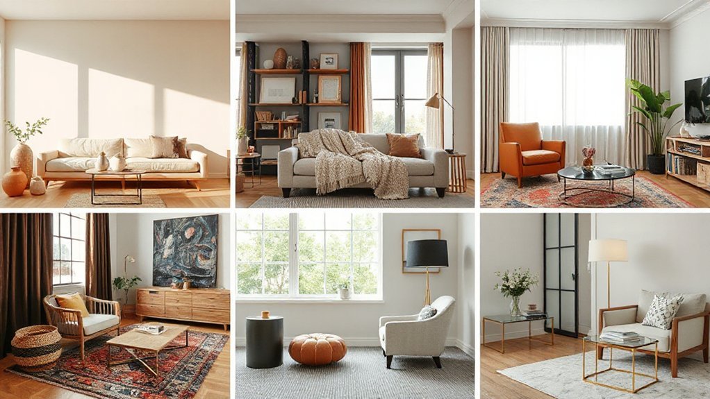
Small-room layering focuses on scale and sightlines; style-based layering changes the rules by shifting your palette, contrast level, and material stack. In Scandinavian, you’ll stack pale woods, matte whites, and wool for low visual noise. In Modern, you’ll use crisp planes, tight seams, and one high-contrast focal finish like lacquer or metal. For Industrial, you’ll layer patina—concrete, blackened steel, leather—and let joints and hardware show. In Traditional, you’ll build depth with patterned textiles, carved details, and warm undertones guided by Color psychology. In Boho, you’ll mix global textiles, plants, and artisanal ceramics, keeping a unifying hue. In Japandi, you’ll balance quiet neutrals with tactile linen and oak, optimizing furniture ergonomics through low, generous seating.
Layering Mistakes to Avoid (With Quick Fixes)
You can sabotage a layered scheme by overmatching colors and textures, so you’ll need controlled contrast—mix matte with sheen and keep patterns in the same palette but different scales. If you ignore scale and proportion, your room reads off-balance, so anchor with correctly sized rugs and key furniture, then stack smaller accents in graduated sizes. Flat lighting kills depth, so you’ll want a three-layer plan—ambient, task, and accent—using dimmers and varied color temperatures to create separation.
Overmatching Colors And Textures
- Limit repeats: cap any one color or texture at 2–3 appearances.
- Mix finishes: pair matte walls with satin trim, brushed metal, or glazed ceramics.
- Break the set: swap one matching pillow for a patterned weave or bouclé.
Quick fix: keep your palette tight, then shift materials—linen, wool, leather, and wood—to add dimension.
Ignoring Scale And Proportion
Although a layered room thrives on contrast, it falls apart fast when scale and proportion don’t line up—think undersized rugs that “float,” art that’s too tiny for the wall, or a coffee table that visually disappears against a deep sofa. To restore scale balance, start with anchors: choose a rug that tucks at least the front legs of key seating, and size your coffee table to about two-thirds the sofa length. Build proportion harmony by grouping decor in varied heights but related visual weight—pair a tall vase with a wider bowl, not two spindly pieces. When hanging art, aim for roughly 60–75% of the furniture width below it. Finally, edit: fewer oversized accents beat many mini ones.
Flat Lighting Without Depth
When lighting relies on a single overhead fixture, the room reads flat because illumination hits every surface at the same angle and intensity. You lose shadow play, and even Minimalist textures look washed out. Fix it by building layers: ambient for overall fill, task for function, and accent for depth and focal points. Use dimmers and warmer color temperatures to create hierarchy and reduce glare.
- Add two wall sconces to model faces and artwork with cross-lighting
- Place a floor lamp or table lamp at seating height to anchor zones
- Install LED strip or picture lights to graze walls, boosting texture and contrast
Choose Innovative lighting with tight beam spreads and high CRI so materials read true. Balance brightness ratios, not just lumens, for depth.
Room-by-Room Layering Checklist You Can Follow
To layer a room like a pro, you need a repeatable system that moves from fixed elements to flexible finishes without missing the details that make a space feel “done.” Start with architecture: paint, flooring, and window treatments, then set your plan using Color theory (undertones, contrast, and a 60/30/10 mix). Next, lock in Furniture arrangement: establish traffic flow, anchor with a rug, and balance heights. Add lighting in tiers—ambient, task, accent—on dimmers to avoid flatness. Layer textiles: curtains, pillows, throws, and bedding with varied weaves. Bring in hard finishes: wood, metal, stone, and glossy accents for reflectance. Style in clusters: books, art, plants, and ceramics; repeat shapes and colors. Finish with scent, sound, and negative space.
Frequently Asked Questions
How Much Should I Budget to Layer a Room Effectively?
Budget $300–$1,500 per room for effective layering, depending on scale. Prioritize rugs, lighting, and textiles for textural contrast and color coordination. You’ll spend more if you add custom drapery, art, and upgraded furniture.
Can I Layer Successfully in a Rental Without Painting or Drilling?
Yes, you can layer successfully in a rental without painting or drilling. Use peel-and-stick Wall textures, removable hooks, and tension rods. Apply Lighting techniques like plug-in sconces, floor lamps, and smart bulbs. Add rugs, throws, art.
What’s the Best Order to Layer When Buying Pieces Over Time?
Start with a solid anchor rug, then key seating, then lighting, then storage, then art, then textiles. Lock Color schemes early; refine Texture combinations later. You’ll stay flexible, budget-smart, and on-trend as you upgrade.
How Do I Layer Sustainably Using Secondhand or Upcycled Decor?
Layer sustainably like a careful weaver: you’ll thrift core anchors first, then add Vintage textiles and upcycled accents. You’ll verify durability, washability, and VOCs, choose Eco friendly materials, refinish locally, and rotate seasonal layers.
How Do I Maintain Layered Spaces With Kids or Pets?
You maintain layered spaces by anchoring rugs, using washable slipcovers, and rotating delicate accents upward. Apply child proofing tips like corner guards and storage bins; choose pet friendly materials like performance fabrics, leather, low-pile rugs.
Conclusion
Layering turns your space into a system, not a stash. You start with strong anchors, then stack a neutral-to-accent color plan, and finish with texture, lighting, and well-scaled accessories—like tuning an equalizer until every frequency lands clean. If you’re working small, you keep pieces leggy, use vertical layers, and repeat tones to prevent visual shrinkage. Avoid over-patterning and random décor; instead, edit, balance, and let each layer earn its footprint.