
You can’t pick a bedroom colour scheme by scrolling and guessing; you need to decide how you want the room to feel—calm, cosy, or airy—then check what your light actually does all day. Start with one anchor you already love, like a duvet or artwork, and let it set your undertones. From there, you’ll balance walls, trim, and accents so nothing clashes. The part most people skip is what changes everything…
Decide the Bedroom Mood (Calm, Cosy, Airy)
Before you pick a single paint swatch, decide how you want your bedroom to feel: calm, cosy, or airy.
A calm mood suits you if you crave rest and mental quiet. Choose soft, muted colours like misty blues, gentle greens, warm greys, or dusty lavender, and keep contrast low.
If you want cosy, aim for comfort and intimacy. Pick deeper, warmer hues—terracotta, cocoa, olive, or inky navy—and balance them with creamy neutrals so the room doesn’t feel heavy. Add one rich accent colour to anchor the space.
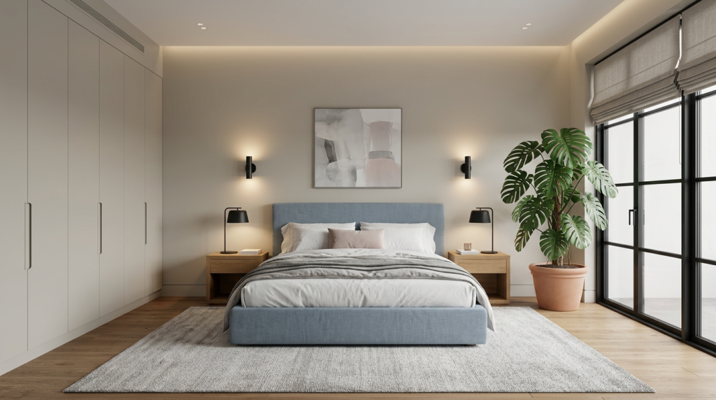
For an airy mood, you’ll want openness and ease. Use pale neutrals, light pastels, and crisp whites, then keep patterns minimal and finishes clean.
Check Light Direction and Bulb Temperature
Because light changes how paint reads, you’ll want to check your room’s natural light direction and your bulb temperature before you commit to a colour scheme.
North-facing rooms skew cooler, so warm whites, greiges, and soft blush tones can keep things inviting.
South-facing light runs warm and bright, letting you use cooler hues like blue-grey or sage without feeling chilly.
East light looks crisp in the morning but dims later; test colours at breakfast and at night.
West light turns golden in late afternoon, which can intensify warm paints and muddy some greens.
Then check bulbs: 2700K feels cosy, 3000K looks neutral, and 4000K+ reads crisp.
Match bulbs across lamps to avoid colour shifts.
Pick Your Anchor Item (Duvet, Rug, Artwork)
Once you’ve considered how your light affects colour, choose one “anchor” piece—your duvet cover, a rug, or a favourite artwork—and pull the rest of the bedroom palette from it. Pick the item you won’t tire of, since it sets the mood every day.
If it’s patterned, circle two or three tones that repeat most, then treat them as your core colours. If it’s solid, borrow contrast from its texture: crisp linen pushes you toward cleaner hues; plush wool invites softer, muted shades.
Use the anchor to guide accents too—throw pillows, bedside lampshades, and curtains should echo one tone and complement another. Keep the mix tight: one dominant colour, one secondary, one small pop.
Choose a Base Wall Colour That Suits the Room
With your anchor piece setting the direction, let your walls do the steady work of supporting it. Start by reading the room’s light: north-facing spaces lean cool, so warmer off-whites, greiges, or soft blush can balance them. Bright south light can handle cooler whites, pale blue-greens, or stone.
Consider size and ceiling height—lighter tones open tight rooms, while mid-tones add coziness in larger bedrooms without feeling cavernous. Match undertones to your anchor item so nothing clashes: pair creamy textiles with creamy paint, and crisp blacks with cleaner whites.
Test large swatches on multiple walls and check them morning, afternoon, and lamp-lit. Choose a finish you can live with, like matte or eggshell.
Build the Palette With the 60–30–10 Rule
After you’ve settled on a wall colour, use the 60–30–10 rule to keep the rest of your choices cohesive without feeling matchy.
Aim for 60% of the room in your dominant shade—usually walls plus large pieces like the rug or bedding. Then layer 30% in a secondary colour through curtains, an upholstered chair, or a duvet cover to add depth without stealing focus.
Finish with 10% in an accent colour for punch: throw pillows, art, lampshades, or a small vase.
To make it easy, pick your 60% first, then choose a 30% that sits a step darker or lighter. Use the 10% for contrast, pattern, or a small hit of metallic. Repeat accents twice for balance.
Match Undertones So Colours Don’t Clash
Even if you love two colours on their own, mismatched undertones can make a bedroom feel “off” fast. Before you commit, check whether each shade leans warm (yellow, red, peach) or cool (blue, green, violet).
Pair warm whites with creamy beiges, terracotta, or olive; pair cool whites with greys, navy, or icy pastels.
You can spot undertones by holding paint chips against true white paper in daylight: the hidden tint shows up quickly. Do the same with bedding, rugs, and wood finishes, since “neutral” fabrics often skew pink, green, or blue.
If you’re mixing metals, keep the temperature consistent—brass and oak read warm, while chrome and ash read cool.
When undertones align, your palette looks intentional, calm, and cohesive.
Make Small Bedrooms Look Bigger With Colour
When your undertones line up, you can use colour to change how big your bedroom feels, not just how it looks. For a small room, lean into light-to-mid values that reflect available light and reduce harsh visual breaks. Soft greige, misty blue, pale sage, or warm off-white can push walls outward, especially in rooms with limited daylight. Keep saturation low so the eye moves smoothly rather than stopping at bold patches.
If you want depth without shrinking the space, use one hue in a few closely related shades across walls, bedding, and curtains. That creates a continuous field that reads as more square footage.
In narrow rooms, a slightly deeper shade on the short wall can balance proportions without closing it in.
Choose Trim, Ceiling, and Accent Contrast
Because contrast controls where your eye stops and starts, your trim, ceiling, and accent choices can either calm a bedroom palette or make it feel choppy.
If you want a seamless, restful look, keep trim close to the wall colour in the same undertone, and paint the ceiling one or two steps lighter. This soft transition lifts the room without outlining every edge.
For crisp structure, choose bright white trim against mid or dark walls, but limit high-contrast pairings to one or two surfaces so the space doesn’t feel busy.
Use accents to guide focus: a darker headboard wall, black hardware, or warm wood can anchor the bed. Repeat that accent twice elsewhere so it feels intentional.
Test Paint Samples the Right Way (Day to Night)
Before you commit to a bedroom colour, test it the way you’ll actually live with it—across a full day and into the evening. Paint large swatches (at least 12×12 inches) on two walls: one that gets strong daylight and one in shade.
Better yet, paint poster board so you can move it near the bed, closet, and trim. Watch it in morning light, midday glare, late-afternoon warmth, and with your lamps on.
Note undertones that show up only at night: gray turns green, beige goes pink, white looks blue. Turn off overheads and test your bedtime lighting.
Live with the sample for two nights, then decide. Take photos, but trust your eyes more.
Conclusion
You’ll choose the perfect bedroom colour scheme by starting with the mood you want, then letting your room’s light guide every decision. Pick one anchor piece you love, settle on a wall colour that supports it, and build balance with the 60–30–10 rule. Keep undertones consistent so nothing clashes, and use contrast on trim and accents to add depth. Finally, test samples from day to night before you commit.


