
If you want a calm interior, you can’t rely on “beige” alone. You need a neutral palette with a clear base tone, the right undertone for your room’s light, and enough texture to keep it from feeling flat. Soft whites, warm sands, and muted greiges can work, but only if you balance contrast and add grounded accents like wood or clay. The tricky part is choosing what to change first.
Copy These Timeless Neutral Colour Palettes
Whether you’re decorating a room, designing a brand, or planning an outfit, you can’t go wrong with a timeless neutral palette. Copy a few proven combinations and you’ll get calm, cohesive results fast.
Try soft white + warm sand + light oak for airy serenity.
Choose greige + charcoal + brushed nickel when you want modern restraint.
Go with cream + camel + cognac leather for welcoming warmth.
Pair stone + taupe + matte black to add crisp definition without harsh contrast.
Use ivory + linen + muted sage for a natural, spa-like feel.
Prefer depth? Combine espresso + putty + brass to keep it grounded and elegant.
Repeat one shade across walls, textiles, and accessories, then vary texture—wool, linen, wood, ceramic—so the palette stays rich, not flat.
Pick Your Neutral Colour Palette Base Tone
Before you add accent colours or hunt for the perfect “greige,” choose your base tone—warm, cool, or balanced—because it sets the undertone for everything else.
Warm bases lean creamy, sandy, or caramel and make a space feel inviting; pair them with soft whites, tan leathers, and brushed brass.
Cool bases skew to crisp whites, stone, and blue-tinged greys, giving you a clean, airy look; echo them with chrome, black accents, and pale oak.
Balanced bases sit between, like putty, oatmeal, and true taupe, so you can mix metals and wood tones without clashes.
Pick one base and repeat it across walls, large textiles, and major furniture.
Then vary depth, not undertone, to keep calm.
Match Neutral Undertones to Your Room’s Light
Once you’ve settled on a warm, cool, or balanced base, let your room’s light confirm (or correct) the undertone you choose. North-facing rooms skew cooler, so warm beiges and soft greiges keep walls from feeling flat or icy.
South-facing rooms amplify warmth, so cooler taupes, stone whites, and balanced greys prevent yellowing.
Check east and west light too: morning sun can make paint look crisper, while late-day light can turn neutrals peachy.
Test large swatches on multiple walls and watch them at three times—morning, midday, and evening—under both daylight and your lamps.
If a neutral suddenly reads pink, green, or purple, you’ve got a mismatched undertone. Adjust one step warmer or cooler, then retest before committing.
Layer Textures to Warm Neutral Colour Palettes
Because warm neutrals can read one-note on large surfaces, you’ll get a richer, cozier palette by layering textures instead of piling on more colour. Start with a matte base on walls, then add tactile pieces that catch light differently: nubby linen, boucle, wool, cane, and softly grained oak. Mix smooth and rough finishes so the same beige or clay tone feels intentional, not flat.
Choose a chunky knit throw, a low-pile rug, and cushions in slubbed cotton to build warmth without changing your palette. Bring in ceramics with a chalky glaze, baskets in seagrass, and a lampshade in paper or pleated fabric.
Even small details—aged brass pulls, ribbed glass, stitched edges—add calm depth and comfort.
Use Contrast So Neutral Colour Palettes Feel Deep
Even if you stick to a single neutral colour family, you can make it feel layered by building in contrast. Pair light walls with deeper upholstery, or flip it with pale seating against a charcoal rug. Use crisp whites to sharpen edges, then add mid-tone greige or taupe to soften transitions.
Control value shifts: keep most surfaces within two to three steps, then introduce one high-contrast anchor so the room doesn’t look flat. Repeat that anchor in small ways—picture frames, a lamp shade, a patterned cushion—so it feels intentional, not random.
Mind undertones, too: cool neutrals read cleaner, warm neutrals read quieter, and mixing both without a plan can muddy the palette.
Add Earthy Accents (Wood, Clay, Green, Black)
To keep a neutral palette from feeling sterile, weave in earthy accents that add weight and warmth without changing the scheme. Bring in wood through oak frames, walnut side tables, or a pale ash stool to introduce grain and gentle variation.
Use clay and ceramic pieces—vases, lamps, bowls—in terracotta, sand, or chalky taupe to echo natural minerals. Add green in a restrained way: a single olive linen cushion, eucalyptus stems, or a matte sage throw softens hard edges without turning the room “colorful.”
Anchor everything with black, but keep it intentional—thin metal legs, a charcoal picture mount, or a simple sconce—so your neutrals feel grounded, not heavy, and balanced.
Choose Neutral Colour Palettes by Room and Mood
While your overall neutral scheme can stay consistent, each room benefits from a slightly different mix of undertones and contrast based on how you want it to feel.
In bedrooms, lean into warm ivories, soft taupe, and muted oatmeal to signal rest, then keep contrast low with layered textiles.
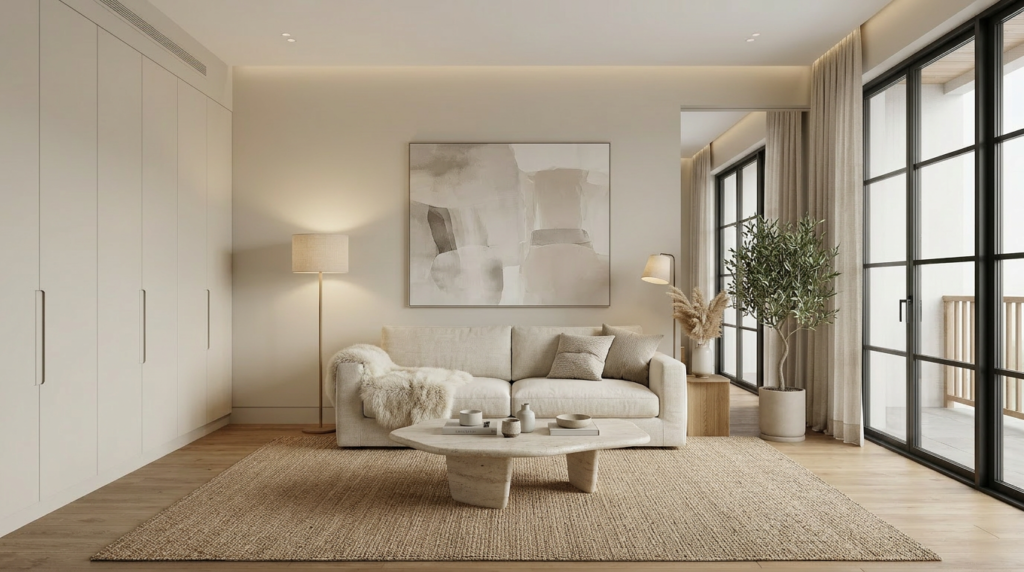
For living rooms, balance greige or sand walls with slightly deeper mushroom or charcoal accents so the space feels grounded yet social.
In kitchens, crisp off-white, pale stone, and brushed nickel read clean; add a light warm wood to prevent sterility.
Bathrooms suit cool-leaning putty, foggy gray, and chalky white for a spa effect, especially with matte finishes.
In a home office, choose camel, clay-beige, and inky black touches to boost focus without feeling stark.
Fix the Most Common Neutral Palette Mistakes
Room-by-room tweaks help you set the mood, but a neutral scheme can still fall flat if a few common missteps sneak in. If everything matches, you’ll get a washed-out look, so build contrast with one deeper anchor (charcoal, espresso, or olive) and repeat it twice.
If undertones clash, your greige may read pink beside a yellow cream, so test swatches together in morning and evening light.
If the space feels cold, swap bright white for warmer off-whites and add wood, leather, or woven textures.
If it feels heavy, lighten one plane: ceiling, trim, or rugs.
Finally, don’t skip sheen; mix matte walls with satin trim or a subtle metallic for depth and calm.
Conclusion
You can create a calm home by choosing a timeless neutral palette and letting one base tone lead. Match undertones to your room’s light so whites, sands, and greiges stay balanced all day. Then you’ll warm the look with layered textures—linen, bouclé, wool—and keep it rich with subtle contrast in matte and tactile finishes. Ground everything with earthy wood, clay, greenery, or black accents, and you won’t fall into flat, chilly neutrals.


