
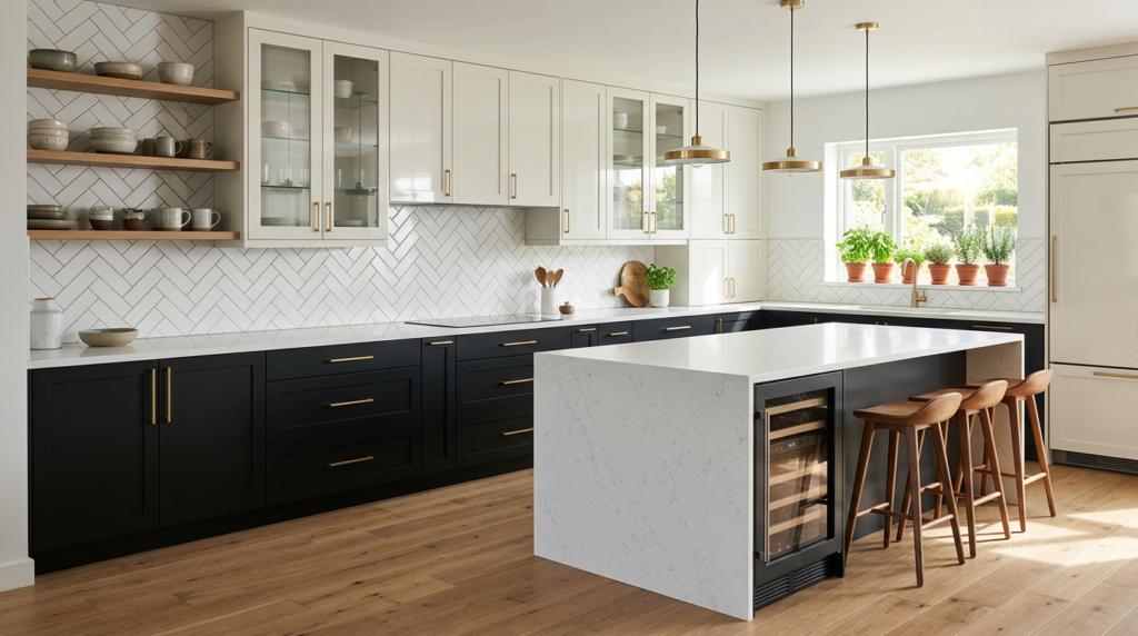
You can make your kitchen feel larger, warmer, or more tailored just by choosing the right two-tone kitchen cabinet split. You’ll decide whether the contrast sits on uppers vs. lowers, isolates the island, or frames a focal wall. A clean white paired with navy or deep green can look sharp, while wood lowers can soften the whole room. But undertones and lighting can ruin a “perfect” combo—unless you plan the order of choices. These are also popular with buyers, so could add value to your home, potentially.
Choose Your Two-Tone Cabinet Split (Uppers, Lowers, Island)
If you plan your split before you pick colours, you’ll get a two-tone kitchen that feels intentional instead of busy. Start by deciding what should visually “ground” the room. Lower cabinets carry the weight, so making them the deeper tone can anchor the layout and hide scuffs.
Keep uppers lighter to reduce heaviness, especially in small kitchens or low ceilings.
If you’ve got an island, treat it as your feature piece. You can keep perimeter cabinets unified and shift contrast to the island for a cleaner look.
In open-plan spaces, echo the island tone in nearby shelving or trim so it doesn’t feel random.
Measure sightlines from main entry points, then commit to one clear split.
Best Two-Tone Kitchen Cabinet Colour Combos (12 Ideas)
Once you’ve locked in your cabinet split—uppers, lowers, and maybe an island—you can choose colours that reinforce that structure and keep the kitchen feeling balanced.
Try these 12 reliable pairings: white + charcoal, white + navy, white + sage, cream + mushroom, ivory + warm walnut, light grey + deep green, greige + black, pale blue + crisp white, sand + slate, taupe + forest, soft blush + warm grey, and natural oak + matte black.
Keep the lighter tone up top to lift the room, and ground the space with the darker shade below. If you’ve got an island, repeat the lower colour for cohesion or switch to the darkest tone for a focal point.
Always test samples under day and night lighting.
Two-Tone Cabinet Colours by Style (Modern to Farmhouse)
Because every design style carries its own “rules” for contrast, undertone, and texture, the best two-tone cabinet colours depend on the look you’re aiming for—modern, transitional, coastal, traditional, or farmhouse.
For modern kitchens, you’ll get the cleanest read from high-contrast pairings like matte white uppers with charcoal lowers, or greige with black hardware.
If you lean transitional, choose soft, blended neutrals—warm white plus taupe, or light gray plus deep navy—so the split feels tailored, not trendy.
Coastal spaces shine with airy uppers (white or sand) and sea-inspired lowers (muted blue or blue-green).
Traditional rooms suit classic depth: cream uppers with heritage green or inky blue bases.
Farmhouse looks best with bright uppers and grounded lowers like slate or olive.
Two-Tone Kitchen Cabinets With Wood (Best Stains + Paints)
While painted cabinets bring crisp colour, wood adds warmth, grain, and depth—so two-tone kitchens often look their best when you pair a timeless stain (white oak, walnut, or a soft espresso) with a clean, undertone-matched paint.
Use wood on lowers or an island for a grounded look, then paint uppers to keep the room airy.
For stains, choose natural white oak to brighten and modernize, rich walnut to add contrast without feeling heavy, or a soft espresso when you want depth that still reads classic.
Pair oak with warm whites, creamy greige, or muted sage.
Pair walnut with soft white, dusty blue, or deep green.
Pair espresso with warm white, clay, or charcoal.
Finish with a low-sheen clear coat to highlight grain.
Two-Tone Cabinet Mistakes to Avoid (Lighting, Undertones, Hardware)
Even if you’ve picked two colors you love, two-tone cabinets can fall flat if you ignore lighting, undertones, and hardware. Test both shades in your kitchen’s morning and evening light, because warm bulbs can muddy cool paints and make contrast disappear.
If you’ve got north-facing windows, deepen one tone or you’ll end up with a washed-out scheme.
Next, check undertones. Pairing a green-leaning white with a purple-gray reads “off,” not layered. Match undertone families (warm with warm, cool with cool) or use a true neutral as a buffer.
Finally, don’t treat hardware as an afterthought. One finish can unify both cabinet colors; mixed metals work only when you repeat them consistently.
Scale matters too. Oversized pulls can overwhelm uppers.
Conclusion
You’ve got plenty of ways to make two-tone kitchen cabinets feel intentional and timeless. Start by choosing your split—uppers and lowers, a standout island, or a subtle mix—then pick a combo that fits your style, from modern contrast to warm farmhouse charm. If you want extra depth, bring in wood stains for texture and balance. Finally, test paint in your lighting, watch undertones, and match hardware so everything works together.


