
If you’re updating your kitchen to boost resale value, cabinet colour is one of the fastest ways to shape a buyer’s first impression. You can make the space feel brighter, larger, and more “move-in ready” with the right neutral, or you can signal quiet luxury with a deeper tone. But not every trendy shade holds up, and undertones can make or break the result—so which colours actually pay off?
Kitchen Cabinet Colours That Raise Resale Value
Although trends come and go, the cabinet colours that boost resale value stay remarkably consistent: they look clean, timeless, and broadly appealing. If you want broad buyer appeal, you can’t go wrong with crisp white, soft off-white, or warm greige; they photograph well, brighten the room, and make kitchens feel larger.
Light gray also performs well because it reads modern without turning polarizing. If you prefer deeper colour, choose classic navy or charcoal for a confident, upscale look that still feels neutral to most buyers.
Keep the finish smooth and even, and pair your cabinet colour with simple hardware so the space reads cohesive. You’ll signal “move-in ready” and help buyers imagine their own style.
How to Choose Cabinet Colour (Light, Undertones, Style)
Before you fall in love with a paint chip, match your cabinet colour to your kitchen’s light, undertones, and overall style so it looks intentional all day—not just at noon. Check direction: north light cools colours; south light warms them. In dim rooms, mid-tones can turn muddy, so test larger samples on multiple walls and cabinets.
Next, read undertones. Compare your countertop, backsplash, and flooring: if they skew warm (beige, honey oak, brass), pick cabinet shades with warm undertones; if they skew cool (gray stone, chrome, blue), stay cooler. Hold swatches against these fixed finishes.
Finally, respect style. Sleek slabs suit crisp neutrals or saturated hues; shaker doors handle softer, complex colours. Keep hardware and wall colour in the same temperature family.
White and Off-White Cabinet Colours Buyers Trust
When you want a cabinet colour that feels safe to most buyers, white and off-white deliver a clean, “move-in ready” look that suits nearly any countertop, backsplash, or flooring. You’ll make the kitchen feel brighter, larger, and more hygienic—three perceptions that help photos and showings land well.
Choose a soft white instead of stark, especially if your space gets warm daylight; it keeps the room from looking clinical. If your lighting runs cool, pick an off-white with a subtle creamy base so the cabinets don’t read blue.
Use a durable satin or semi-gloss finish so scuffs wipe off easily, and match your trim and ceiling whites for a cohesive, high-end impression. Keep hardware simple and consistent too.
Greige, Taupe, and Warm Beige Cabinet Colours
If you want warmth without committing to a strong colour, greige, taupe, and warm beige give your cabinets a calm, upscale look that still feels broadly “buyer-safe.” These shades soften harsh lighting, pair easily with both cool and warm finishes (think stainless steel, brushed nickel, white quartz, or wood floors), and hide everyday smudges better than bright white.
To add value, choose a balanced undertone: greige works when you need a modern neutral, taupe leans richer for depth, and warm beige keeps things inviting. Use a satin or matte finish so the colour reads sophisticated, not glossy.
Keep walls simple, then repeat the cabinet tone in a runner, hardware, or backsplash grout. You’ll get a cohesive, updated kitchen that photographs well and appeals to more buyers.
Light Wood-Tone Kitchen Cabinets That Feel Updated
Although white kitchens still dominate, light wood-tone cabinets bring back warmth in a way that feels current rather than dated. You’ll get an airy, natural look that photographs well and appeals to buyers who want something softer than stark paint.
Choose pale oak, maple, or ash with a matte finish to keep the grain subtle and modern. Pair them with simple slab or slim Shaker fronts, minimal hardware, and clean lines so the wood reads intentional, not rustic.
Balance the warmth with light, stone-like counters and a calm backsplash in off-white or sandy tones. If you want contrast, use black faucets or warm metal pulls instead of heavy patterns.
Keep staining consistent across cabinets, trim, and shelves.
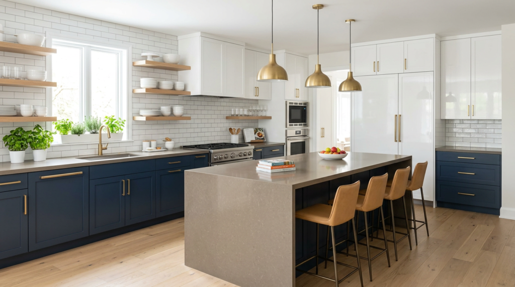
Navy and Deep Green Cabinets Without Looking Dated
Light wood cabinets keep things bright and natural, but deeper shades can add just as much character with a more dramatic edge. If you choose navy or deep green, you’ll get richness that still feels current when you balance it with clean lines and simple hardware.
Stick to classic silhouettes—Shaker or slim flat-panel doors—so the colour reads tailored, not trendy. Pair navy with warm brass or brushed nickel, and add pale counters like quartz or light marble-look surfaces to keep contrast crisp.
Deep green looks fresh with natural oak accents, creamy whites, and matte black details. Use the dark tone on lower cabinets or an island, then keep uppers light to avoid a heavy feel.
Layer in good lighting, and the shade stays timeless.
Cabinet Colours and Finishes That Hurt Resale Value
When you’re choosing cabinet colours, it’s worth remembering that some bold finishes don’t age well in buyers’ eyes and can quietly drag down resale appeal. Skip ultra-trendy shades like neon, bright purple, or heavy teal if you want broad buyer confidence.
High-gloss lacquer in intense colours can also read “cheap” or “hard to maintain,” because it shows fingerprints, scratches, and uneven touch-ups.
Be careful with distressed, crackle, or faux-antique finishes; they lock you into a specific style and make buyers price in repainting. Avoid mismatched two-tone schemes that feel random, and steer clear of busy wood stains with strong red or orange undertones that fight modern floors and counters.
If you love bold, use it on walls or décor—you can change those faster.
Conclusion
When you choose cabinet colours that feel timeless, you make your kitchen easier to love—and easier to sell. Stick with trusted whites and off-whites for a bright, clean look, or pick warm greige, taupe, and light wood tones for a modern, welcoming feel. If you want drama, go with navy or deep green in a balanced way. Avoid overly trendy shades and cheap-looking finishes, and you’ll protect resale value.


