You can mix neutral and bold colours in interiors without your space feeling chaotic if you start with a neutral base that suits your room’s undertone and light. Then you pick one or two bold shades you’ll repeat, so they look intentional rather than random. Balance everything with the 60-30-10 rule and use texture—linen, wood, matte paint—to soften contrast. The real shift happens when you decide where that bold colour should live…
Pick a Neutral Base (Undertone + Lighting)
Before you bring in bold colour, lock in a neutral base that works with your room’s undertone and lighting. Start by reading the fixed elements you can’t ignore: flooring, countertops, brick, and large upholstery. If they lean warm (yellow, red, orange), choose warm neutrals like creamy white, greige, taupe, or warm beige.
If they lean cool (blue, green, violet), stick to crisp white, cool greys, or stone.
Then test paint in your actual light. North-facing rooms dull colour and skew cool, so warmer neutrals keep the space from feeling flat. South-facing light boosts warmth and contrast, so cooler neutrals can calm it down.
Sample large swatches on multiple walls and check them morning, afternoon, and night.
Choose 1–2 Bold Colours You’ll Repeat
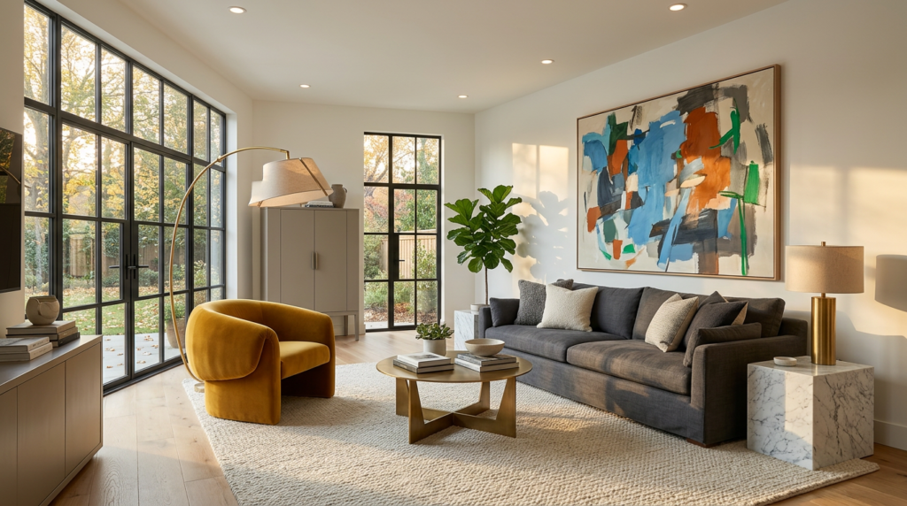
Once your neutral base is set, pick one or two bold colours you’ll repeat throughout the room so the look feels intentional, not random. Choose shades you genuinely like and that play well with your base’s undertone—think inky navy with cool greys, terracotta with warm beiges, or emerald with creamy whites.
Repeat those bold colours in small, consistent touchpoints: a cushion stripe that echoes artwork, a vase that nods to a rug detail, or a lamp shade that mirrors chair upholstery. You’re creating visual “breadcrumbs” that lead the eye around the space.
Keep the finish consistent too; a glossy cobalt reads differently than a matte one. If you’re torn, test with swatches and move them around for a day.
Mix Neutrals and Bold Colours With 60-30-10
You’ve chosen the bold colours you’ll repeat, so now give them a clear framework with the 60-30-10 rule: use about 60% neutral as the main backdrop (walls, large rugs, big upholstery).
Next, 30% is a supporting colour or secondary neutral (curtains, an accent chair, cabinetry).
And 10% is your bold hits (art, cushions, throws, lamps, small décor).
Start by listing your room’s biggest surfaces and assign them to the 60% bucket to keep the space calm.
Next, pick one supporting tone that bridges your neutral base and your bold accents; this prevents a “floating colour” look.
Keep the 10% bold consistent in finish and temperature so it reads intentional.
If the room feels flat, shift a little from 60 to 30 before increasing bold.
Put Bold Colour on Walls, Furniture, or Built-Ins
Although accessories let you test-drive colour, committing bold colour to a wall, a standout furniture piece, or a run of built-ins gives the room real structure and stops your accents from feeling scattered.
Choose one main move: a colour-washed feature wall, a saturated sofa, or cabinetry in a deep hue. Keep the rest of the shell neutral so the bold element reads as intentional, not noisy.
If you paint a wall, carry that colour in one or two smaller touches so it feels anchored.
If you pick a bold sofa, let it sit against calm walls and repeat its tone in art or a rug.
For built-ins, treat them like architecture: go darker to define the room’s edges and make neutrals look cleaner.
Mix Neutral and Bold Colours With Texture and Materials
When your palette balances neutrals with a punchy hue, texture does the quiet work of blending them. Pair smooth, bold-painted surfaces with tactile neutrals like linen, bouclé, wool, or matte plaster so the contrast feels intentional, not jarring. You’ll soften a saturated sofa by adding a nubby throw or a ribbed cushion in a close neutral.
Use materials to echo undertones. Warm whites and camel feel natural beside terracotta, brass, oak, and leather; cool greys and crisp whites click with cobalt, chrome, concrete, and smoked glass. Keep one finish dominant, then layer one or two supporting textures for depth.
You can also shift intensity with sheen: choose eggshell or matte for bold colour, and use subtle gloss on neutrals to catch light.
Pull the Palette Together With Accents and Art
Once you’ve set the main balance of neutrals and bold colour, use accents and art to repeat that hue in smaller, deliberate hits so the whole room feels connected. Choose two to three accent types—cushions, a throw, a vase, lampshades—and distribute them across the space, not in one cluster.
Let artwork do heavy lifting: pick a piece that contains your bold colour plus a neutral already in the room, then echo its tones elsewhere. Frame choices matter; black, oak, or brass can bridge warm and cool neutrals.
If your bold colour feels loud, shift it into patterns or textured finishes for softer impact. Finally, add one contrasting micro-accent (like a thin stripe or book spine) to keep the palette lively.
Conclusion
You’ll get the best mix of neutral and bold colours when you start with a neutral base that suits your room’s undertone and lighting. Then pick one or two bold shades you can repeat, so nothing feels random. Use the 60-30-10 rule to keep balance, and decide where bold belongs—walls, furniture, or built-ins. Add texture with linen, bouclé, wood, or metal to soften contrast. Finish with art and accents that tie it together.