
You want your bedroom to feel calm the moment you walk in, and colour does most of that work. You can steer the mood with soft neutrals, muted blues, or gentle greens, but the “right” shade shifts with your daylight, bulb temperature, and trim colour. If you choose without testing, the room can turn flat, chilly, or oddly busy. The next step is matching colour to your room’s light and the feeling you want most…
Bedroom Colour Ideas by Mood and Room Light
Although you might fall in love with a paint colour on a swatch, the mood it creates in your bedroom depends on two things you can’t ignore: how you want the space to feel and how much natural and artificial light the room gets.
If you want calm, choose low-saturation blues or muted greens, then test them in morning and evening light.
For energy, try brighter jewel tones, but keep them to one wall if your room’s small.
North-facing rooms skew dim, so pick colours with stronger depth so they don’t look washed out.
South-facing rooms intensify colour, so avoid highly reflective finishes.
Under warm bulbs, reds and yellows glow; under cool LEDs, blues sharpen.
Always sample large swatches beside bedding.
Soft Neutral Bedroom Colour Ideas (Warm vs Cool)
Ever wonder why one “neutral” bedroom feels cosy while another reads crisp and airy? It’s usually the undertone. Warm neutrals—creamy ivory, soft beige, greige with a hint of taupe—carry yellow, red, or brown notes that make your room feel snug, especially under warm bulbs and evening light.
Cool neutrals—pale stone, misty greige, light dove grey—lean green or violet, so the space feels cleaner and more open in bright daylight.
To choose, look at your flooring and textiles: honey woods and brass love warm shades; ash woods, chrome, and marble prefer cool ones. Test swatches on two walls, then check them morning and night before committing.
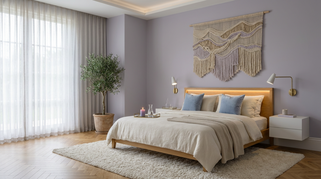
Blue Bedroom Colour Ideas That Feel Sleep-Friendly
Once you’ve nailed your neutral undertone, blue gives you an easy next step for a bedroom that feels calm without turning cold. Choose dusty denim or muted slate if you want a soft, lived-in look that still reads restful at night.
If your room runs dark, go lighter with powder blue on walls and keep trim crisp to lift the space.
For a cocooning effect, try deep navy on a single accent wall behind the headboard, then balance it with warm whites, oatmeal bedding, and brass hardware so it doesn’t feel stark.
You’ll get the best sleep-friendly vibe when you repeat blue in small doses—pillows, a throw, bedside lampshades—rather than saturating every surface.
Finish with matte paint to reduce glare and visual noise.
Green Bedroom Colour Ideas Inspired by Nature
If you want your bedroom to feel grounded and quietly restorative, green delivers that nature-linked calm without reading sterile. Start with a muted sage on the walls to soften light and make the room feel breathable.
Prefer more drama? Choose deep forest green for a headboard wall and keep the ceiling crisp to prevent heaviness.
You can layer greens through textiles: olive bedding, mossy curtains, and patterned cushions with leaf motifs. Balance the palette with creamy whites, pale greys, and natural wood so the green looks fresh, not loud.
Add living plants or botanical prints to echo the colour without overdoing it. For a modern finish, try matte paint and brushed brass accents; they make green feel tailored and serene.
Warm Earthy Bedroom Colour Ideas (Terracotta to Taupe)
When you want a bedroom that feels instantly cosy and sun-warmed, earthy hues like terracotta, clay, caramel, and taupe create that grounded calm without turning the space dark. You’ll notice these shades soften sharp angles and make the room feel more sheltering, especially in cooler light.
Choose terracotta when you crave energy that still relaxes; it reads like late-afternoon sunlight.
Go for clay or muted cinnamon if you prefer a quieter, dustier warmth.
Caramel works when you want a creamy glow that flatters skin tones and makes bedding look inviting.
Taupe is your all-rounder: it calms visual noise, balances warm and cool elements, and keeps the room feeling spacious.
Finish with natural textures—linen, wool, rattan—to reinforce the earthy mood.
Bedroom Colour Ideas: Wall, Trim, and Accent Pairing
Because the right pairings do most of the visual work, treat your bedroom palette as three coordinated parts: wall colour for mood, trim for crisp definition, and accents for contrast and personality.
Start with walls in a calming mid-tone—sage, dusty blue, warm greige, or muted clay—so the room feels settled at any light level.
Keep trim a step lighter and cleaner: soft white, ivory, or a pale version of your wall shade, which sharpens lines without stealing attention.
Then choose one accent direction and repeat it twice: charcoal and blackened bronze for depth; sand and oat for softness; or aubergine, navy, or forest for richness.
Use accents in bedding, a rug, and one statement piece, so everything reads intentional.
Bedroom Colour Mistakes That Make Rooms Feel Chaotic
You’ll also create chaos when you treat every surface like a statement: bold ceiling, loud feature wall, patterned bedding, and bright art all fighting at once.
Don’t pair warm beige with icy grey or blue-based white trim; the clash reads “off” even if each colour looks nice alone.
Skip high-gloss everywhere, since it bounces light and exaggerates contrast.
Finally, don’t forget scale: tiny, busy prints across large areas feel restless.
Limit your palette, repeat key tones, and let one element lead.
Conclusion
You create a relaxing bedroom when you match colour to mood and light. You can lean on soft neutrals for easy calm, choose sleep-friendly blues, or bring in nature with gentle greens. If you want warmth, earthy terracotta and taupe keep things grounded. Pair wall colour with crisp trim and a few darker accents for depth, not clutter. Test swatches morning and night, and avoid high-contrast mixes that feel busy.


