
We are looking at the best colour ideas for open plan living spaces, that will work for you. In an open-plan space, you can’t treat colour like an afterthought because every zone sits in view. You’ll get the best flow when you start with a base neutral that matches your light, then layer warm or cool tones to keep it from feeling flat. Add one or two accents to define areas without chopping the room up. The tricky part is choosing undertones that never clash… and that’s where most people slip.
How to Choose a Base Colour for Open-Plan?
Where do you start when your kitchen, dining, and living areas all share one sightline? You choose a base colour that unifies the whole layout before you layer accents.
First, read your fixed elements: flooring, countertops, tile, and large upholstery. Pick a base that harmonises with those undertones, not the other way around.
Next, assess light: north light cools colours, while south light warms them, so test swatches morning and night.
Then, decide the mood you want—airy, cosy, crisp, or dramatic—and select a mid-range value that won’t blow out in sun or feel heavy at dusk.
Finally, commit to one finish level across zones for continuity, then vary textures instead for visual interest.
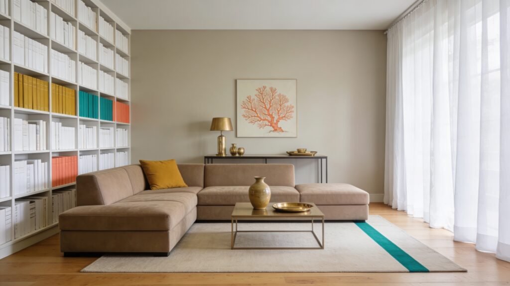
Neutral Colour Ideas for Open-Plan Living Spaces
Once you’ve settled on a base colour that plays nicely with your flooring, counters, and light, neutrals make the easiest next step for keeping an open-plan space calm and connected. Start with a soft off-white on most walls to bounce light and blur boundaries between kitchen, dining, and lounge.
Use gentle greys to add definition without chopping up the view: paint a single wall, choose a slightly deeper ceiling tint, or anchor the seating zone with a charcoal rug.
If you want contrast, pair crisp white trim with a mid-tone greige on cabinetry for a clean, tailored look. Keep undertones consistent across paint, tile, and fabrics so the room doesn’t feel patchy.
Finish with layered textures—linen, boucle, matte ceramics—to stop neutrals looking flat.
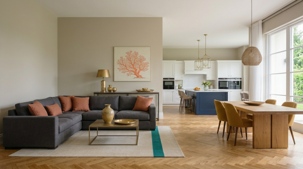
Warm Earth-Tone Colour Ideas for Open-Plan Spaces
If you want your open-plan kitchen, dining, and living areas to feel inviting rather than clinical, warm earth tones do the heavy lifting. Start with a clay, terracotta, or cinnamon wall to add instant warmth without shrinking the space. Pair it with creamy off-whites on trim and ceilings to keep light bouncing around.
Use a caramel or tobacco leather sofa to anchor the living zone, then layer rust, ochre, and burnt orange cushions to tie seating to the dining area. In the kitchen, choose walnut or oak cabinetry, or add a bronze tap and pulls for a sunbaked glow.
Ground everything with a jute rug and woven baskets, and repeat one earthy shade in art and ceramics for flow.
Cool, Calming Colour Ideas for Open-Plan Spaces
Cool palettes bring a different kind of comfort to open-plan living—one that feels airy, quiet, and intentionally uncluttered. Start with soft blue-greys or misty sage on the main walls to visually widen the space and reduce glare in bright zones. If your layout gets little daylight, choose cool off-whites with a hint of grey rather than icy, stark white.
Use deeper slate, ink, or forest tones on built-ins, a hallway run, or the kitchen island to add structure without shrinking the room. Keep ceilings a shade lighter to lift the volume, and carry the same undertone through adjoining areas so transitions feel smooth.
Finish with calm textures—linen, pale wood, brushed metal—to keep the mood grounded, not cold.
Accent Colour Pairings for a Cohesive Open Plan
Because open-plan rooms flow into each other, your accent colours need to do more than “pop”—they should repeat with intention to keep the whole space feeling unified.
Start with one anchor accent, then add a partner shade that shares an undertone. Try navy with warm brass, sage with terracotta, or charcoal with blush for a modern-soft balance.
If you love bold, pair teal with rust or mustard, then echo each colour twice through cushions, art, vases, or bar stools.
Keep finishes consistent: if you pick brushed gold, repeat it in lighting and hardware.
Use black accents to sharpen pastels, or off-white accents to calm saturated hues.
Limit yourself to two accents plus a neutral base for clean continuity.
Colour Zoning Ideas to Define Kitchen, Dining, Lounge
Repeating accent colours keeps an open-plan space cohesive, but you can also use colour to give each zone a clear role. Start with a shared neutral on main walls, then shift tones by area: choose a crisper white or cool grey around the kitchen to feel clean and bright, and a warmer greige near the lounge to feel relaxed.
Define the dining zone by changing the paint on built-ins, shelving, or cabinetry only—try a deeper olive, navy, or terracotta to signal “gather here” without closing the room in. Use the same colour on smaller touchpoints across zones (stool seats, cushions, ceramics) so the transition feels intentional.
If you’ve got an island, paint its base a distinct shade to anchor the kitchen boundary.
Feature Wall Colours That Zone Open-Plan Rooms
If you want a clear sense of “this is the lounge” or “this is the dining area” without adding walls, paint a feature wall to create a visual stop point in the sightline. Choose the wall you naturally face when you enter or sit down, so the colour does the zoning work for you.
For lounging, try deep, muted tones like inky blue, forest green, or smoky terracotta to anchor sofas and rugs.
For dining, use warmer, appetite-friendly shades such as clay, cinnamon, or a rich caramel to frame the table.
In the kitchen end, keep the feature subtle: a muted charcoal or olive behind shelving can separate the workspace without fighting cabinetry.
Repeat the feature colour in cushions, art, or tableware so zones feel connected, not chopped up.
Colour Ideas for Low-Light Open-Plan Living Spaces
Even when your open-plan space doesn’t get much natural light, the right paint colours can lift it and stop it feeling flat or cavernous. Start with warm off-whites, creamy beiges, or soft greige to bounce available light without turning chilly.
If you want colour, choose muted clay, blush, or dusty sage; they keep depth while staying reflective.
For a cosier mood, try mid-tone taupe, smoky blue, or olive on key walls, then keep ceilings a clean white to raise the visual height.
Avoid stark bright white and icy pastels, which can read grey in shade.
Finish with satin or eggshell for gentle sheen, and use colour-matched trims to reduce harsh contrast. Add darker accents through furniture rather than paint.
How to Transition Colours Seamlessly in Open Plan
Although open-plan rooms flow together, you don’t need one flat colour everywhere to keep them cohesive. Start with a “bridge” shade you’ll repeat across zones—on trim, an accent wall, textiles, or art—so your eye keeps finding familiar cues.
Then shift intensity, not direction: move from soft to mid-tone versions of the same hue as you travel from lounge to dining to kitchen. Use natural breaks to signal transitions, like a rug edge, a shelving run, or a change in pendant lighting.
Keep undertones consistent, and echo one warm or cool neutral throughout to steady the palette. Finally, let one feature colour appear in small touches in every area.
Open-Plan Colour Mistakes That Ruin Cohesion
When you decorate an open-plan space without a clear colour plan, small choices quickly add up to a disjointed feel. The biggest mistake is treating each zone like a separate room, then piling on unrelated paint colours, rugs, and cushions.
You also ruin cohesion by overusing strong accents in multiple areas, so your eye jumps everywhere instead of flowing.
Ignoring undertones is another common trap: mixing warm beiges with cool greys makes walls, floors, and cabinetry clash.
Don’t forget sightlines—if you can see the kitchen from the sofa, mismatched metals and worktops read as noise.
Finally, skipping a unifying element, like consistent trim colour, repeated wood tone, or one anchoring neutral, leaves the space without a visual thread.
Conclusion
You’ll get the best results in open-plan living by starting with a flexible base colour, then layering texture and tone so the space feels connected, not flat. Use warm earth shades or cool sages and blues to balance light levels, and add a few confident accents to define each zone. Keep undertones consistent, repeat key colours in accessories, and let lighting guide your choices. Avoid sudden colour breaks that disrupt flow.


