
You’re seeing UK interiors in 2026 lean into calm warmth and quiet depth. You can use soft clay, terracotta, and muted blush to make rooms feel inviting without looking sugary. You’ll also notice heritage greens like sage and moss paired with warm neutrals for a grounded, restorative finish. If you want more drama, you can add inky navy or charcoal to an alcove or feature wall—but the real difference comes from where you place each shade.
2026 UK Interior Colour Trends: Quick Pick Guide
Whether you’re refreshing a single room or planning a whole-house update, the easiest way to choose paint in the UK is to start with the trends that already suit our light, layouts, and period features.
Try soft clay and terracotta to warm north-facing spaces without going heavy. Choose inky navy or charcoal for alcoves, panelling, or built-ins to add depth and hide scuffs.
Go for muted blush or dusty rose in bedrooms to keep it calm, not sugary. Use misty blue-greys to sharpen white trim and flatter daylight.
Pick buttery off-whites instead of stark brilliant white for a softer backdrop. Finally, add a statement with ochre or saffron on a single wall, stair risers, or a ceiling stripe.
UK Heritage Greens + Warm Neutrals (Best Rooms)
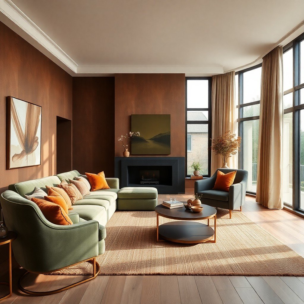
After picking your trend-led shades, you can anchor the scheme with UK heritage greens and warm neutrals—colours that suit our changeable light and feel right in period homes. Use olive, moss, or deep sage on walls to add calm depth, then balance it with clay, oat, biscuit, or soft putty on ceilings, trims, and larger furniture.
These pairings work best in living rooms, where green feels restorative against timber and brick. In dining rooms, it makes evening light look richer. In kitchens, choose green cabinetry with warm off-white walls to keep it welcoming, not cold.
In bedrooms, go lighter: sage with creamy linen tones for an easy, breathable feel. Finish with brass, rattan, and natural wool to keep the palette grounded.
2026 Inky Blue and Navy (Cosy Drama)
Why does inky blue feel so instantly cosy in a UK home? It absorbs grey daylight and makes rooms feel snug, especially in north-facing spaces.
Use it to add drama without shouting: paint a chimney breast, alcoves, or a snug’s ceiling for a cocooning effect. Pair navy with warm metals like brass, aged gold, or copper to keep it welcoming.
Balance the depth with chalky off-whites on trim and ceilings, and layer texture through wool throws, velvet cushions, and dark oak or walnut.
In kitchens, try navy cabinetry with light stone worktops for a classic-but-current look.
In bedrooms, an inky feature wall behind the headboard sharpens the space and helps you unwind.
Muted Blush and Soft Pinks (Calm Spaces)
Although pink can feel bold on a paint chart, muted blush and soft, dusty roses read as calm neutrals in UK homes, especially when grey daylight flattens harsher colours. Use them to warm north-facing rooms without losing that airy, pared-back feel.
On walls, choose a blush with a taupe or beige base so it won’t turn sugary under LEDs. Pair it with chalky whites, stone greys, and natural oak to keep the look grounded. You’ll get a flattering backdrop for black metal, smoked glass, and brushed brass without the drama of stronger reds.
In bedrooms, soften the scheme with linen bedding and wool throws; in hallways, try it as a subtle contrast to crisp skirting and pale wood floors.
Sunny Yellow Accents (How to Use Sparingly)
When you want a room to feel brighter without repainting every wall, sunny yellow works best as a small, deliberate accent. Choose one or two items, not a whole suite: a cushion, a lampshade, a vase, or a narrow stripe on shelving.
Keep the base palette calm—warm whites, greige, soft oak—so the yellow reads intentional, not noisy.
Pick a slightly muted sunflower or ochre rather than neon; it’ll feel grown-up and easier to live with. Repeat the tone once, maximum twice, to create rhythm without visual clutter.
Balance it with grounding colours like charcoal, navy, or deep green. If you’re unsure, test with removable accessories first, then commit only if the light flatters it daily.
Where These 2026 Colours Work Best at Home
Sunny accents can lift a room, but the bigger impact comes from placing your 2026 colours where they suit the light and the job the space needs to do.
In north-facing rooms, choose warm clay, soft apricot, or butter-cream to counter cool daylight and keep the space welcoming.
In south-facing living rooms, you can go cooler: misty blue-greens and dusty lilacs stay calm even in strong sun.
For bedrooms, lean into muted sage, mushroom, or inky navy on a single wall to quiet your mind without shrinking the room.
In kitchens, try deep green or terracotta on lower cabinets or a breakfast nook for a grounded, social feel.
In hallways and stairs, use pale greige or chalky pink to bounce light and soften transitions.
Match Paint With Trim, Floors and Finishes (UK Tips)
Because UK homes often mix original features with modern updates, you’ll get the best result by choosing paint that plays nicely with what can’t (or won’t) change—your trim, floors, and metal finishes.
If you’ve got warm honey oak or pine floors, lean into warm whites, clay, terracotta, olive, or mushroom tones; cool greys can make timber look orange. With dark-stained floors, pick softer mid-tones so rooms don’t feel heavy.
For original skirting and architraves in bright white, choose cleaner wall colours; for creamier trim, pick warmer paints to avoid a “dirty” contrast.
Match undertones to finishes: brass loves warm greens and blush; chrome suits crisp blues and cool neutrals; black iron pops against muted pastels and deep inky shades.
Conclusion
You’ll see 2026’s UK colour trends leaning into calm warmth and quiet depth. Choose soft clay, terracotta, or muted blush to keep rooms welcoming, then ground them with heritage greens like moss and sage. Add inky navy or charcoal for cosy drama on a feature wall or alcove. Use sunny yellow as a light touch, not a takeover. Tie it all together with warm neutrals, natural textures, and trim choices that suit your floors and finishes.


