
You can add accent colour without making your room feel busy if you start with one anchor hue you already own, then support it with just a few coordinated shades. Keep the balance simple with the 60–30–10 split, and place colour where your eye naturally lands, not everywhere at once. Repeat each accent in a couple of different spots and scales, then let neutrals and texture do the calming. Next, you’ll decide where that first pop belongs.
Start With One “Anchor” Accent Colour You Already Have
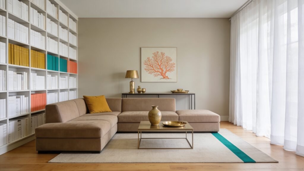
Where should you begin with accent colours without overcomplicating the room? Start with one “anchor” accent colour you already own and love. Look for a repeatable hue in your space: a pillow, rug pattern, art print, vase, or even a book cover. Choose the colour that grabs your eye first and feels intentional, not accidental.
Next, make that anchor visible in at least two spots so it reads as a design choice. You can move items you already have, swap covers, or reposition artwork to pull the colour forward.
Keep the rest of the room quiet while you test: stick to your existing neutrals and core finishes. If the anchor feels too loud, soften it with texture—linen, matte ceramics, or woven baskets.
Pick 1–3 Accent Colours That Work Together
Once you’ve got your anchor colour, how do you choose the rest without turning the room into a rainbow? Limit yourself to one to three supporting accents, and make them feel related. Use the colour wheel: pick neighbours for a calm, cohesive look, or choose one opposite hue for crisp contrast. Keep saturation consistent—pair muted with muted, or bright with bright—so nothing fights for attention.
Pull candidates from what’s already in the space: artwork, a rug, throw pillows, book spines, or even a plant pot. Repeat each accent at least twice in small moments, so it reads intentional.
If you’re unsure, test with paint swatches and fabric samples in daylight and lamplight before committing.
Balance the Room With the 60–30–10 Split
To keep accent colours from taking over, use the 60–30–10 rule: aim for about 60% of the room in your dominant (anchor) colour, 30% in a secondary colour, and 10% in accent pops. Start by choosing where each percentage will live.
Your 60% usually comes from walls, large rugs, or big upholstered pieces that set the baseline. Your 30% can show up in curtains, bedding, an armchair, or cabinetry to add contrast without chaos.
Reserve the 10% for smaller, repeatable notes—think pillows, throws, ceramics, lampshades, or art mats. Keep finishes consistent so colours read intentional.
If the room feels loud, shift one item from the 10% pile into the 30% group, or mute saturation. Reassess in daylight and evening.
Put Pops of Colour on Key Focal Points
The 60–30–10 split gives you the right amount of accent colour; now decide exactly where it should land so it looks intentional. Put your brightest hue on the room’s natural “stop points”: the sofa, the bed, a statement chair, or the wall behind your headboard. These are places your eye already goes, so the colour reads as design, not clutter.
Choose one or two hero pieces—like a bold rug, a pair of pillows, or a painted door—and let everything around them stay calmer. Use colour to outline shape and function: a throw to frame seating, a lamp to anchor a side table, or art to define a dining zone.
Keep finishes clean and edit extras.
Repeat Your Accent Colours 3+ Times
Even if you’ve chosen the perfect accent shade, it won’t feel cohesive until you repeat it at least three times around the room. Aim for a clear pattern: one large hit, one medium, and one small. That rhythm makes the colour feel intentional rather than random.
Start by anchoring the shade in your main focal point, then echo it elsewhere. You can repeat it through pillows, a throw, artwork, a vase, lampshades, books, or even a small tray.
Spread the repeats across different heights and zones so your eye moves naturally: something on the floor, something at seating level, and something higher up. If the accent feels too loud, reduce the size of each repeat, not the number of repeats.
Calm Bold Accents With Neutrals and Texture
When you love a bold accent colour but don’t want it to dominate the room, let neutrals and texture do the balancing. Start with a quiet base—warm white, greige, sand, or soft charcoal—on the largest surfaces so your accent reads intentional, not chaotic.
Then add tactile layers that “absorb” intensity: nubby linen, bouclé, wool, cane, raw wood, or matte ceramics.
Keep the accent in controlled doses and choose finishes that feel grounded. A deep teal looks calmer in velvet than in high-gloss lacquer; a hot coral feels softer in washed cotton than in slick plastic.
Use pattern as a buffer—thin stripes, small geometrics, or tonal prints—so colour shows up without shouting. Anchor it with black or brass details for structure.
Conclusion On How to Add Accent Colours Without Overwhelming a Room
You can add accent colours without overwhelming your room when you start with one anchor hue you already own and let it guide every choice. Keep your palette tight with one to three supporting shades that play well together. Use the 60–30–10 split to keep colour in proportion, then place bolder pops on your main focal points. Repeat each accent at least three times, and soften everything with neutrals, texture, and tidy finishes.


