
You can’t choose colours for a minimalist interior well until you’ve watched how your room’s light shifts through the day. Start by building a tight 3–5 tone palette, anchored in warm neutrals like creamy white, greige, or soft taupe. Then add one muted earth tone for depth, and rely on value contrast—light walls, darker accents—rather than extra hues. Get the undertones wrong, though, and the whole space can feel off…
Start With Your Room’s Natural Light
Before you pick a minimalist palette, pay close attention to your room’s natural light, because it will shift how every colour reads throughout the day. Stand in the space at morning, midday, and evening, and notice whether the light feels warm, cool, or neutral.
North-facing rooms often flatten and cool tones, while south-facing light can brighten and warm surfaces. East light makes mornings crisp; west light deepens shadows late day.
Track glare, too: large windows can wash out subtle neutrals and make walls look lighter than expected. Hold paint samples vertically on multiple walls, not flat on a table, and view them beside your flooring and key textiles.
If you use blinds or sheers, test with them drawn.
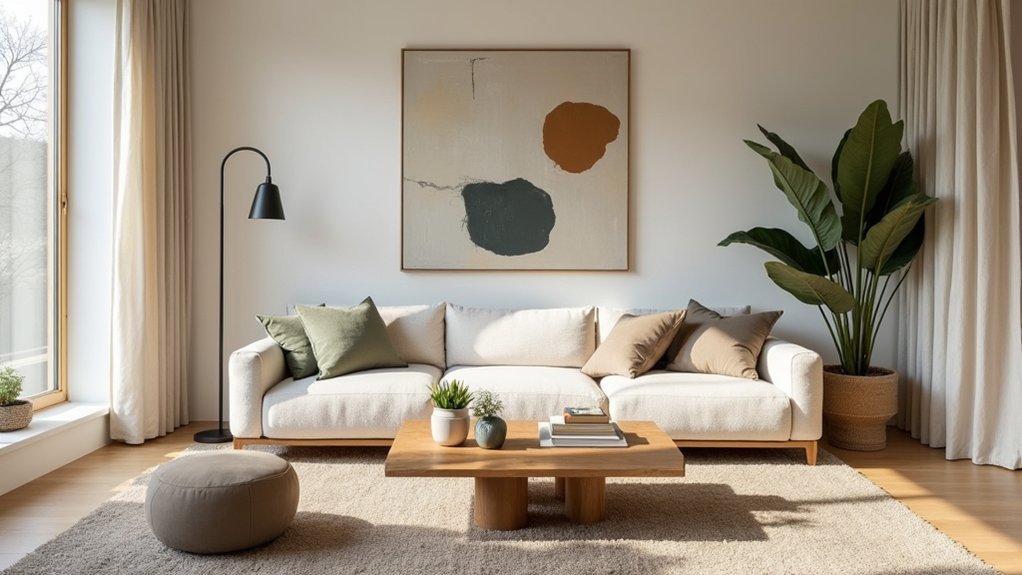
Build a 3–5 Tone Minimalist Palette
Once you’ve clocked how the light behaves, build a minimalist palette of just 3–5 tones—one main wall colour, one secondary neutral, and one accent (plus up to two bridge shades) to keep the room calm without turning it flat.
Choose your main colour for the largest surfaces, then assign the secondary neutral to trim, ceilings, or large textiles so the room reads coherent.
Add one accent for a single repeatable note—art, a chair, hardware, or a cushion—so it feels intentional, not random.
Use bridge shades to soften jumps between main and accent, especially across open-plan sightlines.
Keep values close, not identical, and repeat each tone at least twice to lock in balance.
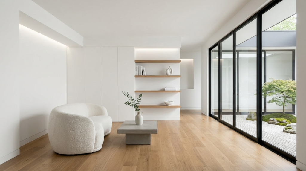
Choose Warm Neutrals (Not Sterile White)
Although crisp white seems like the safest minimalist choice, it often reads sterile or even slightly blue in real rooms, especially under cool daylight and LED bulbs. Instead, pick warm neutrals that keep the look clean while adding comfort.
Start with an off-white or creamy white for walls, then layer in light greige, oatmeal, or soft taupe for larger pieces and textiles. You’ll still get sharp lines and negative space, but the room won’t feel clinical.
Test swatches at different times of day, and check them next to your flooring and countertops so undertones don’t clash.
If you want contrast, use charcoal or warm black in small, deliberate accents like frames, hardware, or a single chair. Keep sheen low for calm depth.
Add Muted Earth Tones the Minimalist Way
If you want your minimalist space to feel grounded instead of flat, bring in muted earth tones with a light hand. Think clay, sand, oat, mushroom, sage, and soft terracotta—shades that read calm, not colourful.
Pick one tone to support your warm neutral base, then repeat it in a few deliberate places so it looks intentional.
Use earth tones in natural materials first: linen curtains, wool throws, jute rugs, leather pulls, or oak shelves. Keep patterns subtle and scale simple, like a tight weave or a matte finish.
Let the tone show up in functional objects too—ceramic bowls, planters, or a single artwork with earthy pigment. Limit the mix, and you’ll keep the room quiet, cohesive, and warm.
Add Contrast With Value, Not Extra Colours
When your palette already feels calm, build contrast by shifting value—lightness and darkness—rather than adding new colours. Keep the hue family consistent, then push one element lighter and another deeper. Paint walls soft off-white, then choose a charcoal rug or inky textiles to ground the room.
If you’re using warm neutrals, add contrast with espresso accents, not a new accent colour.
Control value in layers: large surfaces stay mid-to-light, key anchors go dark, and highlights go bright. Use matte finishes for soft transitions and reserve subtle sheen for focal points so shadows read cleanly.
Test samples in morning and evening light; value changes, and you’ll see contrast before you notice colour.

Match Colours to Wood, Stone, and Metal
Because wood, stone, and metal set the undertone of a space, you’ll get a cleaner minimalist palette by matching paint and textiles to those fixed finishes first.
Identify whether your wood reads warm (oak, walnut), cool (ash, bleached), or neutral, then choose whites and greiges with the same bias.
With stone, follow its dominant cast: creamy limestone pairs with soft ivory; blue-gray slate wants crisp white or cool taupe.
Metals act like punctuation. Brushed brass pushes colours warmer; chrome and stainless sharpen cool schemes; blackened steel deepens charcoals.
Keep saturation low so materials stay the feature.
Test samples beside the actual finish, not in isolation, and check them in day and night light.
Balance Walls, Floors, and Ceilings
Once you’ve aligned your paint and textiles with the room’s wood, stone, and metal, step back and balance the big planes—walls, floors, and ceilings—so the palette feels calm instead of top-heavy.
If your floor runs dark, keep walls lighter to lift the room, and choose a ceiling that’s a step brighter to open it up. If you’ve got pale flooring, you can deepen wall colour slightly for definition without adding visual clutter.
Use sheen to fine-tune weight: matte on walls quiets contrast, while a soft eggshell on trim adds edge. Don’t ignore the ceiling; it’s a fifth wall.
If walls feel busy, simplify the floor with a neutral rug. Keep transitions gentle, not abrupt.
Check Undertones So Nothing Clashes
Even a pared-back palette can look off if the undertones fight each other. When you pick “white,” “greige,” or “black,” you’re also choosing a hidden bias: pink, yellow, green, or blue. Check undertones by comparing swatches side by side, not in isolation.
Hold them against fixed elements you can’t change—oak floors, stone counters, tile, or upholstery—so you see whether they share warmth or coolness. If your floor reads golden, you’ll want creamy, warm-leaning neutrals; if it reads ashy, choose crisper, cooler tones.
Watch for green undertones in gray near plants, and violet undertones near brass. Keep your neutrals within one temperature family for a calm, minimalist flow throughout.
Test Paint Samples in Real Lighting
Where does your room actually fall on the spectrum between bright and dim, warm and cool? You can’t answer that from a paint chip under store fluorescents. Buy sample pots and paint large swatches on multiple walls, especially near windows and in shadowed corners.
Leave the swatches unframed by tape so you see true edges against trim and ceiling. Check them morning, midday, and night with your actual bulbs on, since LEDs can skew green, pink, or blue.
Move a white sheet or board beside the swatch to judge contrast and dirtiness. Live with the samples for two days, then choose the one that stays calm in every scene.
Keep the Palette Timeless as You Decorate
After you’ve nailed the wall colour, keep your minimalist palette timeless by treating decor as subtle variations, not new statements. Stick to two or three core neutrals, then repeat them across textiles, art, and objects. Choose finishes that harmonise: matte ceramics, brushed metal, pale wood, or linen, rather than loud gloss or high-contrast patterns.
When you add colour, use a restrained accent pulled from nature—clay, moss, ink, or sand—and keep it in small doses. Update the room through texture and scale, not extra hues: a heavier throw, a larger print, a new rug in the same family.
Edit often. If a piece fights the palette, move it out or replace it with a quieter counterpart.
Conclusion
You’ll get minimalist colour right when you let your room’s light lead and keep your palette tight. Choose warm neutrals instead of harsh white, then layer a couple of muted earth tones for quiet depth. Create interest with value—light walls, darker accents—rather than adding more hues. Balance walls, floors, and ceilings, and watch undertones so everything stays cohesive. Test samples in real lighting, and you’ll keep the look timeless as you decorate.


