
You can refresh your home with new paint colours faster than you think, but you can’t choose them from a tiny chip at noon. You’ve got to watch how light shifts the tone on different walls, then line it up with your floors, trim, and fabrics so nothing fights. Each room needs a purpose, and the whole house needs flow. Start with a few smart tests, and you’ll see what matters next.
Check Lighting: How Paint Colours Shift
Because light changes throughout the day, the same paint colour can look warm, cool, brighter, or duller depending on where and when you view it. Test swatches on multiple walls, not just one spot, since each direction shifts colour differently. North-facing rooms pull colours cooler; south-facing light can boost warmth and saturation. East light feels crisp in the morning, while west light turns golden late day, changing neutrals fast.
Watch how your bulbs affect colour, too. Warm LEDs can soften whites and deepen beiges; cool bulbs can sharpen blues and gray out creams. Turn on lamps at night and compare to daylight.
If a colour wavers too much, choose a steadier mid-tone or adjust undertone. You’ll avoid surprises after painting.
Match Paint Colours to Floors and Finishes
Once you’ve seen how a colour shifts from morning sun to lamplight, compare it against the finishes that won’t change—your floors, countertops, cabinets, and trim. Pull a board of these fixed materials into the room and hold your paint sample beside them, not against white paper alone.
Match undertones first. If your oak floors read golden, choose paints with warm or neutral bases, not icy blue grays. If your stone counters skew cool, keep whites crisp and avoid creamy yellows that can look dingy.
Use your trim as a referee: bright-white trim makes soft wall whites appear darker, while warm trim can turn “clean” shades pink. Don’t forget sheen; glossy cabinets reflect colour onto nearby walls, so test next to them.
Pick Paint Colours by Mood and Function
Before you commit to swatches and undertones, decide how you want each room to feel and what you’ll actually do there.
For bedrooms, aim for calm with soft, low-contrast colours that help you unwind and sleep.
In a home office, choose focused, steady hues that cut distraction and support long work sessions.
For living rooms, pick welcoming mid-tones that make conversation easy and keep the space from feeling stark.
Kitchens and dining areas can handle brighter, cleaner shades that boost energy and make morning routines feel lighter.
In hallways, use lighter colours to open narrow paths and keep them from feeling closed in.
In kids’ spaces, pick durable, cheerful colours that tolerate mess and still feel upbeat daily.
Choose Paint Colours for Wood and Fabric Tones
Even if you love a colour on its own, it can look completely different next to your home’s wood finishes and everyday fabrics, so start by reading those tones first. Identify whether your woods skew warm (oak, maple, cherry) or cool (ash, grey-stained, walnut).
Then match paint undertones: warm woods like creamy whites, soft greiges, clay, and muted olive; cool woods pair better with crisp whites, blue-greys, sage, and charcoal.
Next, pull cues from your biggest textiles—sofa, rug, curtains. If fabrics are patterned, choose a wall colour from a quieter background shade, not the loud accent.
With solid fabrics, create contrast: pair light upholstery with deeper walls, or dark textiles with lighter paint to keep the room balanced.
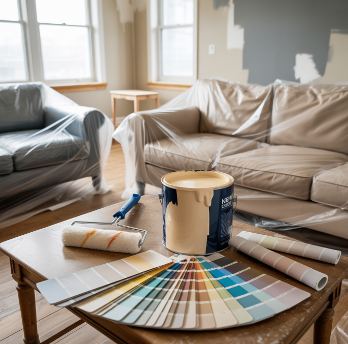
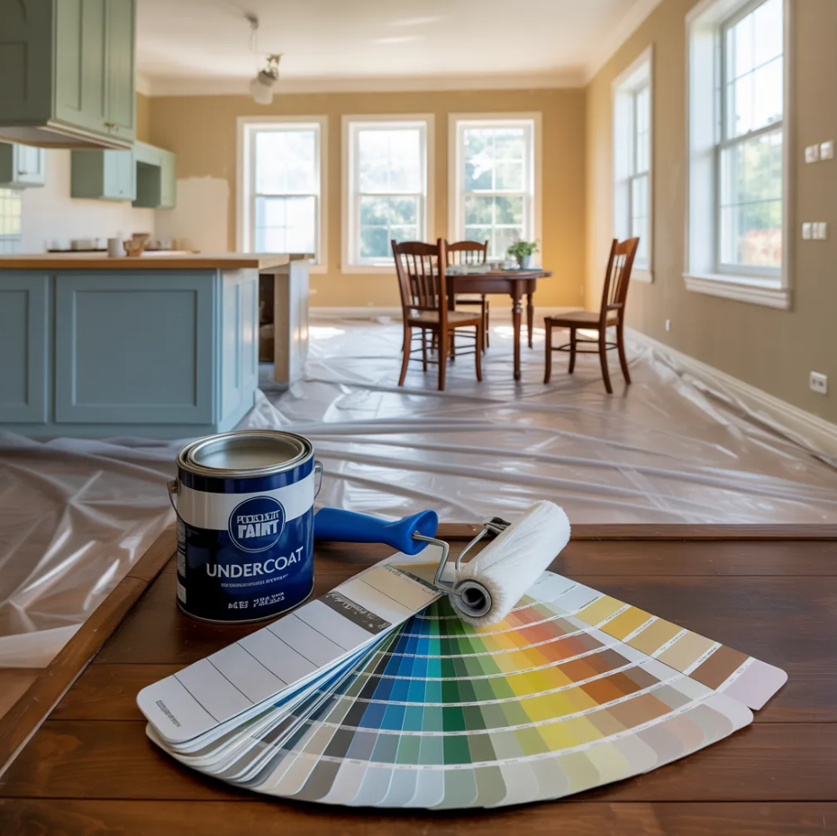
Test Paint Colours With Samples and Swatches
After you’ve narrowed down shades that work with your wood finishes and key fabrics, put them to the test in your actual space. Buy sample pots or peel-and-stick swatches and try at least three related options per room: one lighter, one mid-tone, one deeper.
Paint large boards or 12×12-inch patches on multiple walls, not just one spot, so you can see undertones shift. Move the samples beside trim, flooring, and upholstery, then step back to view them from your main seating areas.
Check them morning, midday, and evening with lights on and off. Notice glare, shadow, and how the colour feels against white paper.
Live with your top pick for 48 hours before committing.
Build a Whole-Home Paint Palette That Flows
Once you’ve chosen a few front-runners in each room, connect them into a whole-home palette that feels intentional as you move from space to space.
Pick one “anchor” neutral for main areas and hallways, then build out 2–3 supporting colours that repeat in different strengths. Keep undertones consistent (warm with warm, cool with cool) so trim, cabinetry, and adjacent rooms don’t clash.
Use a simple ratio: 60% anchor, 30% secondary, 10% accent, adjusting per room size and light.
Create transitions at doorways with shared elements—matching trim, a repeated accent, or a slightly lighter/darker version of the same hue.
Finally, view your choices together on one board, and tweak before you commit.
Conclusion
Now you’re ready to refresh your home with confidence. You’ve checked how colours shift in morning, afternoon, and evening light, and you’ve matched them to your floors, trim, and finishes. You’ve chosen shades that support each room’s mood and function while respecting wood and fabric undertones. By testing generous sample patches, you’ll avoid surprises. Tie everything together with a whole-home palette, and your spaces will feel cohesive, personal, and newly energized.


