Start by checking your sage green’s undertone in daylight: cool sages skew blue-grey, warm sages lean yellow-olive, and that choice steers your pairings. You’ll get instant balance with warm neutrals like creamy off-white, oatmeal, camel, and soft taupe, then add earthy terracotta, clay, or warm woods for coziness. For contrast, use navy or crisp black in small hits, and repeat brass, steel, or nickel finishes. Next, you’ll see how to layer textures and lighting.
Key Takeaways
- Identify sage’s undertone in daylight: cool sages lean blue/grey, warm sages lean yellow/olive; this determines the most harmonious pairings.
- Balance sage with warm neutrals like creamy off-white, oatmeal, camel, and soft taupe to keep the palette cosy and light.
- Add earthy partners—terracotta, clay, rust, tobacco leather, and warm woods—to ground sage and create a natural, layered feel.
- Use high-contrast accents like navy or black to sharpen edges; offset with light neutrals so the room doesn’t feel heavy.
- Keep colour saturation similar and repeat metals/woods 2–3 times; use texture and pattern to add depth without competing.
Start by Spotting Sage Green’s Undertone
Before you start pairing sage green with other colours, pin down its undertone, because that’s what determines whether your space feels crisp and modern or soft and earthy. Check it in daylight and at night: cool sages lean blue/grey, warm sages lean yellow/olive. Hold paint chips next to true white, creamy off-white, and charcoal; the shift becomes obvious.
Once you’ve named the undertone, you’ll choose Complementary color schemes with confidence: cool sage likes muted blush or dusty terracotta, while warm sage reads cleaner beside softened lavender or inky navy. Keep saturation similar so nothing shouts. Use Texture and pattern mixing to reinforce the direction—linen, bouclé, and matte ceramics for softness; polished stone, fine stripes, and black metal for edge.
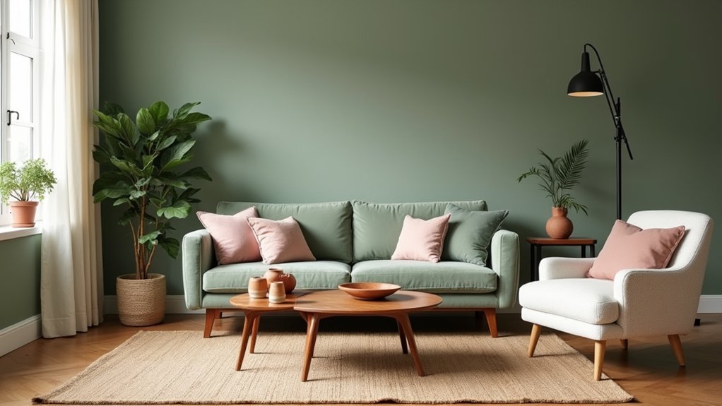
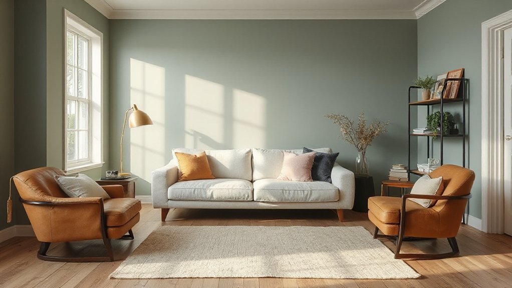
Warm Neutrals That Make Sage Green Feel Cosy
Although sage green can read cool on its own, warm neutrals—think creamy off-whites, oatmeal, camel, and soft taupe—wrap it in instant comfort and make a room feel lived-in rather than sterile. Use them as your backdrop on walls, upholstery, or large rugs, then let sage show up on cabinetry, cushions, or painted trim for a balanced hit of colour. For a modern take on Complementary colour schemes, keep contrast gentle: pair sage with warm ivory and add camel accents to lift the palette without sharpening it. Nail the cosy factor through Textural layering—bouclé, linen, brushed cotton, and matte ceramics—so the scheme feels rich even when it stays quiet. Keep lighting warm to avoid a flat, chilly finish.
Earthy Tones That Pair Naturally With Sage Green
Because sage green already carries a muted, botanical vibe, it looks most effortless when you anchor it with earthy tones like terracotta, clay, rust, tobacco leather, and warm brown woods. Use terracotta planters, clay tableware, or a rust-toned rug to add heat without overpowering the green. If you’re choosing Complementary wall paints, look for clay-beige, sunbaked sandstone, or soft mushroom to keep the palette grounded and current. Bring in patinaed metals, rattan, and walnut or oak to reinforce the nature-first story. Finish with Textured fabric accents—linen, bouclé, woven wool, and washed cotton—in caramel, ochre, or cocoa to build depth and calm. Keep sheens matte and grains visible for a collected, lived-in feel.
High-Contrast Colours for Sage Green (Navy, Black, Clay)
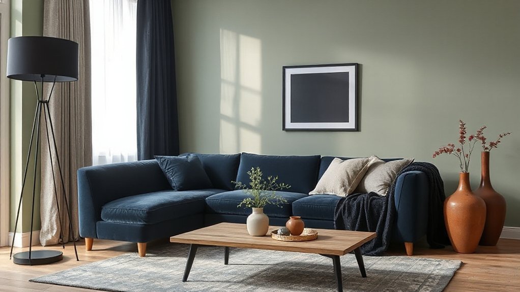
Earthy pairings keep sage green calm and grounded, but high-contrast colours sharpen it and make the whole room feel more intentional. Bring in navy when you want depth without heaviness; it reads tailored and current, especially on built-ins, upholstery, or a feature wall against sage. Use black to crisp up edges—window frames, graphic rugs, or bold art—so sage looks cleaner and more modern, not muddy. Add clay to warm the contrast: think terracotta-leaning textiles or painted niches that echo sage’s muted quality while still popping. For Complementary color schemes, balance darks with plenty of light neutrals so the room doesn’t close in. If you prefer Monochromatic palette options, vary sage from misty to deep olive, then punctuate with one high-contrast anchor.
Metals, Woods, and Accents That Finish a Sage Green Room
A few well-chosen finishes do more for sage green than another paint tweak ever will. You’ll get a sharper, more layered look when you mix warm and cool elements with intent, not clutter.
- Metals: Choose brushed brass for warmth, blackened steel for edge, or satin nickel to keep it crisp; repeat the finish 2–3 times.
- Woods: Pair sage with white oak for Scandinavian ease, walnut for richness, or ash for a cleaner grain.
- Textured fabrics: Add bouclé, linen, or chunky wool to stop the scheme feeling flat and to soften hard lines.
- Accents: Use Complementary art with terracotta, blush, or inky blue, plus ceramics and stone to ground the palette.
Frequently Asked Questions
Does Sage Green Make Small Rooms Feel Larger or Smaller?
Sage green can make small rooms feel larger if you use it in light tones and keep contrast low. Add Decorative accessories sparingly, and optimize furniture placement to maintain clear pathways and airy sightlines.
Which Paint Finish Works Best for Sage Green Walls: Matte or Satin?
You’ll get the best results with satin for sage green walls, because it boosts paint durability and keeps color consistency under changing light. Choose matte only for low-traffic rooms when you want a softer, modern look.
How Do I Pair Sage Green With Patterned Wallpaper or Busy Prints?
Like a calm anchor, you’ll pair sage green with busy wallpaper by letting the print lead and keeping solids simple. Choose complementary accessories in one hue, add contrasting textures, and repeat one small motif.
What Lighting Temperature Flatters Sage Green Most: Warm White or Cool White?
Choose warm white most of the time: it flatters sage green, keeps it earthy, and feels current. In a lighting comparison, cool white can skew it gray. Aim for 2700–3000K color temperature, dimmable.
Can Sage Green Work Well in a Rental Without Repainting?
Yes—you can. Like a soft mist, sage green slips into your rental through Rental restrictions with temporary solutions: peel-and-stick wallpaper, textiles, art, and removable decals. Anchor it using rugs and curtains you’ll take.
Conclusion
Once you’ve spotted sage green’s undertone, you can balance it with warm neutrals, earthy shades, or sharp contrast like navy and black. Keep it cosy with creamy whites, grounded with terracotta and oak, or modern with matte metals. For a polished finish, repeat your accent colour at least three times across the room. Importantly, studies show paint colour can influence perceived room temperature by up to 3°C—so your pairings don’t just look right, they feel right.