If you want your kitchen to help sell your home, you can’t pick colour in isolation. You’ll get better results when you start with what can’t easily change—floors, worktops, and splashbacks—then build a calm, neutral palette around them. Soft whites, warm greiges, and light taupes tend to make the space feel bigger and more inviting, while a controlled accent can add polish. The key is knowing which choices add value—and which quietly reduce it.
Kitchen Colours That Boost Resale Appeal
If you’re choosing kitchen colours with resale in mind, stick to timeless, broadly appealing shades that make the space feel clean, bright, and easy to personalise. Soft whites, warm greiges, and light taupes photograph well and help rooms feel larger.
Choose a consistent neutral for walls and main cabinetry, then add subtle contrast with a slightly deeper island or lower units in muted navy, sage, or charcoal. You’ll get character without scaring off buyers.
Keep undertones coordinated so the kitchen doesn’t read patchy: pair warm neutrals with warm accents, cool neutrals with crisp blacks or steels. Use satin or eggshell finishes for a refined look that hides marks better than flat paint.
Avoid loud brights and heavy darks that shrink the space.
Start With Fixed Finishes (Worktops, Splashbacks, Floors)
Before you pick paint or cabinet colours, lock in the fixed finishes that won’t change easily—worktops, splashbacks, and floors—because they set the kitchen’s undertone and contrast level.
Check whether each surface reads warm (creamy stone, honey oak) or cool (grey veining, blue-based slate), then keep them in the same temperature family so the room feels intentional.
Aim for simple, widely liked materials: mid-tone timber or stone-look floors, subtle splashbacks, and durable worktops with quiet patterning.
If one element is bold, keep the others calm to avoid visual clutter and buyer pushback.
Bring home samples, view them under daylight and evening bulbs, and match them against appliances and hardware for a cohesive, resale-friendly base.
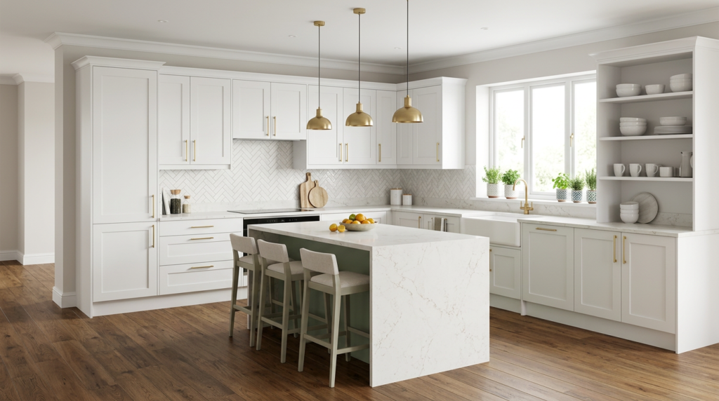
Warm White Kitchen Colours for a Bright, Clean Look
Once you’ve nailed down your worktops, splashback, and flooring, warm white becomes the easiest way to keep the kitchen bright while still feeling welcoming. Choose a creamy white with a soft yellow or beige undertone to avoid a cold, clinical finish, especially in north-facing rooms.
Pair it with matte cabinetry for a modern, forgiving surface, or use it on walls to lift darker units without repainting everything. Warm white also helps kitchens photograph well, which boosts online appeal.
Keep the look crisp by matching trims, ceilings, and cabinet whites, and test swatches under day and evening lighting.
Finish with brushed brass, light oak, or black hardware for contrast and definition without darkness.
Greige Kitchen Colour Schemes for Modern Warmth
Although neutrals often feel safe, greige gives your kitchen a modern warmth that plain grey or beige can’t match. You get the calm of a neutral with an undertone that feels lived-in, so buyers imagine cooking and gathering there.
Use greige on cabinets for a tailored look, then keep walls a softer off-white to stop the room feeling heavy. Pair it with brushed brass or matte black hardware to sharpen the lines, and choose warm wood or stone-look counters to reinforce the cozy edge.
If you want contrast, add a deeper greige island and keep the perimeter lighter. Finish with layered lighting—pendants plus under-cabinet strips—to keep the colour reading rich throughout the day.
Light Grey Kitchens That Still Feel Warm
Greige brings that cozy neutral balance, but light grey gives you a cleaner, airier look without turning the kitchen cold. Choose a grey with a warm undertone (look for hints of beige, taupe, or soft brown) so it won’t read blue in daylight.
Pair it with creamy whites on trim, ceilings, or splashbacks to keep contrast gentle and inviting.
You’ll add instant warmth when you bring in natural oak or walnut shelving, stools, or flooring, plus brushed brass or aged bronze hardware.
Use layered lighting: warm LEDs under cabinets, a soft pendant over the island, and dimmers for evening glow.
Finish with textured elements—linen blinds, matte tiles, and stone-look worktops—so the palette feels lived-in, not sterile.
Navy Kitchen Cabinet Colours as a “Safe Wow” Accent
If you want a bold kitchen colour that won’t feel risky six months from now, navy cabinet colours deliver that “safe wow” effect with ease. You get drama without shouting, and buyers read it as considered, classic design rather than a trend.
Pair navy lowers with crisp white uppers to keep the room bright, or go full navy and lift it with pale counters and reflective splashback tiles. Choose brass or matte black hardware for instant polish, and stick to simple door profiles so the colour stays timeless.
Navy also hides scuffs better than many light paints, which helps your kitchen photograph well and feel maintained. Add warm wood stools or shelves to prevent it from looking cold or heavy.
Sage Green Kitchen Colours for Calm, Broad Appeal
Because it sits between earthy and airy, sage green gives your kitchen a calm, crowd-pleasing colour that still feels intentional. It reads fresh without shouting, so buyers can picture their own style in the space.
Use it on lower cabinets or an island to ground the room, then keep uppers light for lift. Pair sage with warm whites, creamy quartz, and natural oak to create a relaxed, modern look.
Brushed brass or matte black hardware adds definition, while soft greige walls keep everything cohesive.
If you want subtle contrast, choose a slightly deeper sage for cabinetry and a misty version for the backsplash.
Add greenery and textured ceramics, and the palette feels curated, not themed.
Kitchen Colours to Avoid If You’re Selling Soon
While bold colour can photograph beautifully, it can also narrow your buyer pool fast, so stick to shades that feel timeless and easy to live with.
Skip high-gloss black cabinets unless the whole home reads ultra-modern; they show fingerprints and feel heavy.
Avoid intense reds, bright oranges, and saturated yellows, which can dominate open-plan spaces and clash with buyers’ furniture.
Steer clear of trendy millennial pink, teal, or cobalt on permanent elements like cabinetry and worktops; trends date quickly.
If you love dark drama, don’t paint walls deep navy or charcoal without strong daylight, or the kitchen can feel smaller.
Finally, avoid patchwork schemes with multiple competing colours; you want a clean, coherent backdrop that lets buyers imagine moving in.
Conclusion
Choose kitchen colours that help buyers picture themselves living there. Start with your fixed finishes—floors, worktops, and splashbacks—then build a cohesive palette around them. You can’t go wrong with warm whites, soft greiges, light taupes, or gentle greys to keep the space bright and open. Add a controlled “wow” with navy, sage, or charcoal accents. Skip loud hues and heavy dark trends—you’ll keep appeal broad and resale strong.