
If you’re choosing colour schemes for traditional UK homes, you’ll get the best results when you work with the building’s age and materials, not against them. Start with heritage neutrals that flatter plasterwork and wood, then add muted greens or dusty blues to bring depth without looking modern. Warm earth tones can soften cottages and north-facing rooms. The real difference comes from how you handle trim, ceilings, and contrast—because that’s where most schemes fail.
Colour Rules for Traditional UK Period Homes
Although period homes give you plenty of room to personalise, they look best when you follow a few simple colour rules.
Start by matching colour depth to light: in dim halls or north-facing rooms, keep tones lighter to avoid gloom; in bright south-facing rooms, you can push deeper shades without shrinking the space.
Respect original features—painted cornices, panelling, and fireplaces should lead, not compete, so keep the strongest colour on one element per room.
Use ceilings and woodwork to set proportions: a slightly lighter ceiling lifts low rooms; darker skirting can ground tall ones.
Limit your palette to three main colours, then repeat them across adjoining rooms to keep sightlines calm and cohesive.
Heritage Neutral Colour Schemes for UK Homes
Where do you start if you want a calm, timeless look that still suits a Victorian terrace or Georgian townhouse? Begin with heritage neutrals that echo lime plaster, stone, and aged wood. Choose warm off-whites, soft putties, and gentle greiges for main walls to flatter period proportions and natural light.
Keep ceilings a shade lighter to lift cornicing, and use a slightly deeper neutral on skirting and architraves to frame joinery without harsh contrast. In north-facing rooms, lean creamy and biscuit tones; in brighter spaces, cooler chalky whites can feel crisp.
Tie it together with matt finishes for walls and satinwood for trim, so the scheme feels authentic and practical. Add texture through linen, wool, and natural flooring.
Muted Green Colour Schemes for Period Interiors
Heritage neutrals set a calm base, and muted greens build on that softness while adding gentle character that suits Victorian and Georgian rooms. Choose sage, olive, or lichen tones to echo gardens and original joinery, then let them sit quietly against lime plaster, aged timber, and warm stone.
Use muted green on panelling, dado rails, or a chimney breast to emphasise period proportions without overpowering ornate cornices. Pair it with off-white ceilings, brass or antiqued gold hardware, and natural linens to keep the look grounded.
In north-facing rooms, pick a slightly warmer green to avoid a flat cast; in brighter rooms, go dustier for restraint. Finish with matt paint for walls and eggshell on woodwork for a tailored, traditional feel.
Dusty Blue and Navy Colour Schemes for Traditional Rooms
If you want a classic scheme that still feels fresh in a traditional room, dusty blues and deep navy bring calm depth without fighting the architecture.
Use dusty blue on walls to soften cornices, picture rails, and panelled doors, then ground the space with navy on a fireplace surround, built-ins, or an accent wall.
Pair them with crisp off-white ceilings and trim to keep proportions sharp and light levels up.
Choose brushed brass or aged chrome hardware so the blues look intentional, not cold.
Add patterned textiles—stripes, checks, or small florals—in blue and cream to echo heritage style without feeling fussy.
Finish with darker wood frames and a navy lamp base to tie everything together neatly.
Warm Earth-Tone Colour Schemes for Cottage Homes
Although cottages often come with low ceilings, uneven plaster, and plenty of timber, warm earth tones make those quirks feel intentional and welcoming. Start with clay, terracotta, or muted ochre on walls to echo brick hearths and aged stone.
Choose warm putty, oatmeal, or mushroom shades when you want a quieter backdrop that still feels cosy. If your rooms don’t get much sun, lean into honeyed neutrals and soft caramel to keep the space bright without turning stark.
In brighter cottages, try richer tones like tobacco, russet, or olive to add depth and a lived-in calm. Keep finishes matte or chalky so light falls softly across texture, and let natural materials—linen, wool, rattan, and weathered oak—carry the scheme throughout your home.
How to Pair Colours: Trim, Ceilings and Contrasts
When you’ve chosen your main wall colour, you can make the whole scheme feel sharper—or softer—by how you handle trim, ceilings, and contrast.
If you want a crisp, heritage look, paint skirting boards, architraves, and doors in a clean off-white with a slight warmth, not a stark brilliant white.
For a more cocooned feel, take the wall colour onto the woodwork in a lower-sheen finish so details recede but craftsmanship still reads.
Treat the ceiling as your light dial. Keep it a step lighter than the walls to lift height, or use a tinted white that echoes your wall undertone to avoid harsh edges.
Add contrast deliberately: pair muddy greens with inky blues, or warm neutrals with near-black accents, in small, repeated hits.
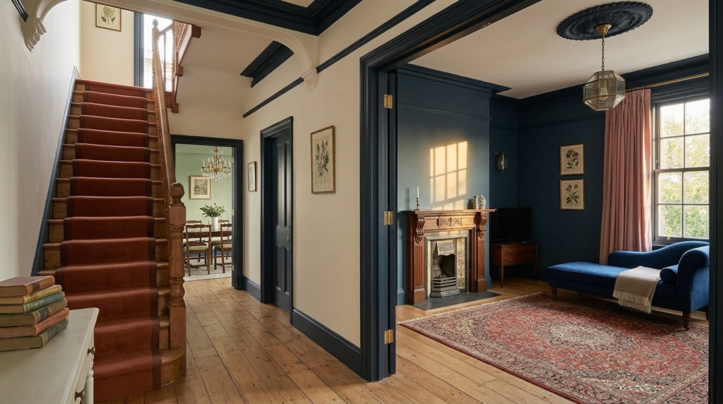
Traditional Hallway and Stair Colour Schemes
Because hallways and stairs link every room, their colour scheme sets the tone for the whole house and has to work hard in tricky light. Choose warm neutrals like stone, putty, or oatmeal on walls to soften narrow spaces, then paint skirting, dado rails, and balusters in crisp off-white for definition.
If you’ve got high ceilings, try a slightly deeper shade on the lower half to ground the space and hide scuffs. For Victorian or Edwardian homes, muted heritage greens, inky blues, or oxblood on the staircase wall add drama without overwhelming.
Keep treads and handrails darker for durability, and pick a satin finish for woodwork so it wipes clean. Finish with a patterned runner that echoes your palette.
Period-Style Kitchen Colour Schemes (Units, Walls, Woodwork)
A well-chosen hallway palette leads you straight into the kitchen, where colour has to feel period-right while coping with heat, steam, and constant use.
Start with painted timber units in muted heritage tones: sage, ink blue, putty, or deep cream. If your kitchen’s small, keep cupboards light and add depth with a darker island or pantry door.
On walls, choose warm off-whites, soft stone, or smoky green to flatter original plaster and tiled splashbacks. Use scrubbable finishes; steam and splashes will test them.
For woodwork, match skirting and architraves to walls for calm, or pick a slightly sharper white to outline joinery.
Tie it together with aged brass, black iron, or oak worktops, so the scheme reads timeless, not themed.
Traditional UK Exterior Colour Schemes (Brick, Render, Woodwork)
Step outside and colour choices get less forgiving, since brick, render, and timber sit under hard daylight and the UK’s relentless rain.
If you’ve got red brick, let it lead: choose warm off-whites, stone, or pale greige for any painted areas, then anchor with deep heritage green, navy, or charcoal on doors and gates.
For yellow London stock brick, soften with creamy whites and muted sage, keeping trim crisp but not stark.
On render, pick breathable mineral paints in chalky white, pale taupe, or soft grey; avoid bright shades that highlight cracks and algae.
For woodwork, stick to satin or eggshell and repeat one dark accent across fascias, sashes, and porch details.
Test swatches in sun and shade.
Conclusion
Choose colours that honour your home’s age and details, and you’ll get a scheme that feels effortless and authentic. Start with heritage neutrals for walls, then add muted greens or dusty blues to highlight panelling, fireplaces, or joinery. Warm earth tones bring cottage comfort, especially with natural textures. Keep trim crisp or softly tonal, and balance contrast carefully. In halls, kitchens, and outside, stick to understated shades that will age beautifully.


