
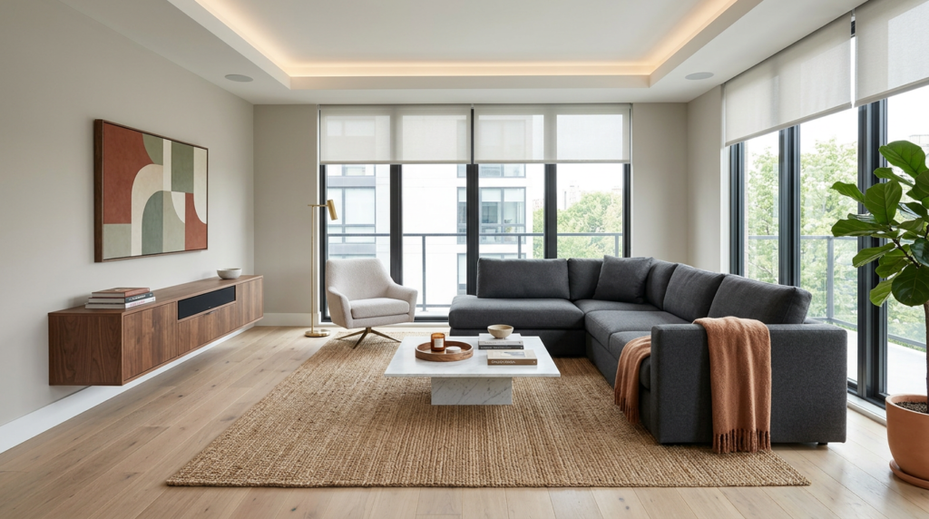
You want a modern living room that feels calm but not flat, and colour is what sets that balance. Start with the 60–30–10 rule so your main neutral does the heavy lifting, a secondary tone adds softness, and a sharp accent brings contrast. Then you match undertones to your light and let fixed pieces like flooring and a sofa guide you, because one mismatch can throw everything off… and that’s where the smartest choices begin.
Choose Modern Living Room Colours (60–30–10)
If you want a modern living room that feels cohesive without looking flat, start with the 60–30–10 colour rule.
Choose one dominant colour for 60% of the space—usually walls, large rugs, or big seating. Keep it calm and versatile so your room doesn’t date fast.
Use a secondary colour for 30% to build contrast and structure: curtains, an accent chair, or built-ins work well.
Then add 10% as a punchy accent through cushions, art, vases, or a single statement lamp. Repeat that accent two or three times so it looks intentional, not random.
Stick to clean, contemporary combinations like warm white + greige + black, or soft taupe + sage + brass. This keeps everything modern and balanced.
Match Undertones to Your Living Room Light
Because light changes how paint reads on the wall, you’ll get a more polished living room when you match a colour’s undertone to your natural and artificial lighting.
Start by noting exposure: north light cools and grays colours, so warm undertones (cream, greige, soft terracotta) keep the room inviting.
South light turns everything golden, so cooler undertones (blue-gray, crisp white, sage) prevent a yellow cast.
East light feels bright and cool in the morning, warmer later; choose balanced neutrals to stay steady all day.
West light intensifies warmth at sunset, so test cooler paints if you want calm.
At night, bulbs matter: warm LEDs boost reds, cool LEDs sharpen blues.
Paint large samples, then check them morning, afternoon, and after dark.
Start With Fixed Elements (Sofa, Floor, Rug)
Start by identifying each item’s dominant colour and undertone (warm, cool, or mixed).
Then decide which element leads: if your rug has multiple colours, pull one mid-tone for walls and a darker shade for accents.
If your floor has strong grain or orange cast, keep surrounding colours cleaner and simpler.
Check everything together in the room’s actual light, not online photos.
Finally, choose one consistent metal/wood direction for tables and frames so the fixed elements feel coordinated, not competing.
Modern Neutral Living Room Colour Ideas
While bold colour has its moment, modern neutral living rooms stay timeless by layering warm whites, soft greiges, and muted taupes in clearly separated roles—one light shade for walls, one mid-tone for upholstery, and one deeper accent for contrast.
Keep your neutrals crisp by matching undertones: pair creamy paint with beige linen, or cooler greige with stone-look textiles. Use black or charcoal in small doses—metal frames, lamp bases, or a slim coffee table—to sharpen the palette and make it feel contemporary.
Add depth through texture, not extra hues: bouclé, brushed cotton, matte ceramics, and ribbed glass. If your sofa and floor are fixed, echo them with a rug that blends two of your chosen neutrals, then repeat the accent twice for cohesion.
Warm Earth-Tone Living Room Colour Ideas
How do you make a living room feel instantly welcoming without losing a modern edge? Reach for warm earth tones that echo clay, sand, terracotta, and toasted beige. Start with a soft caramel or muted taupe on the walls to keep the room bright yet grounded.
Add depth through cinnamon accents, rust cushions, and paprika artwork, then balance it with crisp white trim and matte black hardware.
Keep the palette modern by mixing textures: bouclé, leather, linen, and pale wood. Use a large neutral rug to anchor seating, and layer in brass or bronze lighting for a gentle glow.
If you’re cautious, paint one feature wall or try earth-tone ceramics and throws first. You’ll get warmth without visual clutter.
Deep Green Living Room Colour Ideas (Sage to Olive)
Because deep greens sit so comfortably between moody and natural, they make your living room feel calm, curated, and current in one move. Start with sage on walls if you want softness, then layer olive through textiles for depth.
If you’re feeling bold, paint built-ins or a fireplace surround in forest green to anchor the room without shrinking it. Balance green with warm neutrals like cream, oatmeal, and camel, and add black accents to sharpen edges.
Choose natural woods—oak, walnut, or ash—to keep the palette grounded. For a modern finish, mix matte paint with brushed brass or aged bronze hardware.
Keep patterns subtle: tone-on-tone stripes, botanical weaves, or a vintage rug that repeats green quietly.
Inky Blue Living Room Colour Ideas (Navy to Denim)
Deep greens bring an earthy calm, but inky blues deliver that same depth with a sharper, more tailored edge. Choose navy when you want the room to feel grounded and architectural; it reads almost neutral, especially against crisp white trim or warm oak.
Go denim for a softer, lived-in look that still feels modern.
Use inky blue on a feature wall to frame a sofa and artwork, or commit to full walls for a cocooning evening vibe. Balance the shade with brass or blackened metal, and add texture through boucle, velvet, or leather so the colour doesn’t fall flat.
Keep lighting layered—floor lamp, table lamp, and dimmable ceiling—so blue shifts from moody to inviting. Anchor it with a patterned rug in cream and charcoal.
Soft Pastel Living Room Colour Ideas (Modern, Not Sweet)
Soft pastels can look grown-up in just a few smart moves: pick muted versions (dusty blush, sage, misty lilac, powder blue) and pair them with crisp whites, warm woods, and matte black accents.
Use one pastel as your “air” colour on walls, then keep big furniture calm in oatmeal, greige, or soft charcoal so the room feels modern, not candy-coated.
If you’re nervous, try a pastel on the ceiling, inside shelving, or just one wall behind the sofa.
Build texture instead of more colour: linen curtains, bouclé cushions, wool rugs, and ribbed ceramics keep pastels sophisticated.
Choose clean-lined shapes, minimal pattern, and plenty of negative space so the palette reads intentional.
Finish with a few tonal artworks for cohesion.
Add Contrast With Trim, Black, and Wood Tones
When your wall colour feels a little too “flat,” you can sharpen it instantly with contrast from trim, black accents, and layered wood tones.
Paint trim a crisp white to outline the room and make modern colours look cleaner. If you want more edge, choose a slightly warmer white so it doesn’t read icy.
Bring in black with intention: a matte black coffee table, picture frames, or a slim floor lamp creates structure and makes soft hues feel grown-up. Repeat black in at least two spots so it looks deliberate, not accidental.
Then balance it with wood. Mix one light wood (oak, ash) with one deeper tone (walnut) to add depth without clutter. Keep grain visible for warmth and contrast.
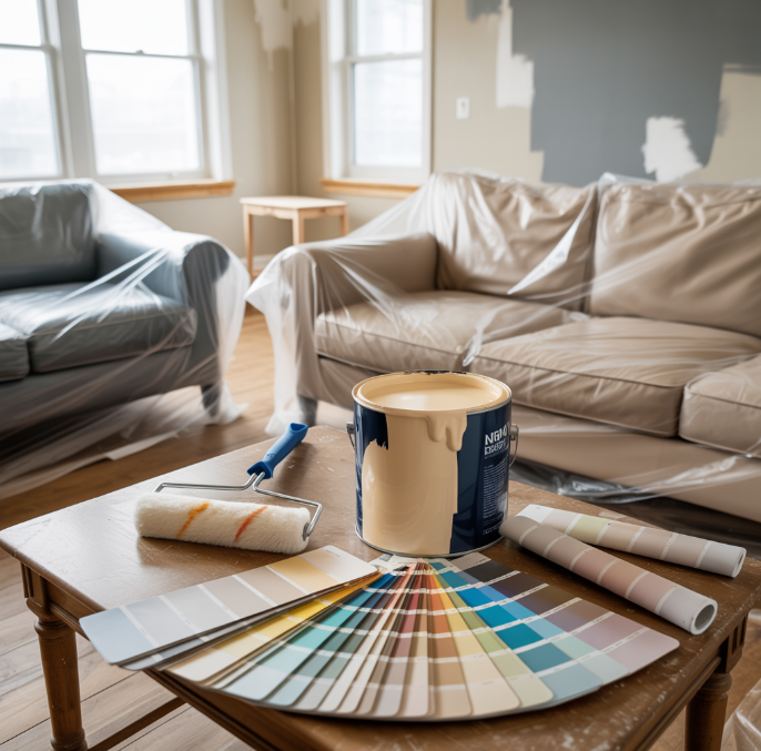
Test Living Room Paint Colours Before Committing
Before you buy gallons of paint, test your top living room colours in the exact light you live with every day. Paint shifts with morning sun, overcast afternoons, and warm bulbs at night, so a “perfect” swatch can turn muddy or too bright on your walls.
Buy sample pots or peel-and-stick sheets, then paint large squares on multiple walls, especially near windows, trim, and wood tones. Leave a white border so you can judge undertones against clean contrast.
Watch the colour for two full days, and compare it beside your sofa fabric and rugs. If it feels off, adjust the value: go one shade lighter for small rooms or one shade deeper for glare. When it still looks right at night, you’re ready.
Conclusion
You’ll get a modern living room look when you keep your palette cohesive and intentional. Use the 60–30–10 rule, then match undertones to your light so colours stay consistent all day. Start with what you can’t easily change—sofa, flooring, and rugs—then build from there. Whether you choose calm neutrals, warm earth tones, inky blues, or soft pastels, add contrast with trim, black, and wood. Test big samples first.


