
You want a living room that feels current in 2024 but won’t look dated next year. Start with colours that hold up: warm whites with creamy undertones, soft greiges that flex with light, and deeper anchors like navy, earthy green, or terracotta. You’ll get a calmer space when you balance contrast, match trim wisely, and let wood and texture do some of the work—but the real question is which shade fits your room’s light.
Timeless Living Room Colour Ideas: How to Choose
If you want a living room that still feels fresh years from now, start by choosing colours that suit your space, light, and lifestyle rather than chasing trends.
Begin with what’s fixed: flooring, large furniture, and any stone or brick. Pull one dominant neutral from these elements, then add one supporting colour and one accent you can swap seasonally.
Test paint in large samples on multiple walls, and check it morning, afternoon, and night with lamps on.
Keep contrast intentional: pair deeper tones with lighter upholstery, or light walls with grounded textiles, so the room doesn’t feel flat.
Use repeating colour cues across art, rugs, and cushions to unify the space.
When in doubt, choose muted, complex shades over bright primaries.
Warm White Living Room Colour Ideas (Undertones + Trim)
Because warm whites look simple on a paint chip but shift dramatically on your walls, start by identifying the undertone you’re actually working with—creamy yellow, soft beige, pinky blush, or greige—then match your trim to keep the room cohesive.
If your white reads creamy yellow, choose a slightly cleaner white for trim so it doesn’t look dingy, but avoid icy bright whites that amplify contrast.
With soft beige undertones, keep trim one step lighter than the wall to preserve warmth without turning everything tan.
For pinky blush, pick a neutral, low-pink trim so the walls feel flattering, not rosy.
If you’re using a warm white that leans greige, repeat that nuance on trim in the same family for a seamless, timeless envelope.
Always sample beside your trim.
Soft Greige Living Room Colour Ideas (Floors + Fabrics)
While soft greige reads calm and neutral on the wall, it quickly changes depending on what’s underfoot and what you upholster. Pair it with honey oak or warm walnut floors and you’ll pull out its beige side, keeping the room inviting.
Put it over cool gray tile or ash-stained boards and it swings sleeker, sometimes a touch taupe or violet.
Choose fabrics that steer the balance. Linen, bouclé, and cotton in oat, ivory, or sand soften greige and add depth without contrast.
If you want sharper definition, bring in charcoal, mushroom, or black accents through rugs, piping, or metal legs.
Go easy on icy blues; they can make greige feel flat. Layer textures instead of extra colours for a timeless look.
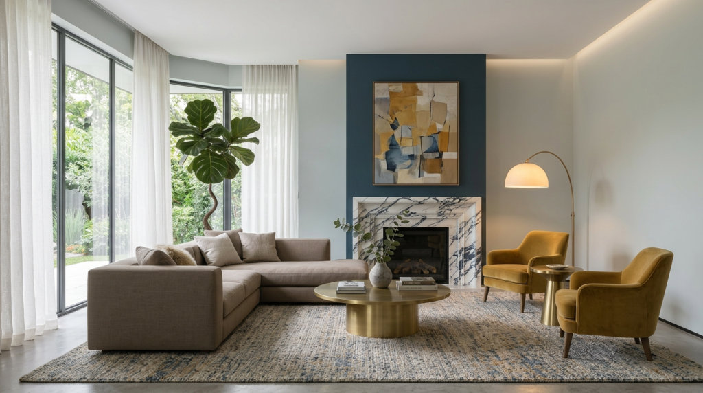
Moody Navy Living Room Colour Ideas (Where to Use It)
When you want a living room to feel grounded and intentional, moody navy delivers depth without the heaviness of black. Use it on a single feature wall behind the sofa to anchor the seating zone and make art pop.
Paint built-in shelving navy to sharpen silhouettes and disguise visual clutter. If you’re nervous, bring navy in through velvet curtains, a textured rug, or a pair of statement armchairs, then repeat it in smaller hits like cushions and ceramic lamps.
Choose a matte or eggshell finish on walls to keep it sophisticated, and go satin on trim for subtle contrast. Balance the darkness with warm lighting and brass accents, so the room stays inviting, not cold.
Earthy Green Living Room Colour Ideas (Light + Woods)
Earthy green brings calm to a living room and looks especially rich in bright spaces paired with natural woods. Use it on walls if you want an enveloping feel without going dark, or keep it to cabinetry and built-ins for a tailored look.
Balance the colour with pale oak, walnut, or ash furniture so the room stays warm and grounded. If you’ve got lots of daylight, choose a softer sage; in mixed light, pick an olive with a muted undertone to avoid looking flat.
Keep trim and ceilings warm white to sharpen edges, and layer in textured linens, jute, and boucle for depth. Finish with matte black or aged brass hardware, plus plants that echo the paint and make the palette feel intentional.
Grounded Terracotta Living Room Colour Ideas (Pairs Well With)
Because terracotta carries warmth without feeling overly sweet, it grounds a living room and instantly makes the space feel lived-in. Use it on one feature wall, built-ins, or a matte ceiling to add depth without shrinking the room.
Pair terracotta with creamy off-whites for calm contrast, or with soft greige to keep it modern. If you want bolder balance, bring in deep teal, inky navy, or charcoal accents through rugs and art.
Natural materials make it sing: oak, walnut, rattan, linen, and aged leather. Add black metal lighting for edge, or brushed brass for glow.
Keep patterns simple—stripes, geometrics, or textured weaves—so the colour stays the hero. It works year-round too.
Conclusion
You don’t need trendy shades to make your living room feel current in 2024—you need colours that last. Start with warm whites or soft greiges for an easy, flexible base, then add depth with moody navy where you want definition. Bring in calm with earthy greens and cozy warmth with grounded terracotta. Keep trims cohesive, build contrast intentionally, and lean on wood tones and textured fabrics to tie everything together for the long haul.


